The charts that matter: the green shoots of global recovery?
With US employment data coming in much better than expected, John Stepek looks at how that’s affected the charts that matter most to the global economy.

Welcome back. A quick reminder to sign up for MoneyWeek if you’re not already a subscriber. You get your first six issues free as well as a rather fun e-book about previous market booms and busts (well, I thought it was fun to write, put it that way). Subscribe here now.
Here are the links for this week’s editions of Money Morning.
- Monday:What bounce back loans can tell us about how we’ll pay for all this
- Merryn’s blog: “Stealth” debt jubilees are here – and that’s a very good thing
- Tuesday: Commodities: possibly the biggest opportunity in today’s markets
- Wednesday: These seven charts show exactly why you must own gold today
- Thursday: Disease, rioting and mass unemployment – so why are markets soaring?
- Friday: Why a stronger euro is good news for investors
There’s also our Quiz of the Week – see what you can remember and what you missed of the economic and political events of the past seven days.
Try 6 free issues of MoneyWeek today
Get unparalleled financial insight, analysis and expert opinion you can profit from.

Sign up to Money Morning
Don't miss the latest investment and personal finances news, market analysis, plus money-saving tips with our free twice-daily newsletter
Don't miss the latest investment and personal finances news, market analysis, plus money-saving tips with our free twice-daily newsletter
Having a contrarian lens through which to look at markets is pretty useful at times like these, so if you don’t already own a copy of The Sceptical Investor, my book on contrarian investing, then you can buy it here.
And a very special treat for you on the podcast this week – Merryn interviewed none other than former Bank of England head Mervyn King. They talk about everything from Covid-19 to Brexit to how to pay for all of this. Don’t miss this one – you can listen in here.
Also I popped up on The Week’s podcast this week, talking about China’s digital currency plans as well as some much heavier subjects - you can listen to it here.
On to today’s charts of the week...
The charts that matter
The big news yesterday afternoon was that US employment data was far, far better than expected. Analysts had expected to see a massive drop in employment of around eight million. Instead, there were 2.5 million job gains, and the unemployment rate fell to 13.3%, when it had been expected to rise to nearly 20%.
One swallow doesn’t make spring as the saying goes, but it’s certainly one to chalk up for the believers in a V-shaped rally. That said, is it all that surprising given that businesses across the US have been reopening for quite a few weeks now? Let’s see what happens in future months, but for now it’s a very positive statistic.
Of course, markets being markets, good news is not always entirely welcomed, given the potential impact on monetary policy as well as the U-turn in thought processes, as investors bent on one plan of action suddenly have to incorporate an entirely new set of scenarios into their thinking.
That rather threw the cat among the pigeons which is not always obvious from the charts below, as they go up to the close of play on Monday.
The most obvious short-term casualty was gold (measured in dollar terms). Gold has been benefiting from the whole “safe haven” bid. Having been at over $1,720 an ounce on Friday morning, when the jobs data came through, the yellow metal plunged to below $1,690.
With markets suddenly embracing “risk-on”, no one wants to be sitting in an inert shiny rock. However - let’s see if they feel the same way if an unexpectedly rapid recovery turns into rather more rapid inflation than expected too.
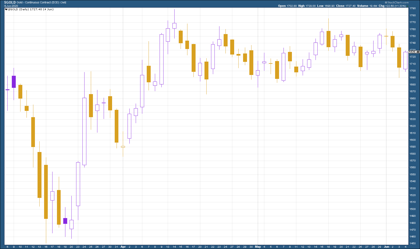
(Gold: three months)
The US dollar index (DXY – a measure of the strength of the dollar against a basket of the currencies of its major trading partners) continued its slide lower this week, despite the strong jobs data. The main driver is still the hope that Europe can get its act together, which as in turn pushed the euro (the biggest component of DXY) higher.
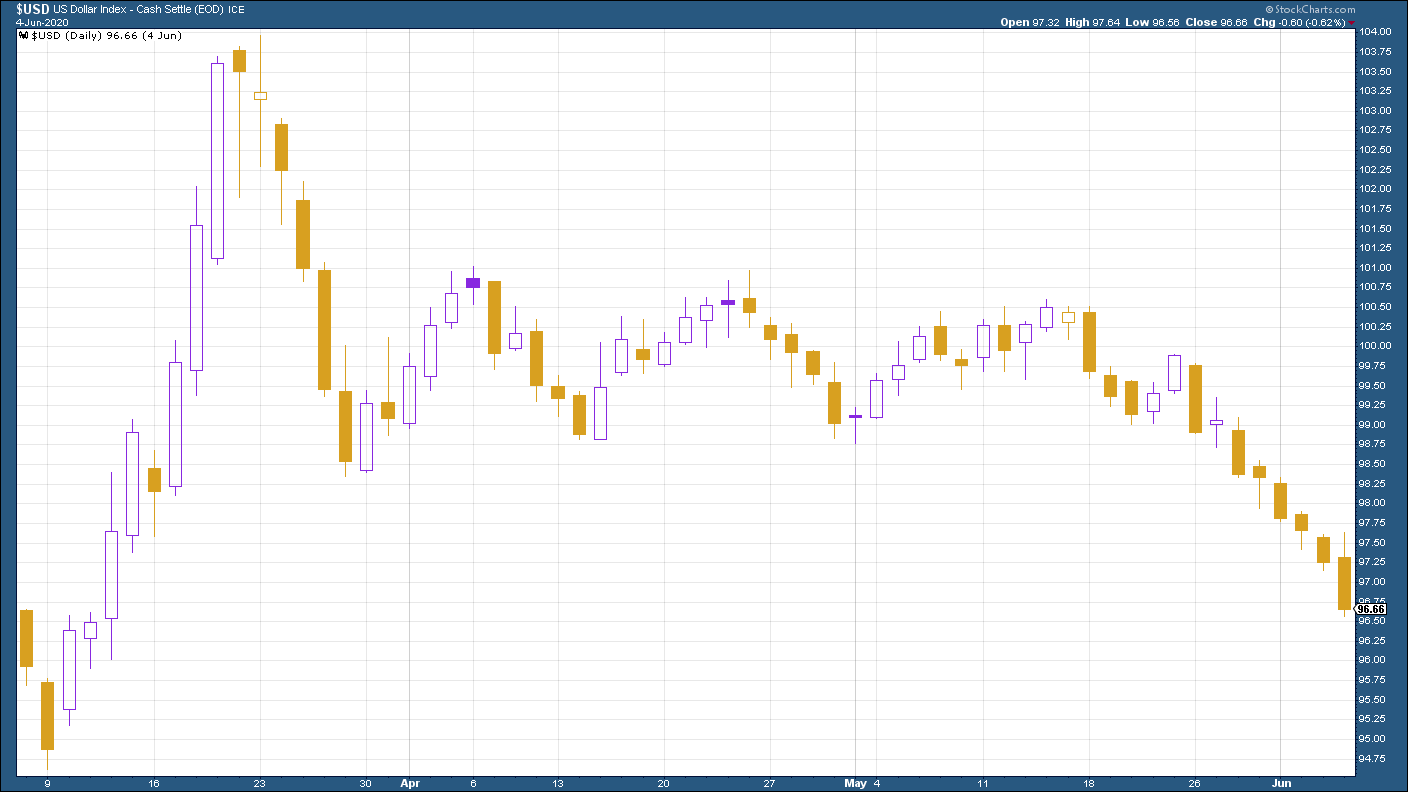
(DXY: three months)
Despite the tensions over Hong Kong, the Chinese yuan (or renminbi) has stopped weakening against the US dollar, which these days is roughly equivalent to an informal truce in the Cold War between the US and China.
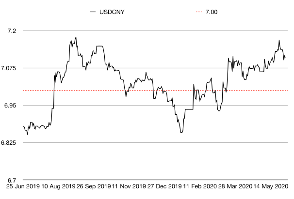
(Chinese yuan to the US dollar: since 25 Jun 2019)
The yield on the ten-year US government bond moved significantly higher this week and the good jobs data only pushed that trend further. If there’s a strong recovery, it points to higher inflation and higher interest rates over time.
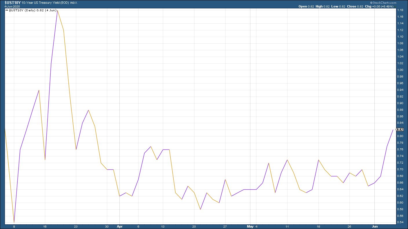
(Ten-year US Treasury yield: three months)
The yield on the Japanese ten-year rose into positive territory, following the US bond higher.
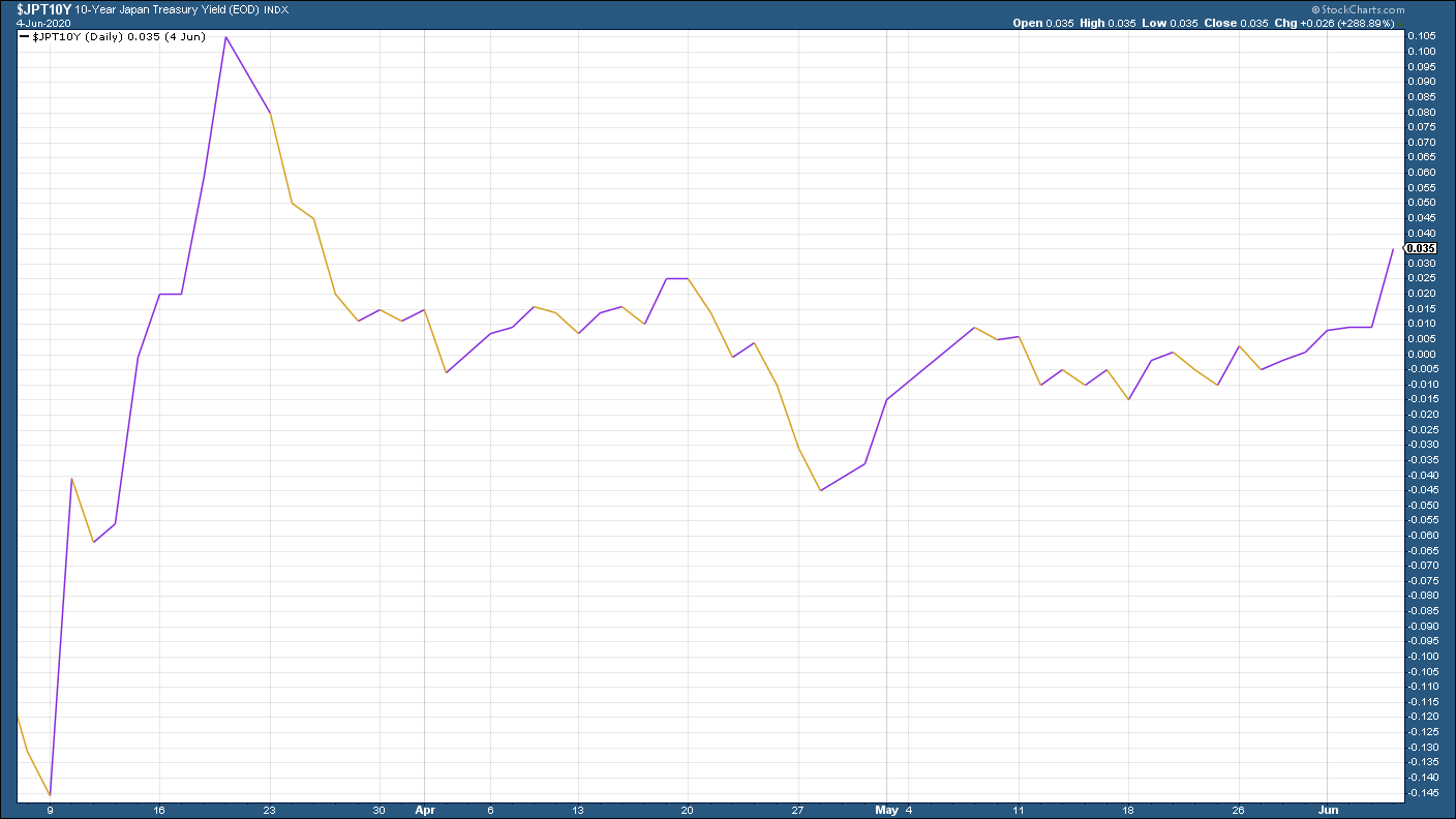
(Ten-year Japanese government bond yield: three months)
Meanwhile the yield on the ten-year German bund headed sharply higher amid hopes that the eurozone can get its act together and also on the news that Germany plans to throw some of its prior fiscal caution to the winds.
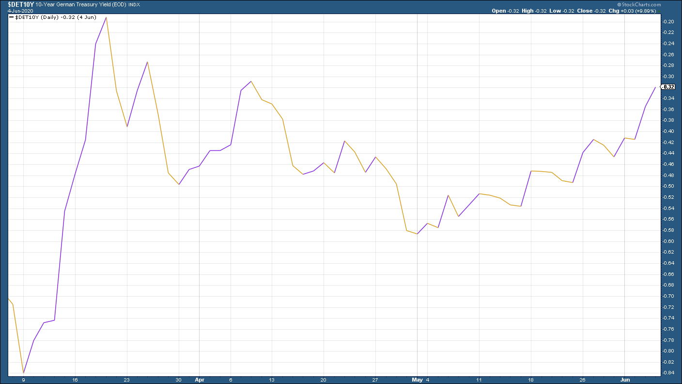
(Ten-year Bund yield: three months)
Copper had a very good week, bolstered by hopes for an ongoing reopening in the global economy. Copper hit absolute bottom just before stock markets bottomed out (as you can see in the chart below - the markets bottomed on March 23rd and copper hit its low shortly before that), which is yet another reason why it’s always worth watching “the metal with a PhD in economics”.
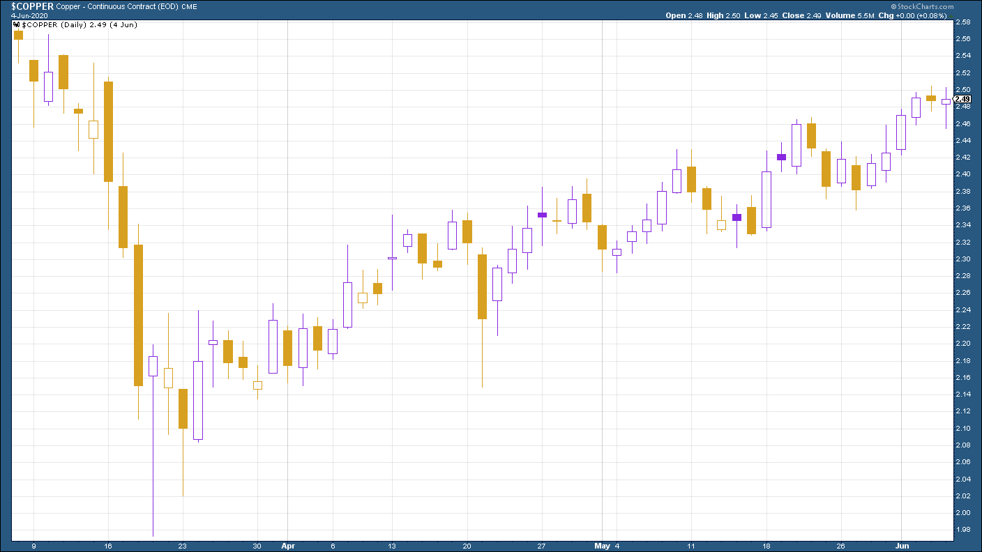
(Copper: three months)
The Aussie dollar which is of course sensitive both to the Chinese economy and to commodity demand, continued to push higher against the US dollar this week.
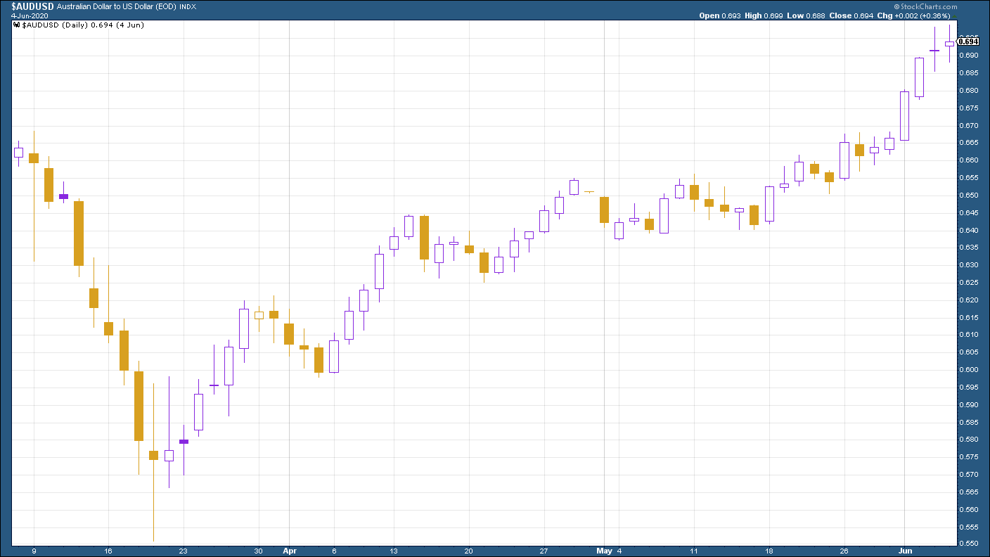
(Aussie dollar vs US dollar exchange rate: three months)
Cryptocurrency bitcoin continues to trade in a range - every time it claws its way back above 10,000 it gets slapped down. It’ll be one to watch when (if) it finally takes off I suspect.
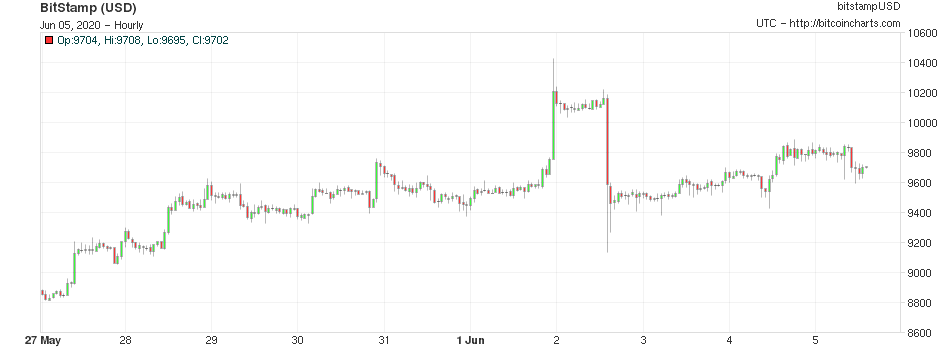
(Bitcoin: ten days)
This week’s US weekly jobless claims figure was somewhat overshadowed by the aforementioned nonfarm payrolls report on Friday. But the news was relatively positive on that front too.
The number of new claims fell below two million for the first time since the middle of March. Initial claims fell to 1.9m (down from 2.1m last week). The four-week moving average now sits at 2.28m, compared to last week’s 2.61m.
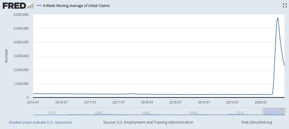
(US jobless claims, four-week moving average: since January 2016)
The oil price kept moving higher too, similarly to copper. We’ll find out next week if oil cartel Opec’s scheduled meeting over the weekend does anything to derail that.
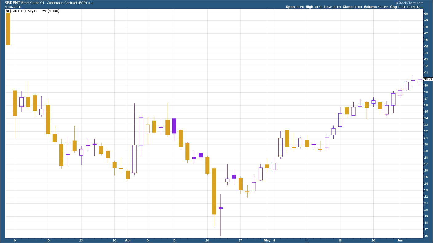
(Brent crude oil: three months)
Amazon shares were higher this week along with the wider market...
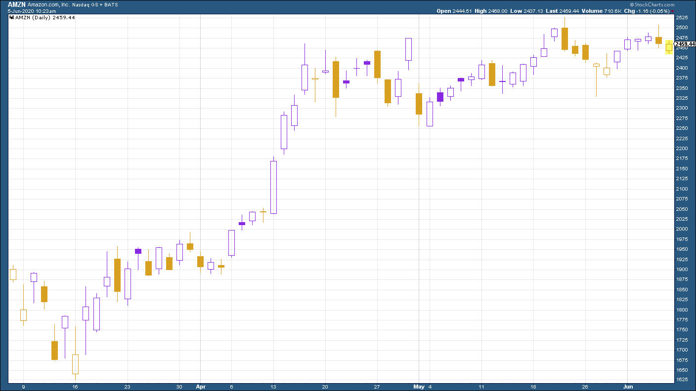
(Amazon: three months)
… as were shares in electric car group Tesla.
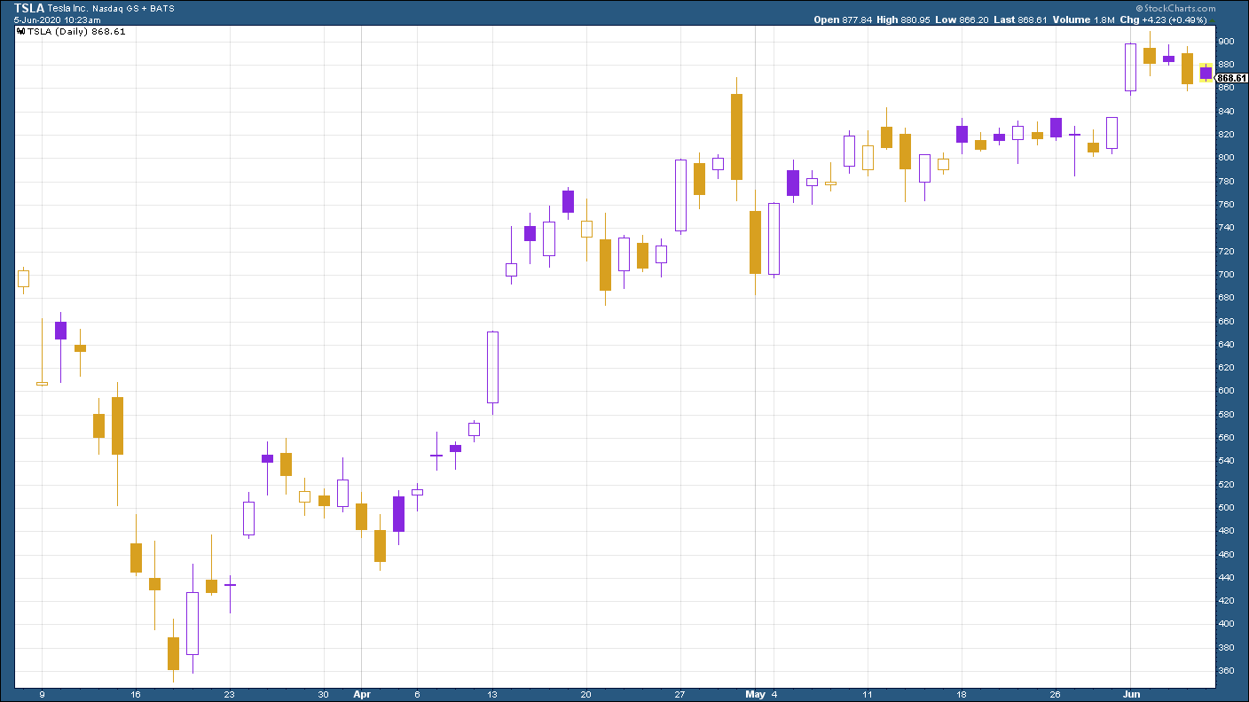
(Tesla: three months)
Get the latest financial news, insights and expert analysis from our award-winning MoneyWeek team, to help you understand what really matters when it comes to your finances.
