These seven charts show exactly why you must own gold today
Covid-19 is accelerating many trends that were already in existence. The rising gold price is one such trend. These seven charts, says Dominic Frisby, reveal why gold could soon “go bananas”.

Get the latest financial news, insights and expert analysis from our award-winning MoneyWeek team, to help you understand what really matters when it comes to your finances.
You are now subscribed
Your newsletter sign-up was successful
Want to add more newsletters?
It’s all about gold today, folks.
This is the week that Incrementum AG puts out its annual research note, In Gold We Trust.
It’s one heck of an undertaking by the Liechtenstein investment company – over 18,000 hours of research have gone into its 300-plus pages.
Try 6 free issues of MoneyWeek today
Get unparalleled financial insight, analysis and expert opinion you can profit from.
Sign up to Money Morning
Don't miss the latest investment and personal finances news, market analysis, plus money-saving tips with our free twice-daily newsletter
Don't miss the latest investment and personal finances news, market analysis, plus money-saving tips with our free twice-daily newsletter
And now I will attempt to distill it all into some 900 words.
Corona is an accelerant for the gold market too
The main authors of the Incrementum AG report – Ronald-Peter Stoeferle and Mark J Valek – are, as you might expect, pro-gold. Many MoneyWeek readers will feel the same way – I know I do – but we should still lay these cards on the table up front.
But goldbug or not, the analysis of these reports over the years has been consistently level-headed. Before I share some of their charts, let me just distil their key takeaways.
We have mentioned many times on these pages how corona has accelerated things that were likely to happen anyway: the rise of remote working, shopping, education and healthcare, for example.
Stoeferle and Valek argue that corona had done the same for a long overdue recession. It was coming anyway. Now it’s here. Gold is “the seventh sense of financial markets” and it has been outperforming stocks for over 18 months now. Covid has made this more apparent.
Attempts to normalise the extraordinary monetary policy that emerged after 2008 – in other words, no more money printing, zero-interest-rate policies and so on – have now well and truly been thrown out of the window, along with the baby and the bathwater.
Now, the reactions and interventions to the pandemic are “overstretching the debt sustainability of many countries” so that “government bonds will increasingly be called into question as a safe haven”. Gold could take on this role, they argue.
Here’s hoping, say I. When government bonds are no longer a safe haven, gold goes bananas. We have been waiting a long time for that. Perhaps the great accelerant that is Covid will do for them as well.
Extraordinary geo-political situations and monetary experimentation are only going to help gold. We are at the “dawn of a new monetary world order” in which gold, as a “stateless reserve currency”, will play an important role.
Inflation is very much a real prospect. Central banks have got a problem on their hands if they want to tackle it. Excess debt means raising interest rates is a no go. In such an environment, silver and gold should do very well.
While gold is at or close to all-time highs in most currencies, it is a given that it will reach all-time highs in US dollars. “The question is not whether the gold price will reach new all-time highs, but how high these will be.”
It’s proper goldbug erotica!
These seven charts show you just why you need to own gold
So let’s look at seven charts that caught my eye specifically.
First, the ratio between gold and the S&P 500 stock index. Gold rose against the S&P from 2000 to 2011. That changed in September of that year, and the S&P began outperforming (see red circle). In late 2018, that eight-year trend appears to have reversed, and gold is once again beating stocks.
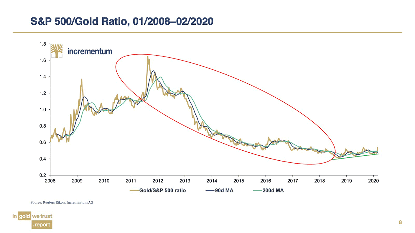
In 2011 one ounce of gold was worth 1.6 times the S&P. Today the S&P is at around 3,000. Multiply 3,000 by 1.6 and you get an eventual target for gold of $4,800/oz. I’d take that!
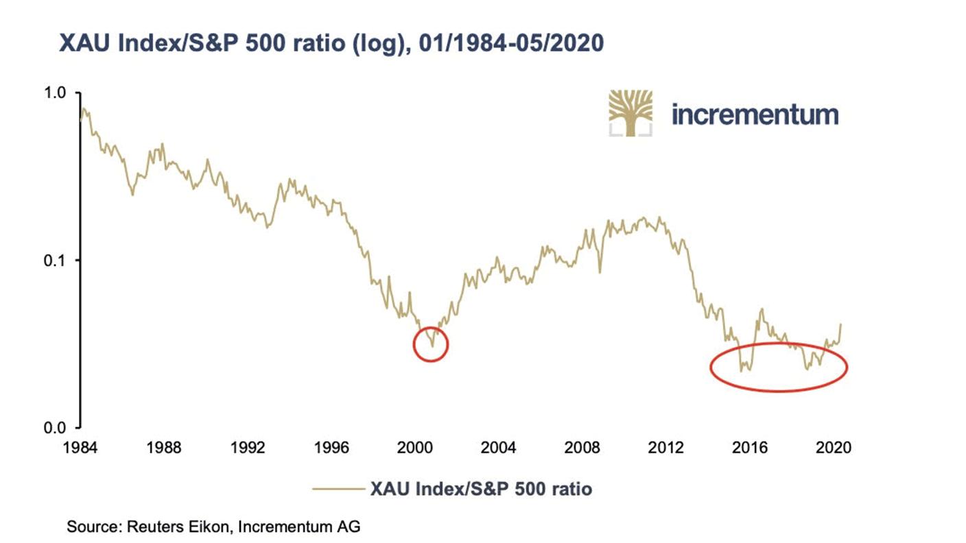
Second, gold stocks. As measured by the XAU – the Philadelphia Gold & Silver index of precious metals mining companies – these reached their lowest level ever versus the S&P 500 in late 2015, and retested that low in late 2019. With a clear double bottom now in place, there is a lot of potential upside.
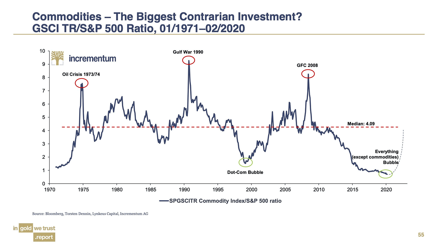
Third, we have commodity prices versus the S&P 500. They are at their lowest level ever. Sure, improved production methods will always put downward pressure on commodities prices, but the level we are at is extraordinary. If this ratio starts ticking up, inflation will bite hard.
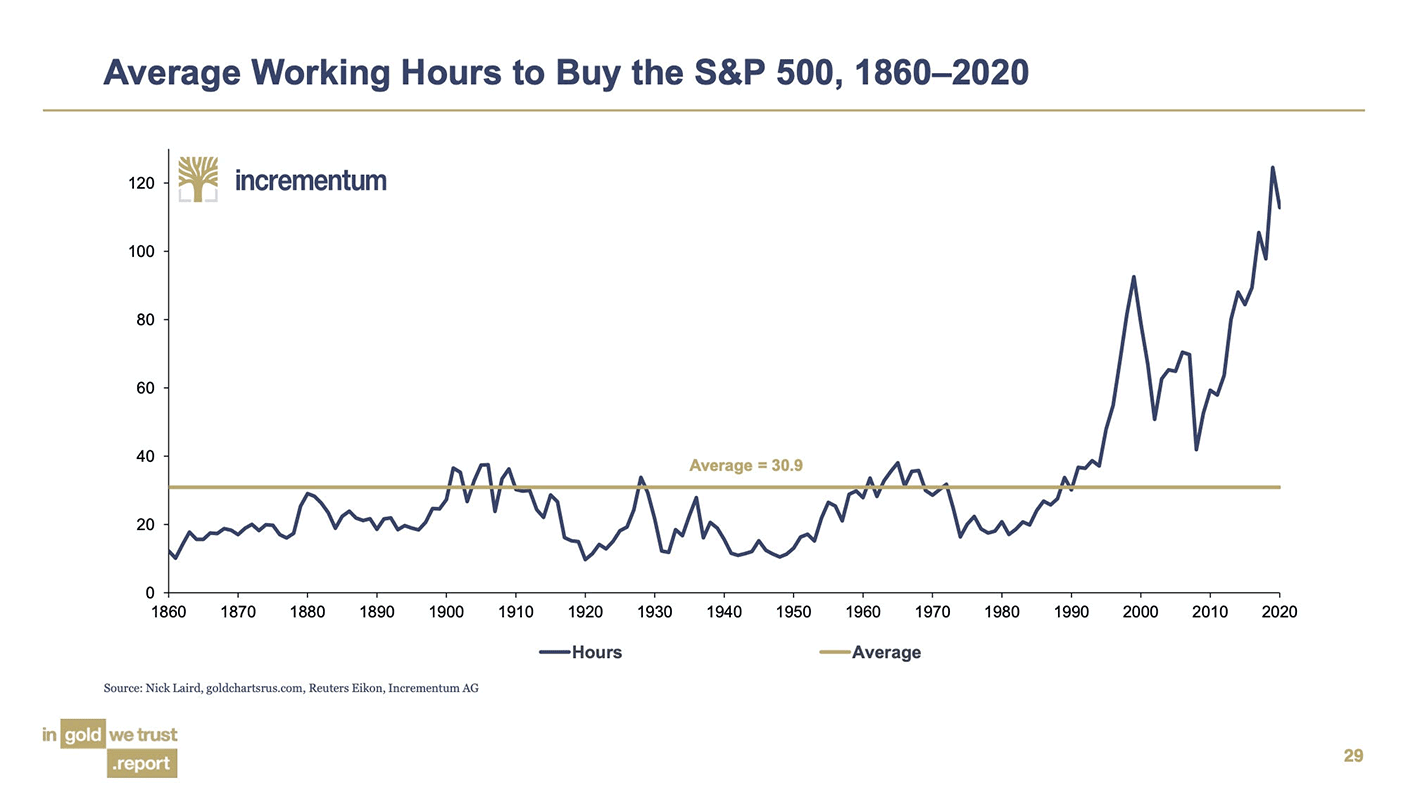
Which brings me to the man on the street, and our fourth chart. Was ever there a chart that so demonstrated the gap between Wall Street and Main Street as the one below? Look at how expensive the stockmarket has become relative to average wages. The inflation of the money supply has made it into financial assets, but not wages. If you want to know why the working man got left behind, and why he’s angry – there’s your answer.
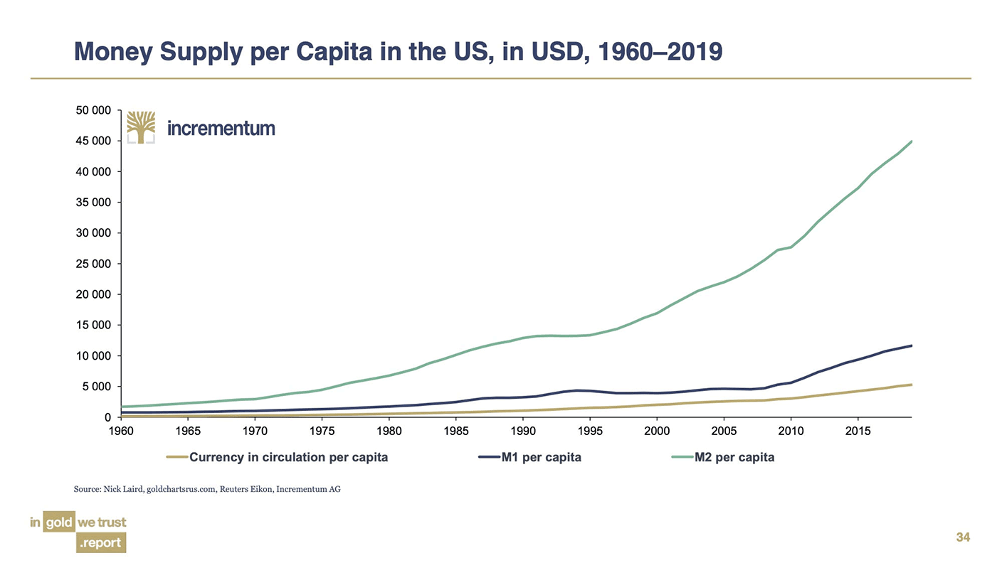
Speaking of money supply, that’s also extraordinary. Below, in our fifth chart, we see money supply per head, according to various measures. My! We live in interesting times. It’s hard to see how this doesn’t lead to very nasty inflation of some kind or other.
And that is why we have the “Everything Bubble”, the subject of our sixth chart. It’s hard to find an asset – tangible stuff like commodities aside – that hasn’t risen in value. The chart below shows the ratio between disposable personal income and household holdings of financial assets.
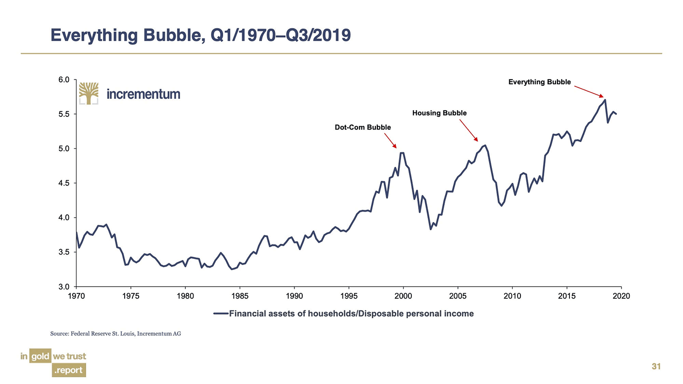
Again, the gap between what people actually earn and what they own is stark. This is what happens when you prop up markets with funny money. It’s why there is such an extraordinary wealth gap between generations, and why kids – by that I mean anyone born after about 1985 – can’t afford a house.
Speaking of funny money, our seventh and final chart shows the amount of global debt trading on negative yields.
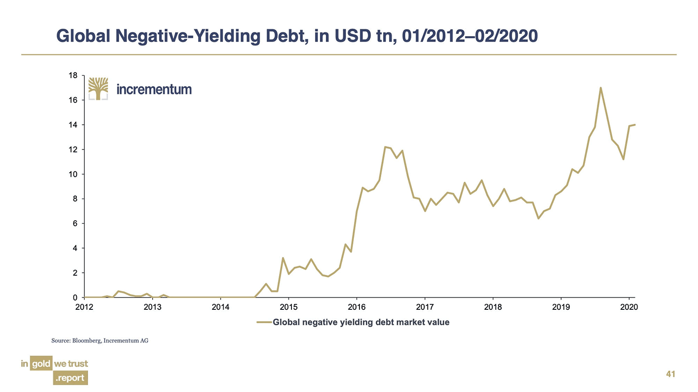
Such a thing barely existed five years ago. Now there’s $15trn of the stuff.
Lord knows how this all ends. All I can advise is, own some gold, and hope it doesn’t go up, as the old Wall Street saying goes. Alternatively – own lots of gold and hope it does.
Daylight Robbery – How Tax Shaped The Past And Will Change The Future is available at Amazon and all good bookstores with the audiobook, read by Dominic, on Audible and elsewhere. If you want a signed copy, you can order one here.
Get the latest financial news, insights and expert analysis from our award-winning MoneyWeek team, to help you understand what really matters when it comes to your finances.
