Welcome back.
This week’s magazine looks at the US stockmarket bubble. US stocks are “wildly overpriced” on pretty much every measure, says Jeremy Grantham. A day of reckoning is surely coming, and when it does it won’t just be US stocks that suffer – everything else will come down in sympathy.
Our other big feature looks at trading biases – the “psychological pitfalls that can part inexperienced investors from their money”. Experienced trader Michael Taylor lays out eight key things to be aware of.
Try 6 free issues of MoneyWeek today
Get unparalleled financial insight, analysis and expert opinion you can profit from.

Sign up to Money Morning
Don't miss the latest investment and personal finances news, market analysis, plus money-saving tips with our free twice-daily newsletter
Don't miss the latest investment and personal finances news, market analysis, plus money-saving tips with our free twice-daily newsletter
Read all that and more in this week’s magazine – sign up now if you’ren ot already a subscriber.
This week’s “Too Embarrassed To Ask” video takes a look at “drawdowns”. They’re an unfortunate fact of life for pretty much every investor. But just what is a drawdown? Find out here.
In this week’s podcast, Merryn’s talking to Sebastian Lyon of Troy Asset Management about the joys of a boring investment style, why you shouldn’t confuse ESG investing with ethical investing, plus inflation, financial repression, gold… and much more. Listen to the episode here.
Here are the links for this week’s editions of Money Morning and other web articles you may have missed:
- Tuesday Money Morning: In a “defined contribution” pension? Cheer up!
- Merryn’s blog: Why central banks should stick to controlling inflation
- Wednesday Money Morning: Everything you wanted to know about ethereum but were too afraid to ask
- Thursday Money Morning: Could the “metaverse” be the next big investment theme?
- Friday Money Morning: The two key factors that keep driving house prices higher
Now for the charts of the week.
The charts that matter
Gold levelled off a little after almost a month of steady rises, though it then shot up on Friday afternoon as US jobs data came in far weaker than most people expected (which gives the Federal Reserve more reason to be cautious when “tapering”).
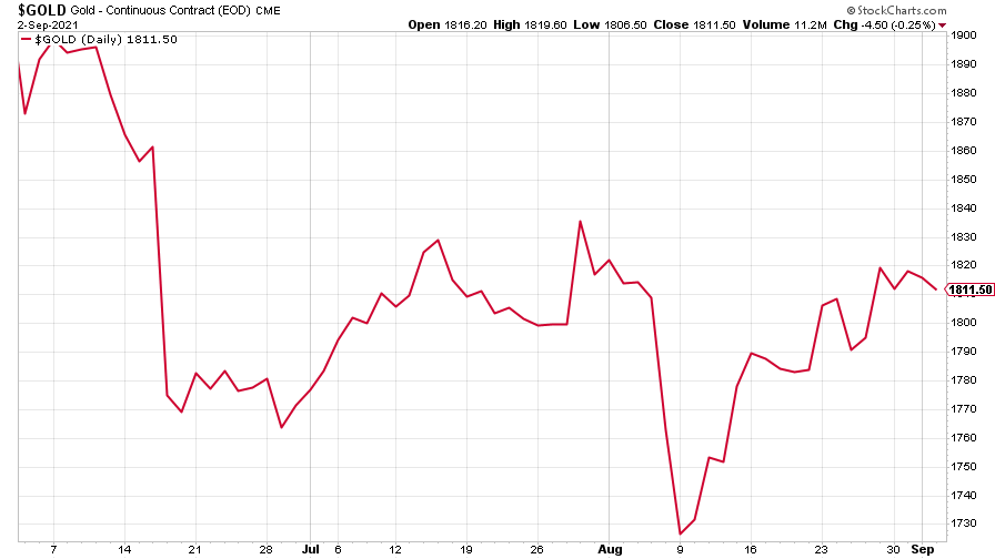
(Gold: three months)
The US dollar index (DXY – a measure of the strength of the dollar against a basket of the currencies of its major trading partners) dropped, particularly after the aforementioned weak jobs data.
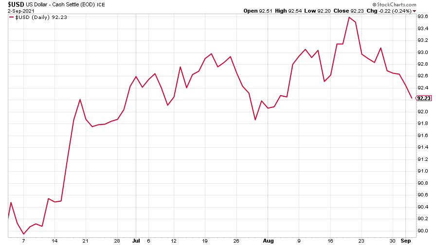
(DXY: three months)
The Chinese yuan (or renminbi) continued to see very little action (when the red line is rising, the dollar is strengthening while the yuan is weakening).
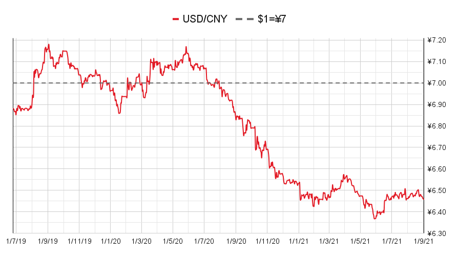
(Chinese yuan to the US dollar: since 25 Jun 2019)
The yield on the ten-year US government bond ended the week more or less where it started, despite Jerome Powell confirming plans to cut monetary stimulus later this year.
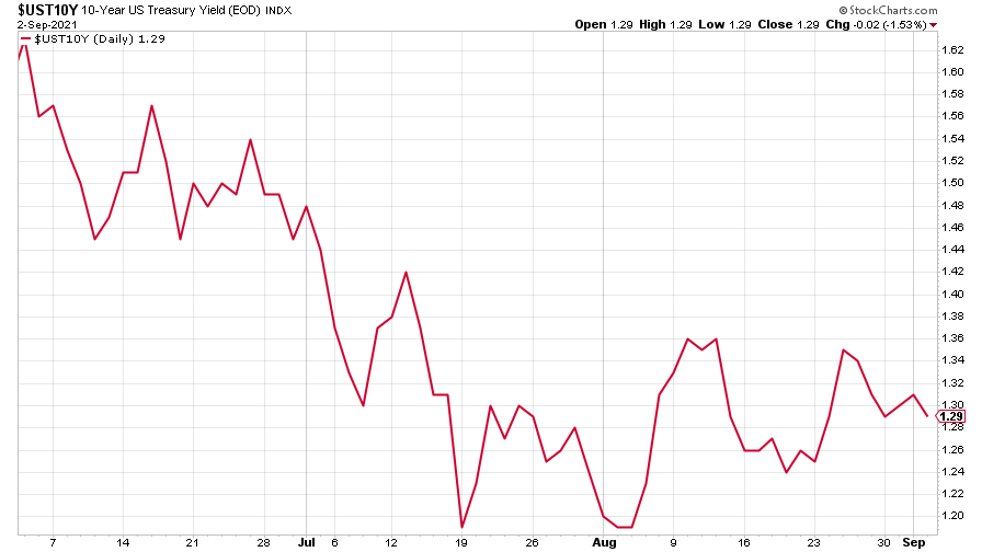
(Ten-year US Treasury yield: three months)
The yield on the Japanese ten-year bond was a little higher but still barely changed, despite news that Japan’s prime minister would step down.
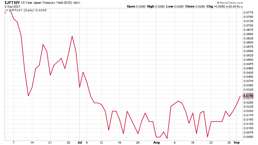
(Ten-year Japanese government bond yield: three months)
And the yield on the ten-year German Bund was higher too, though tapered off towards the end of the week.
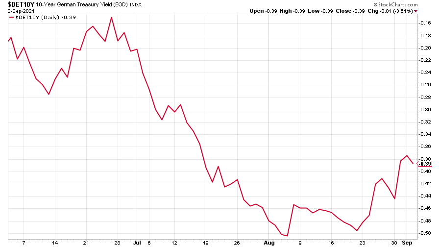
(Ten-year Bund yield: three months)
Copper paused its rebound from a recent low.
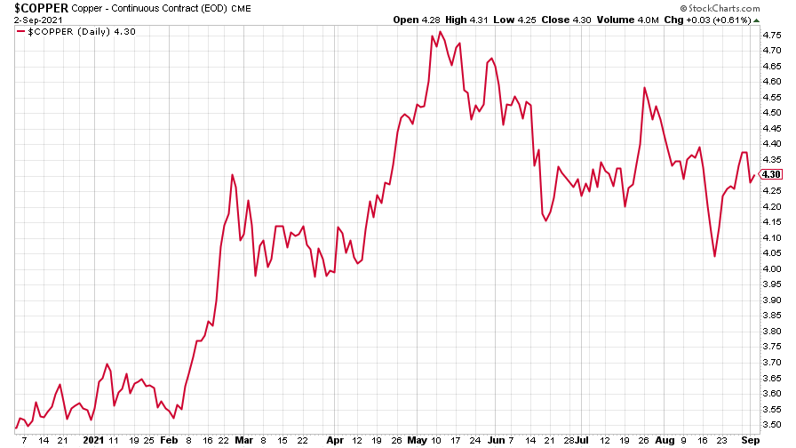
(Copper: nine months)
The closely-related Aussie dollar bounced back, too.
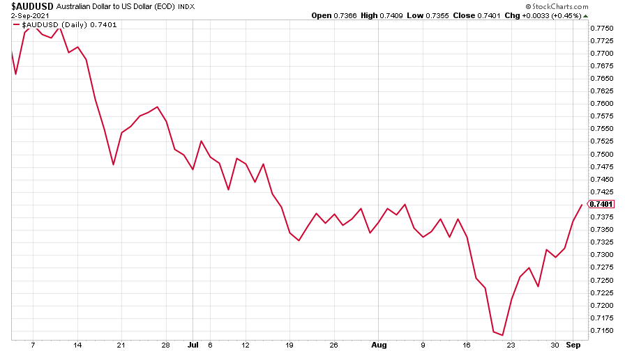
(Aussie dollar vs US dollar exchange rate: three months)
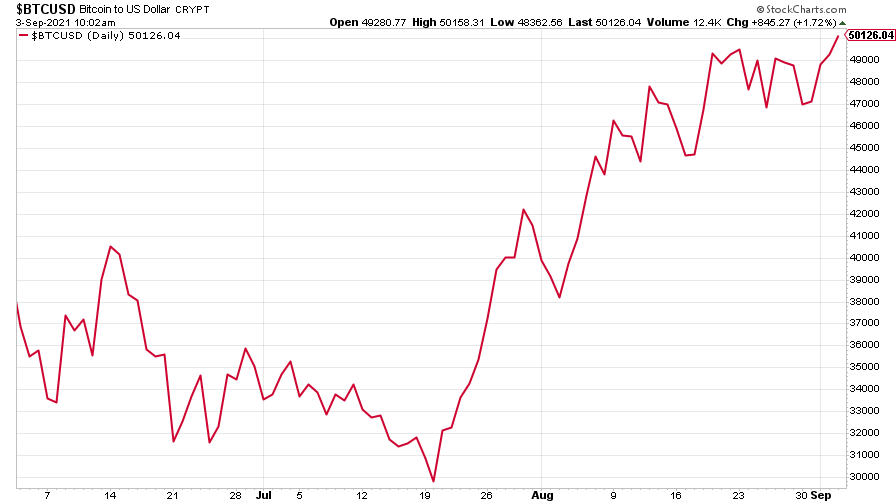
Bitcoin continued to head back towards the moon, topping $50,000 for the first time since May this year.
(Bitcoin: three months)
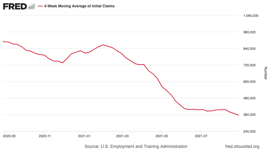
US weekly initial jobless claims fell by 14,000 to 340,000. The four-week moving average fell by 11,750 to 355,000. Meanwhile, the nonfarm payrolls figure for August, released on Friday afternoon, was far weaker than expected.
(US initial jobless claims, four-week moving average: since Jan 2020)
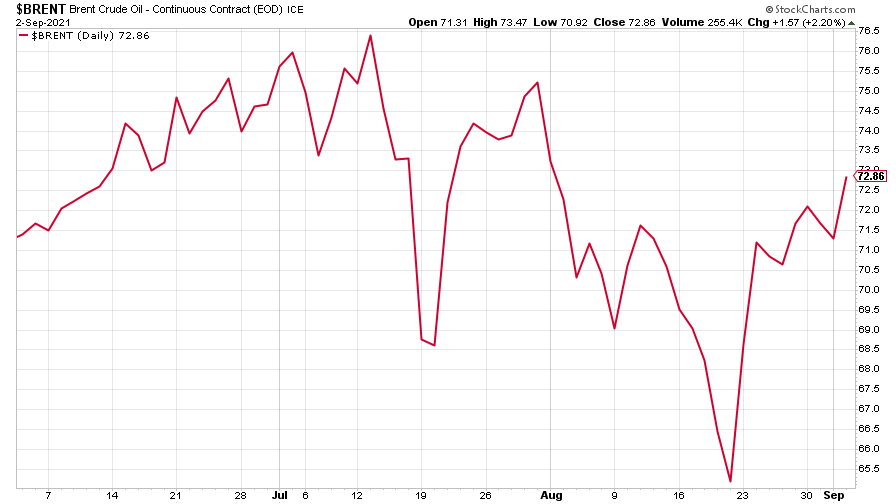
The oil price is back on its upward march, though it remains some way off its July high.
(Brent crude oil: three months)
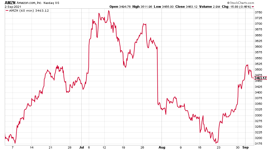
Amazon slipped back after its recent run of gains.
(Amazon: three months)
And Tesla paused for breath, too.
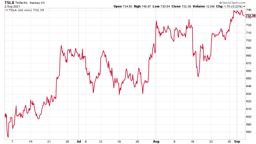
(Tesla: three months)
Have a great weekend.
Ben
Get the latest financial news, insights and expert analysis from our award-winning MoneyWeek team, to help you understand what really matters when it comes to your finances.

