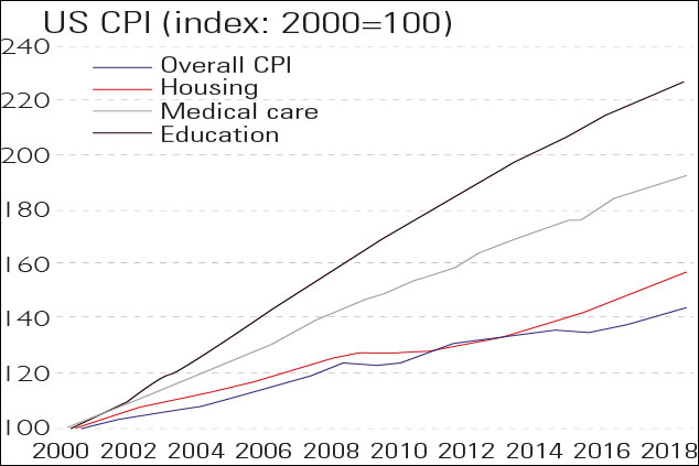
Chart of the week: US inflation is worse than it looks
The current annual rate of consumer price inflation (CPI) in America is just below the US Federal Reserve’s target of 2%, but to most people it feels much higher.
The current annual rate of consumer price inflation (CPI) in America is just below the US Federal Reserve's target of 2%, but to most people it feels much higher, says John Mauldin in Thoughts from the Frontline. Even at 2% a year prices jump by an overall 50% in 20 years, and in any case CPI "doesn't reflect real-life spending".
For some of life's necessities, prices have risen "dramatically". Over the past two decades medical care, housing and education (the cost of going to university) have jumped by far more than CPI. The Fed also uses an accountancy technique called Hedonic Quality Adjustment, the upshot of which is that if an item has improved in quality, it is deemed not to have become more expensive. "Does that match your experience?"
Subscribe to MoneyWeek
Subscribe to MoneyWeek today and get your first six magazine issues absolutely FREE
Sign up to Money Morning
Don't miss the latest investment and personal finances news, market analysis, plus money-saving tips with our free twice-daily newsletter
Sign up to Money Morning
Our team, led by award winning editors, is dedicated to delivering you the top news, analysis, and guides to help you manage your money, grow your investments and build wealth.
-
How to invest in nuclear power
We need nuclear power to go green, says Dominic Frisby. But there is a better option than huge power stations
By Dominic Frisby Published
-
Chase slashes its easy-access savings rate – is it time to switch?
The Chase easy-access savings account has proved popular with savers thanks to its competitive rate and bonus deals. But, as the rate has dropped, has it lost its charm?
By Katie Williams Published
-
The charts that matter: bond yields and US dollar continue to climb
Charts The US dollar and government bond yields around the world continued to climb. Here’s what happened to the charts that matter most to the global economy.
By Ben Judge Last updated
-
The charts that matter: markets start the year with a crash
Charts As markets start 2022 with a big selloff, here’s what happened to the charts that matter most to the global economy.
By Ben Judge Published
-
The charts that matter: Fed becomes more hawkish
Charts Gold rose meanwhile the US dollar fell after a key Fed meeting. Here’s what else happened to the charts that matter most to the global economy.
By Saloni Sardana Published
-
The charts that matter: a tough week for bitcoin
Charts Cryptocurrency bitcoin slid by some 20% this week. Here’s what else happened to the charts that matter most to the global economy.
By Ben Judge Published
-
The charts that matter: omicron rattles markets
Charts Markets were rattled by the emergence of a new strain of Covid-19. Here’s how it has affected the charts that matter most to the global economy.
By Ben Judge Published
-
The charts that matter: the US dollar keeps on strengthening
Charts The US dollar saw further rises this week as gold and cryptocurrencies sold off. Here’s how that has affected the charts that matter most to the global economy.
By Ben Judge Published
-
The charts that matter: gold hangs on to gains while the dollar continues higher
Charts The gold price continued to hang on to last week’s gains, even as the US dollar powered higher this week. Here’s how that has affected the charts that matter most to the global economy.
By Ben Judge Published
-
The charts that matter: inflation fears give gold a much needed boost
Charts US inflation hit its highest in 30 years this week, driving gold and bitcoin to new highs. Here’s how that has affected the charts that matter most to the global economy.
By Ben Judge Published