Get the latest financial news, insights and expert analysis from our award-winning MoneyWeek team, to help you understand what really matters when it comes to your finances.
You are now subscribed
Your newsletter sign-up was successful
Want to add more newsletters?

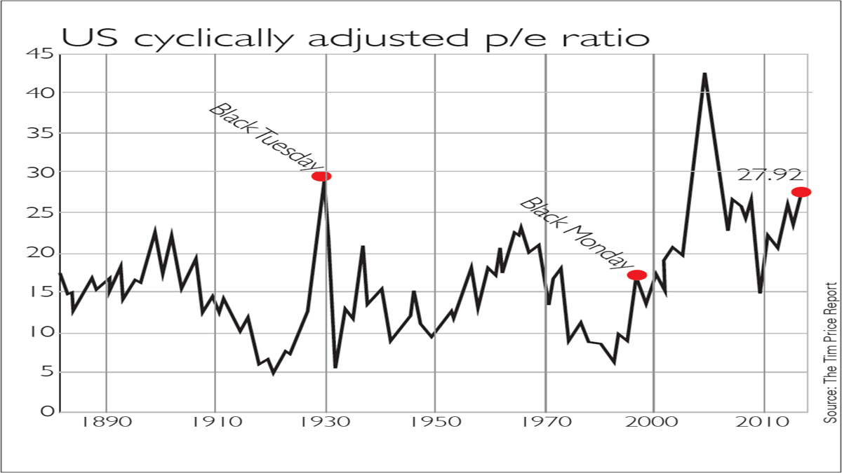
In the past few years, the US stockmarket has gone from expensive to extremely expensive. The cyclically adjusted price/earnings ratio (Cape) divides the price of an index by the average annual earnings figure over the past ten years, adjusted for inflation. It was developed by Yale economist Robert Shiller, so is often known as the Shiller p/e.
Cape evens out the sharp ups and downs of the profit cycle, which can give a skewed impression of the usual, one-year p/e ratio. The US Cape for the S&P 500 index has reached 28, close to the 1929 peak, which in turn was only exceeded by the apex of the dotcom bubble. The long-term average, as MoneyWeek contributor Tim Price notes in The Price Report, is 16.7, so the US market is 70% overvalued.
This doesn't mean stocks will fall immediately. As the chart shows, valuations can stay elevated for years at a time certainly longer than most short sellers can stay solvent. But over the very long term, valuations tend to revert to the mean. So buying stocks when Cape is high implies below-average long-term returns. This is another reason we are keener on European stocks. Capes in continental Europe tend to be in the teens.
Try 6 free issues of MoneyWeek today
Get unparalleled financial insight, analysis and expert opinion you can profit from.

Sign up to Money Morning
Don't miss the latest investment and personal finances news, market analysis, plus money-saving tips with our free twice-daily newsletter
Don't miss the latest investment and personal finances news, market analysis, plus money-saving tips with our free twice-daily newsletter
Get the latest financial news, insights and expert analysis from our award-winning MoneyWeek team, to help you understand what really matters when it comes to your finances.
MoneyWeek is written by a team of experienced and award-winning journalists, plus expert columnists. As well as daily digital news and features, MoneyWeek also publishes a weekly magazine, covering investing and personal finance. From share tips, pensions, gold to practical investment tips - we provide a round-up to help you make money and keep it.

