This chart pattern could be extraordinarily bullish for gold
The mother of all patterns is developing in the gold charts, says Dominic Frisby. And if everything plays out well, gold could hit a price that investors could retire on.

Get the latest financial news, insights and expert analysis from our award-winning MoneyWeek team, to help you understand what really matters when it comes to your finances.
You are now subscribed
Your newsletter sign-up was successful
Want to add more newsletters?
You might be familiar with “island reversals” or “pennants”, “double bottoms” or “falling wedges”. These are some of the many recurring patterns that appear in stock charts that now have their own names, patterns that traders might use to identify where a market is headed next.
But looking for such patterns can be a dangerous business. There’s the risk of all sorts of confirmation biases. Not unlike decoding tea leaves, when staring at charts, you can often discern whatever it is you want to discern. On the other hand, many patterns also have this unusual, almost uncanny habit of playing out.
With that disclaimer out of the way, today we are going to look at one such pattern that has formed in the gold chart over many years. And it is extraordinarily bullish.
Try 6 free issues of MoneyWeek today
Get unparalleled financial insight, analysis and expert opinion you can profit from.

Sign up to Money Morning
Don't miss the latest investment and personal finances news, market analysis, plus money-saving tips with our free twice-daily newsletter
Don't miss the latest investment and personal finances news, market analysis, plus money-saving tips with our free twice-daily newsletter
Cups, handles and tea leaves
The pattern I’m talking about looks like an old-school cappuccino cup with a little handle – the type we used before Starbucks took over. You know the cups – they’re white and you can barely get your thumb and forefinger in the handle.
Given that it looks like a cup and handle, the pattern in question has been called “cup and handle”. There is a large bowl-like shape – the cup – with the handle to the right.
It’s a bullish set-up, and you tend to come across it quite often in bull markets.
One example might be in the tech stocks such as Amazon, Apple and Microsoft. They had a huge bubble in 1999-2000 (one side of the cup); they swooned into a bowl for ten years; sometime in the early part of this decade they retested their old highs (the other side of the cup); and then consolidated around that level (forming the handle) before launching higher.
It kind of makes sense with growth stocks – there’s the bubble, the correction, then the re-test, with the company now built on sound fundamentals. The market doesn’t quite believe the new highs yet, there’s still some price memory, and some sellers who need to be rinsed out – hence the consolidation. Then finally the old highs are broken – and it’s off to the races.
I remember first coming across the “cup and handle” pattern during gold’s last great bull market. It was around the turn of the decade.
Gold had broken the $1,000 an ounce barrier for the first time in early 2008. Then the global financial crisis came along and gold sold off. By early 2009 it had rallied back to test its old highs, but it couldn’t get through.
But rather than selling off, it loitered about, or just below, for many months – thereby forming the handle of the cup. By the autumn it had got through and it was off to the races.
Here is that “cup and handle” drawn onto gold over the period. The dashed line by the way is the rim – or the froth if you want to continue the cappuccino metaphor. You can see what I mean when I say it’s a tad arbitrary.
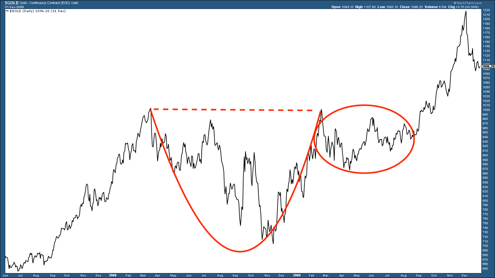
One way of calculating a bullish target is as follows (but we really are in the realms of quackery here): the rim of the cup (dashed line) was at $1,020, and the bottom was around $700. The distance between the top and bottom – in this case $320 – would be the hoped-for upside once the chart broke back above the rim. In this case that would have been $1,340.
As it happened gold went a lot further and hit $1,920 in 2011. So that was a “cup and handle” that played out over a couple of years.
So where are we now?
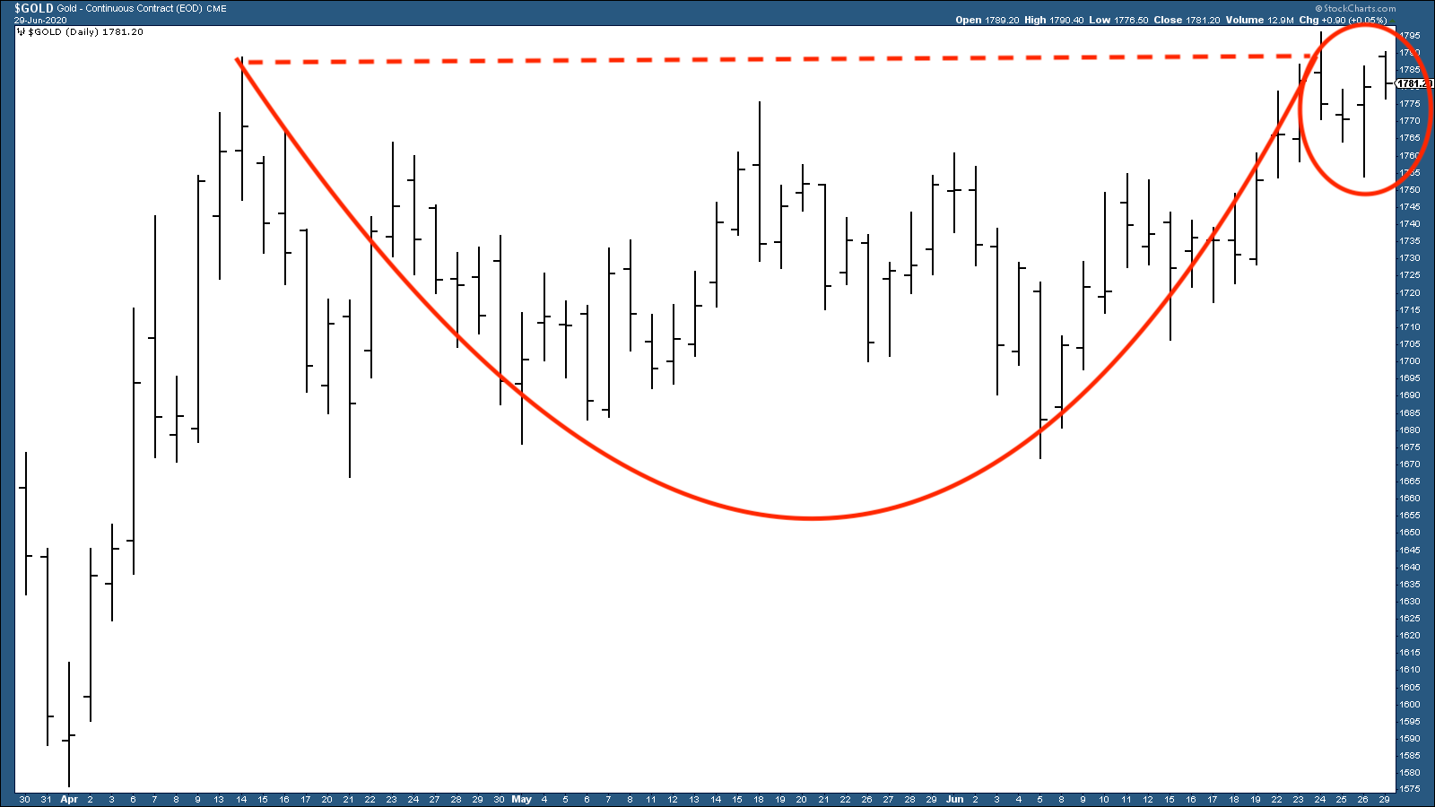
Take a look at gold over the past three months, and you can quite easily make the argument that a “cup and handle” is also starting to take shape now.
That bodes well.
Using the quack model: the top of the cup is $1,790, the bottom is $1,665 (I’m using round numbers). The difference then is $125, so that’s a $125 rally we should see if gold breaks to the upside.
That rally would take us above $1,900, and into the “re-testing gold’s all-time highs” zone.
But – if gold goes to $1,900, then hovers around that zone, we’ll be forming another much bigger “cup and handle”, formed over eight years, as the chart below shows.
We haven’t even finished the cup yet, let alone the handle, so don’t get too excited. But here nevertheless is the formation starting to take shape.
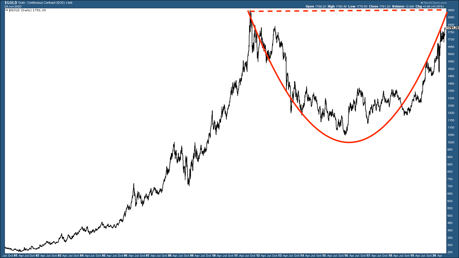
These kinds of saucer patterns are very bullish. The rim is at $1,920 and the bottom of the cup at $1,050 (the late 2015 lows). That’s a difference of $870, and thus a long-term upside target of $2,800. I’d take that.
That’s not a cup and handle – this is a cup and handle
Which brings me to what started this article in the first place. The mother of all “cup and handle” patterns.
Here we see what is known as the “real price of gold” since 1970 – that is gold adjusted for CPI (consumer price index) inflation. You can see that we have a “cup and handle” pattern that has formed over many decades. One side of the rim is that 1980 high of $850, the other side is that 2011 high at $1,920. All the action since 2011 has been forming the handle.
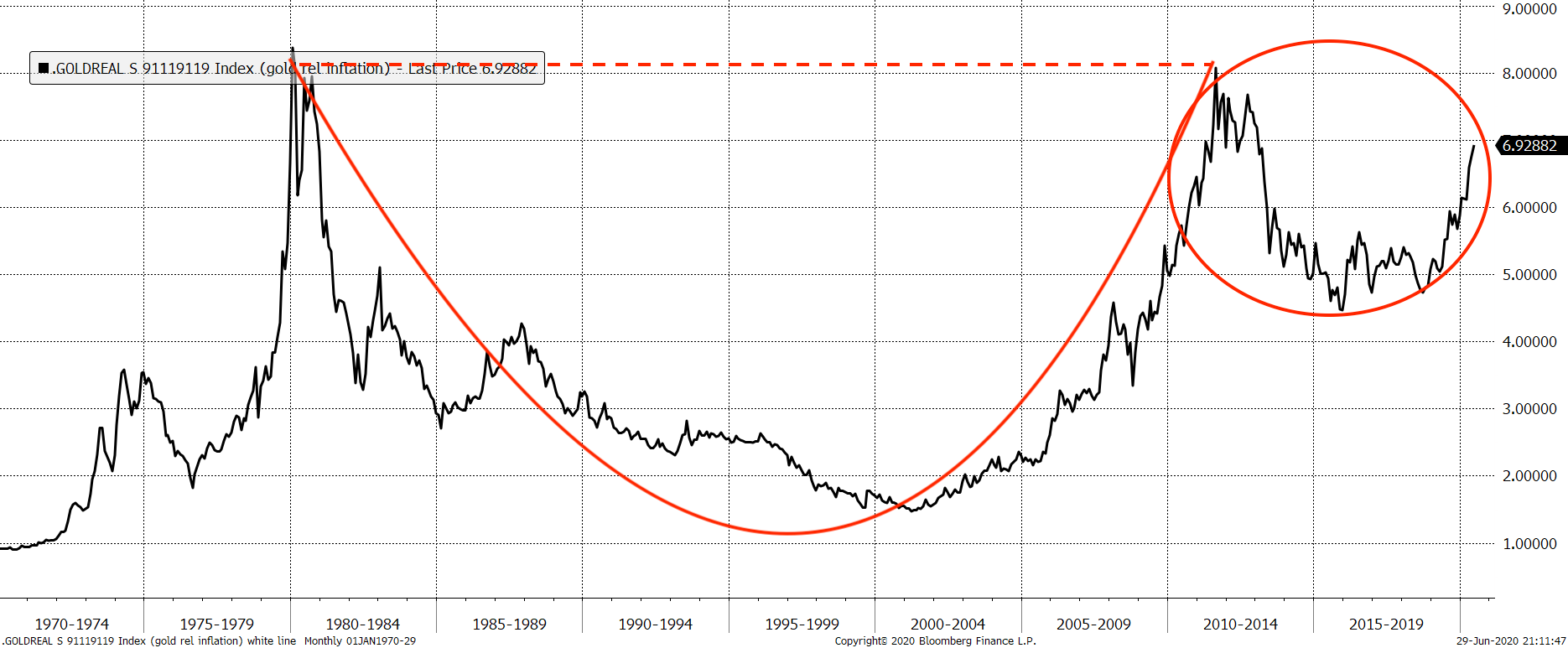
Using the bottom of the cup to the rim formula to measure the upside target gives us a gold price of – well, one that you should be able to retire on.
It also suggests rampant inflation and a possible reset with gold revalued much higher. How likely is that? I don’t know – but it’s what some on the fringes have been saying for some time. And how often does the fringe become the mainstream?
So there we are: a chart pattern to get very excited about, or a bunch of hocus pocus tea leaves. Or perhaps a bit of both.
Daylight Robbery – How Tax Shaped The Past And Will Change The Future is available at Amazon and all good bookstores with the audiobook, read by Dominic, on Audible and elsewhere. If you want a signed copy, you can order one here.
Get the latest financial news, insights and expert analysis from our award-winning MoneyWeek team, to help you understand what really matters when it comes to your finances.
