
Good morning. Today we continue with our series on technical analysis. As promised last week, today we look at moving averages (MAs) – but some rather more sexy combinations than your bog-standard 20-, 50-, 200-day MAs.
Before we start, take a look at last week’s piece if you need a quick refresher on what moving averages are and how they work. We use moving averages to measure trends. The default measure for the short-term trend on a one-year chart is usually the 20MA – it shows the average price of the last 20 days. For intermediate trends – the last 50 days – we use the 50MA. And for long-term trends, it’s the 200MA.
The thing is, 20, 50 and 200 are rather bland round numbers. They get used by everyone. So let’s spice them up a bit. Instead of 20, let’s look at the 21MA – 21 is a Fibonacci number. My experience is that prices tend to bounce off this average more frequently than they do the 20MA, so it makes for a better entry or exit point.
Try 6 free issues of MoneyWeek today
Get unparalleled financial insight, analysis and expert opinion you can profit from.

Sign up to Money Morning
Don't miss the latest investment and personal finances news, market analysis, plus money-saving tips with our free twice-daily newsletter
Don't miss the latest investment and personal finances news, market analysis, plus money-saving tips with our free twice-daily newsletter
Similarly, to look at intermediate trends, we will replace the 50 with the 55-day moving average. Again it’s a Fibonacci number. Don’t ask me why, but numbers from the Fibonacci sequence have this curious draw to them.
Finally, for longer term trends, instead of the 200MA, following the same principle, you could use the 233MA. I actually prefer the 255MA, There are roughly 255 trading days in the year so it is, effectively, the one-year moving average. And again, far more frequently than the 200MA in my experience, it catches turning points.
Right now, gold is a textbook example of a lovely strong trend
On the chart below we see the price of gold over the past year, along with the 21MA in red, the 55MA in blue and the 255MA in green. All three moving averages are sloping up. So on a short, intermediate and long-term basis, gold is trending up. It’s in a bull market.

You can get very clever and look at Indian buying, or Chinese central bank holdings, or speculative interest in the futures markets, or new mine supply, or negative real rates or whatever. But all you really need to know about gold is whether it’s going up or not. And your answer is above. Gold is in a bull market on whatever timeframe you care to look.
Very healthy price action in a bull market is for the asset in question, during corrections, to pull back to its long-term moving average and find support there. Look how during the March liquidity crisis gold did just that. It pulled back to the 255MA (green line) and found support there, almost to the dollar.
That’s why I prefer the 255, to the 200. I find it’s a more reliable marker for turning points. But such things are more art or taste than they are science.
The other reason I like the gold chart is that the price is above the short-term trend (red line), which is above the medium-term trend (blue line) which is above the long-term trend (green line). Everything is aligned as it should be. It won’t last forever of course, but this is what a perfect upward trend looks like.
The pound vs the dollar is one messy chart
Compare that to something like Cable (the pound vs the dollar). This is one messy chart.

The 255MA (green line) – long-term trend – is as flat as a pancake. The price was above it last week. It’s below it this week. Cable has also been making a series of lower highs since the election last December, which is not bullish.
On the other hand the 21 and 55MAs are sloping up, and the price is above, so it’s trying to rally. The June low was above the May low which is above the March low – so it is also making higher lows. So it is trying to rally – although this week it’s been falling. Talk about mixed messages!
That is one messed-up chart. As far as moving averages and trend-following are concerned – at least within these parameters – it’s a horrible chart to trade. Which way is this one going to go? Your guess is as good as mine. My instinct says it probably wants to go up, but lord knows.
There are times when the gold chart looks as messy as this, and when Cable is as crystal clear as gold. Now is not one of those times. Unless you are some kind of genius range-trader, you’re usually better off in trending markets that look like gold currently does – and not like Cable.

-
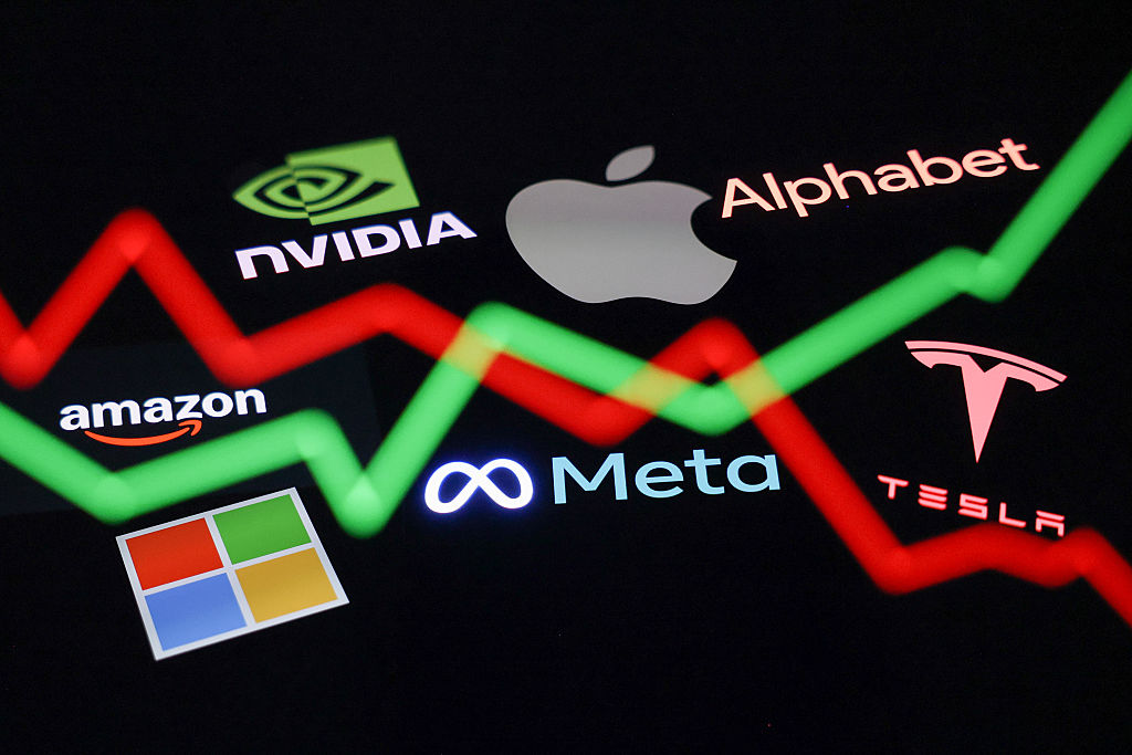 The Magnificent 7 stocks are starting to look mediocre
The Magnificent 7 stocks have been in the vanguard of the AI boom, but they are now falling out of favour among investors. Here's why
-
 The investment opportunities at the heart of the energy transition
A global structural shift towards renewable energy is pushing prices for certain key commodities higher. Here’s how to profit from the energy transition.


-
 What's behind the big shift in Japanese government bonds?
Rising long-term Japanese government bond yields point to growing nervousness about the future – and not just inflation
-
 Is the stock market open on Spring bank holiday?
As the Spring bank holiday draws near, we look at whether the UK and US stock markets will remain open as usual or if there’s a change to trading hours.
-
 Halifax: House price slump continues as prices slide for the sixth consecutive month
UK house prices fell again in September as buyers returned, but the slowdown was not as fast as anticipated, latest Halifax data shows. Where are house prices falling the most?
-
 Rents hit a record high - but is the opportunity for buy-to-let investors still strong?
UK rent prices have hit a record high with the average hitting over £1,200 a month says Rightmove. Are there still opportunities in buy-to-let?
-
 Pension savers turn to gold investments
Investors are racing to buy gold to protect their pensions from a stock market correction and high inflation, experts say
-
 Where to find the best returns from student accommodation
Student accommodation can be a lucrative investment if you know where to look.
-
 The world’s best bargain stocks
Searching for bargain stocks with Alec Cutler of the Orbis Global Balanced Fund, who tells Andrew Van Sickle which sectors are being overlooked.
-
 Revealed: the cheapest cities to own a home in Britain
New research reveals the cheapest cities to own a home, taking account of mortgage payments, utility bills and council tax


