
Over the next couple of months, on Monday mornings, I’ll be looking at some of the basics of technical analysis in a series of Money Mornings run in conjunction with CMC markets.
Last week we looked at support and resistance. Today we consider moving averages: what are they, and how do you use them? (Spoiler alert: I love moving averages.)
If I were to play Desert Island Discs for technical indicators, and found myself marooned with my laptop, and only one technical indicator functioning, but I’m allowed to choose which it is, it would be moving averages.
Try 6 free issues of MoneyWeek today
Get unparalleled financial insight, analysis and expert opinion you can profit from.

Sign up to Money Morning
Don't miss the latest investment and personal finances news, market analysis, plus money-saving tips with our free twice-daily newsletter
Don't miss the latest investment and personal finances news, market analysis, plus money-saving tips with our free twice-daily newsletter
Here’s why.
The simple moving average and how to use it
Moving averages come in all shapes and sizes. We’ll start with the most simple, as they call them in the trade: simple moving averages (SMAs).
When you look at a chart, you need to know what timeframe you are operating in. Some charts go back many years and will be displayed on a weekly or monthly basis. These are useful for studying the long-term parameters of a market, and its history.
Other charts might only go back one or three years and will typically be displayed on a daily basis. Other charts – in the realm of day traders – might only go back a few weeks, or even days, and will be displayed on an hourly or even minute-by-minute basis.
For the sake of simplicity, we will use a one-year, daily chart. Thus a 200-day simple moving average would show the average price of the last 200 days. This rather unwieldy term – the “200-day simple moving average” – would usually be abbreviated to 200MA or 200SMA. We’ll go with MA here – moving averages are often known as MAs. The 50MA would show the average price of the last 50 days. The 20MA the average price of the last 20 days.
Moving averages iron out the daily fluctuations. This gives you a much clearer idea of the direction of a particular market – how a price is trending over a given timeframe. The 20MA shows you the price trend over a 20-day time frame, the 200MA over a 200-day time frame.
Below, for example, we see gold over the past year. The actual price of gold is in black; in green we have the 200MA, in blue the 50MA, and in red the 20MA.
Thus, using these MAs, we get to see the short, medium and longer-term trends.

What moving averages tell us about gold’s direction of travel
We’ll start with the green line – the 200MA. You can see this flattened out and began to slope up around March 2019. Since then the trend over a 200-day period has been up.
You will also note that when gold wobbled in March this year – during the Covid-19 liquidity crisis – the wobble found support around the 200MA.
That often happens. When a market is rising, it will often find long-term support around that point. Conversely, when a market is trending lower, but rallies, it will often meet with resistance around the 200MA. As a result, many people like to use it as a region in which to buy and sell.
The blue line – the 50MA – is a bit more variable than the 200MA. This is inevitable as markets are always more volatile in the shorter-term. The red line – the 20MA – is even less flat.
But trend-followers will love this chart. All three moving averages are sloping up. So the gold price is trending upwards on whichever timeframe you care to look.
What’s more, the averages are in perfect alignment. The gold price itself (in black) is above the 20MA (red), which is above the 50MA (blue), which is above the 200MA (green). Or to put that in layman’s language: the price is above the short-term trend, which is above the medium-term trend, which is above the long-term trend. This is what a bull market looks like.
Bottom line: gold is in a bull market, on whichever timeframe you care to look. What do you do in a bull market? You buy, you hold and that’s it. Surprising how hard it is to do.
Moving averages are customisable. You can choose whatever timeframe you like. Next week I’ll show you a similar, but slightly different moving average combination for short, medium and long-term trends. I find it is a little bit spicier than your bog-standard 20-, 50- and 200-day combo.

-
 'The Bank of England needs a radical overhaul'
Opinion The Bank of England has made many mistakes and is too complacent to face up to them, says Matthew Lynn.
-
 Properties for sale under the £2m mansion tax threshold
The best properties for sale priced below the mansion tax threshold – from a Grade II-listed, 17th-century house in Bristol to a former vicarage in Cornwall.


-
 What's behind the big shift in Japanese government bonds?
Rising long-term Japanese government bond yields point to growing nervousness about the future – and not just inflation
-
 Why you should keep an eye on the US dollar, the most important price in the world
Advice The US dollar is the most important asset in the world, dictating the prices of vital commodities. Where it goes next will determine the outlook for the global economy says Dominic Frisby.
-
 What is FX trading?
What is FX trading and can you make money from it? We explain how foreign exchange trading works and the risks
-
 The Burberry share price looks like a good bet
Tips The Burberry share price could be on the verge of a major upswing as the firm’s profits return to growth.
-
 Sterling accelerates its recovery after chancellor’s U-turn on taxes
News The pound has recovered after Kwasi Kwarteng U-turned on abolishing the top rate of income tax. Saloni Sardana explains what's going on..
-
 Why you should short this satellite broadband company
Tips With an ill-considered business plan, satellite broadband company AST SpaceMobile is doomed to failure, says Matthew Partridge. Here's how to short the stock.
-
 It’s time to sell this stock
Tips Digital Realty’s data-storage business model is moribund, consumed by the rise of cloud computing. Here's how you could short the shares, says Matthew Partridge.
-
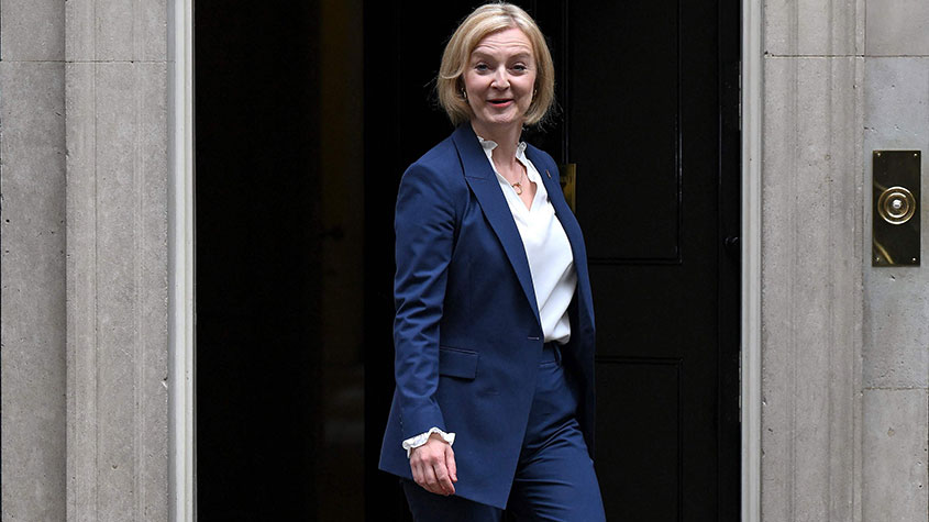 Will Liz Truss as PM mark a turning point for the pound?
Analysis The pound is at its lowest since 1985. But a new government often markets a turning point, says Dominic Frisby. Here, he looks at where sterling might go from here.


