Welcome back.
This week’s cover story is rather timely, as we remain in the grip of an energy crisis with gas prices sky-high and queues still forming at petrol stations. We’re looking at hydrogen. Now, you may be inclined to put hydrogen power in the same box as usable graphene and nuclear fusion. It all sounds incredibly fantastic – there’s just the small matter of practicality. There’s still a very long way to go and a great many hurdles to leap before we can heat our homes and fuel our cars with the stuff. But, says Stuart Watkins, hydrogen is now “rapidly becoming global policy” and is “set to become a multi-trillion-dollar industry”. Stuart picks some of the best ways for you to buy in.
Elsewhere, Max King looks at what we can learn from the top investment trusts of the last 20 years – 42 of them have risen more than tenfold in that time. Max explains what made the winners stand out and how we can identify those that will outperform in the future.
Try 6 free issues of MoneyWeek today
Get unparalleled financial insight, analysis and expert opinion you can profit from.

Sign up to Money Morning
Don't miss the latest investment and personal finances news, market analysis, plus money-saving tips with our free twice-daily newsletter
Don't miss the latest investment and personal finances news, market analysis, plus money-saving tips with our free twice-daily newsletter
If you’re not already a subscriber to MoneyWeek magazine, sign up here and get your first six issues free.
In this week’s podcast, Merryn talks to James Ferguson of MacroStrategy. Things are about to get ugly in the bonds markets – the “daddy of all markets”. And if that happens, “things are going to get a lot harder for everybody”. You need to find a way of protecting your portfolio. Find out what James thinks here.
Here are the links for this week’s editions of Money Morning and other web articles you may have missed:
- Monday Money Morning: It’s boom times for investment banks again – investors beware
- Tuesday Money Morning: The oil price is spiking higher – and there’s no reason to expect it to drop from here
- Merryn’s blog: Forget China, here’s why you should invest in India
- Wednesday Money Morning: How to invest in SMRs – the future of green energy
- Web article: China’s property woes are spreading beyond Evergrande
- Thursday Money Morning: Emerging markets: has the Brics dream survived reality?
- Friday Money Morning: How to invest as natural gas prices soar
- Cryptocurrency roundup: Cryptocurrency roundup: bitcoin approaches its all-time high
Now for the charts of the week.
The charts that matter
Gold remains in the doldrums as bitcoin, which many see as its digital replacement, continues to head back to its record high.
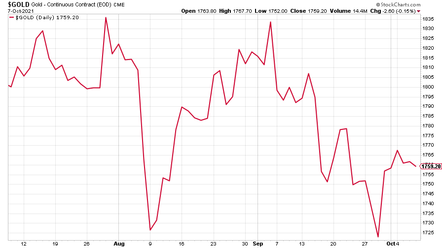
(Gold: three months)
The US dollar index (DXY – a measure of the strength of the dollar against a basket of the currencies of its major trading partners) slipped, but recovered towards the end of the week.
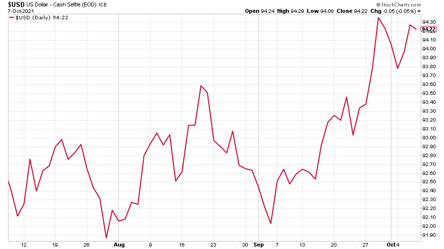
(DXY: three months)
The Chinese yuan (or renminbi) traded sideways (when the red line is rising, the dollar is strengthening while the yuan is weakening).
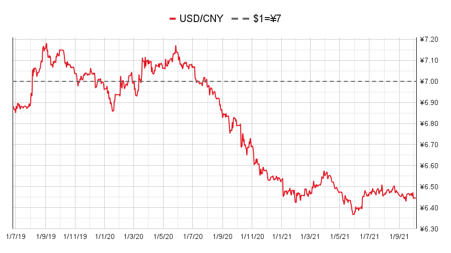
(Chinese yuan to the US dollar: since 25 Jun 2019)
The yield on the ten-year US government bond continued to climb. Beware: they’ve probably got a way to go yet, says James Ferguson in this week’s podcast.
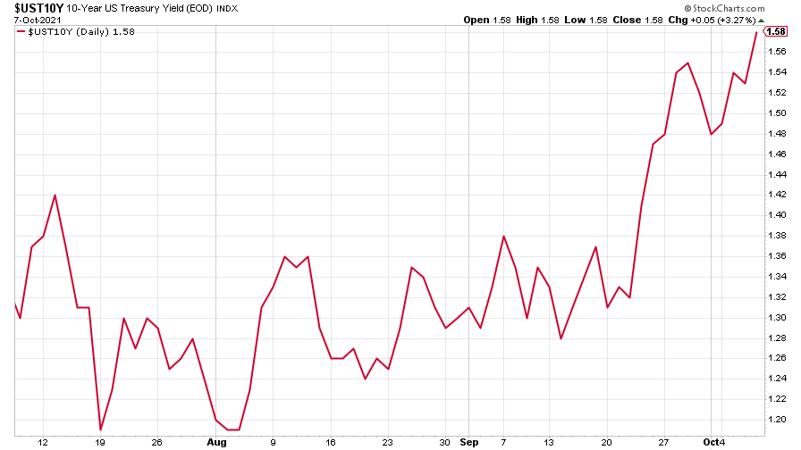
(Ten-year US Treasury yield: three months)
The yield on the Japanese ten-year bond started the week on a low note, but joined in the global climb.
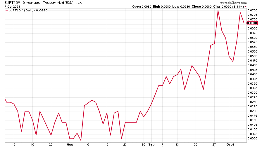
(Ten-year Japanese government bond yield: three months)
And the yield on the ten-year German Bund is fast approaching positive territory, though it remains negative for now.
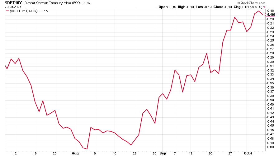
(Ten-year Bund yield: three months)
Copper meandered its way sideways.
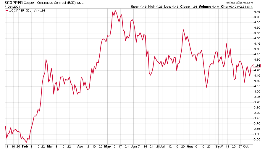
(Copper: nine months)
The closely-related Aussie dollar climbed against the US dollar.
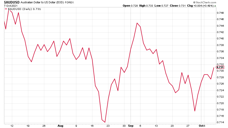
(Aussie dollar vs US dollar exchange rate: three months)
Bitcoin hit over $55,000 – almost back to its $64,000 high.
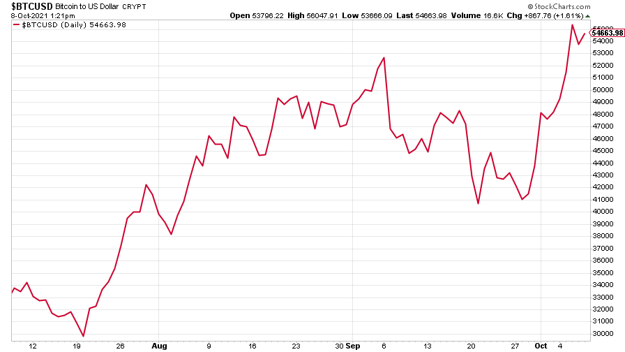
(Bitcoin: three months)
US weekly initial jobless claims fell by 38,000 to 326,000. The four-week moving average rose by 3,500 to 340,500.
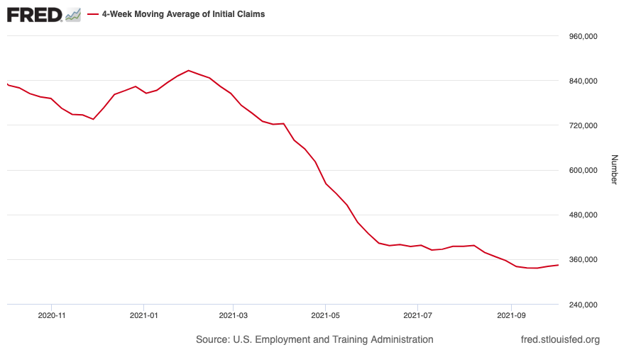
(US initial jobless claims, four-week moving average: since Jan 2020)
The oil price headed over $80 a barrel and we’re unlikely to see it fall, says John.
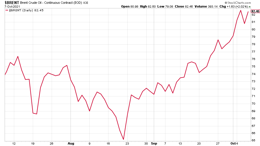
(Brent crude oil: three months)
Amazon recovered some lost ground as the wider Nasdaq market rose.
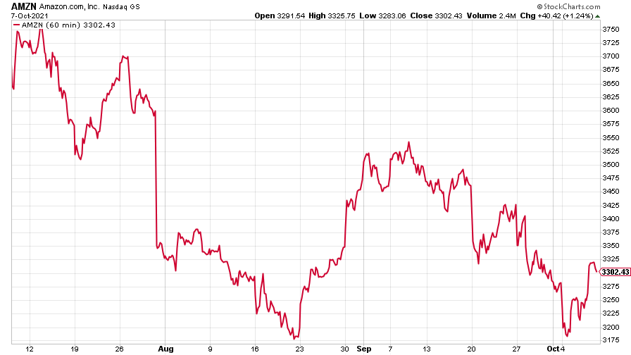
(Amazon: three months)
Tesla continued its march higher.
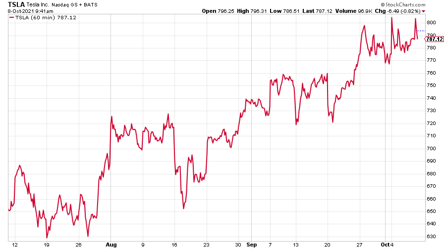
(Tesla: three months)
Have a great weekend.
Get the latest financial news, insights and expert analysis from our award-winning MoneyWeek team, to help you understand what really matters when it comes to your finances.

