Welcome back.
In this week’s magazine, we return to an old favourite: gold. There’s no denying it, it’s had a bad year – down around 15% in the last 12 months even as commodities rallied hard. But does that mean there’s no point holding gold? Far from it, says Dominic Frisby. The backdrop “remains auspicious” for gold, and we could see the price rise by 30%-40%. And of course, in times like these, it’s invaluable as portfolio insurance alone. Find out what he has to say in this week’s magazine – if you’re not already a subscriber, sign up for MoneyWeek magazine now.
This week’s “Too Embarrassed To Ask” video has a gold theme, too. Fifty years ago this month, President Richard Nixon arguably pulled the world off the last vestiges of the “gold standard”. But just what is the gold standard? Find out here.
Try 6 free issues of MoneyWeek today
Get unparalleled financial insight, analysis and expert opinion you can profit from.

Sign up to Money Morning
Don't miss the latest investment and personal finances news, market analysis, plus money-saving tips with our free twice-daily newsletter
Don't miss the latest investment and personal finances news, market analysis, plus money-saving tips with our free twice-daily newsletter
The podcast is back! This week, Merryn’s talking to Edward Bonham Carter of Jupiter Asset Management, and they cover a great deal of ground. Find out what Edward says here.
Here are the links for this week’s editions of Money Morning and other web articles you may have missed:
- Monday Money Morning: Why now is a good time to take a break and review your investment portfolio
- Tuesday Money Morning: Wages are soaring and job vacancies are at record levels – is inflation next?
- Web article: Regulatory crackdowns drive investors to China’s chipmakers
- Wednesday Money Morning: Why the Edinburgh Fringe festival is a great example of Adam Smith’s “invisible hand” in action
- Web article: What’s behind BHP’s move from London to Sydney?
- Web article: UK inflation falls to 2%. A temporary dip or a longer-term trend?
- Thursday Money Morning: Sentiment matters to markets – but how can you tell what investors are thinking?
- Friday Money Morning: This growth scare will pass – but it might make the Fed stay its hand
- Cryptocurrency roundup: Wells Fargo launches bitcoin fund while traders round on Binance
Now for the charts of the week.
The charts that matter
Gold’s recovery stalled again after an encouraging couple of weeks.
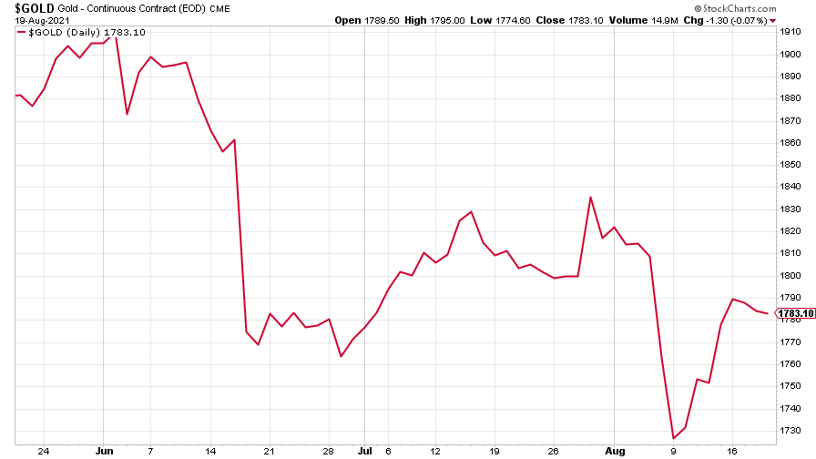
(Gold: three months)
The US dollar index (DXY – a measure of the strength of the dollar against a basket of the currencies of its major trading partners) continued its relentless rise.
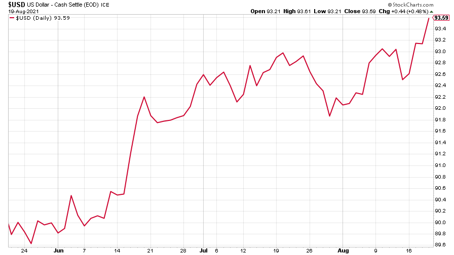
(DXY: three months)
The Chinese yuan (or renminbi) reflected the dollar’s strength (when the red line is rising, the dollar is strengthening while the yuan is weakening).
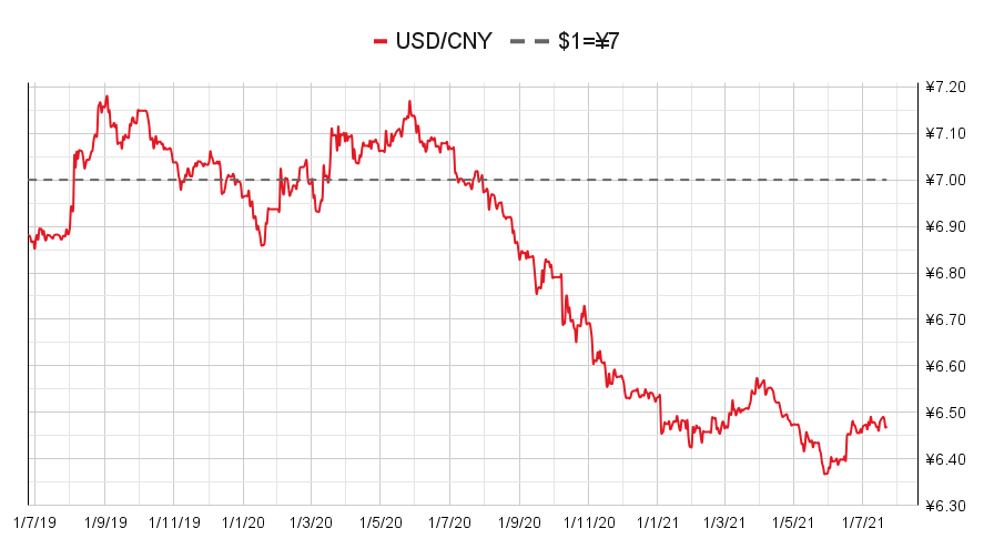
(Chinese yuan to the US dollar: since 25 Jun 2019)
The yield on the ten-year US government bond fell further.
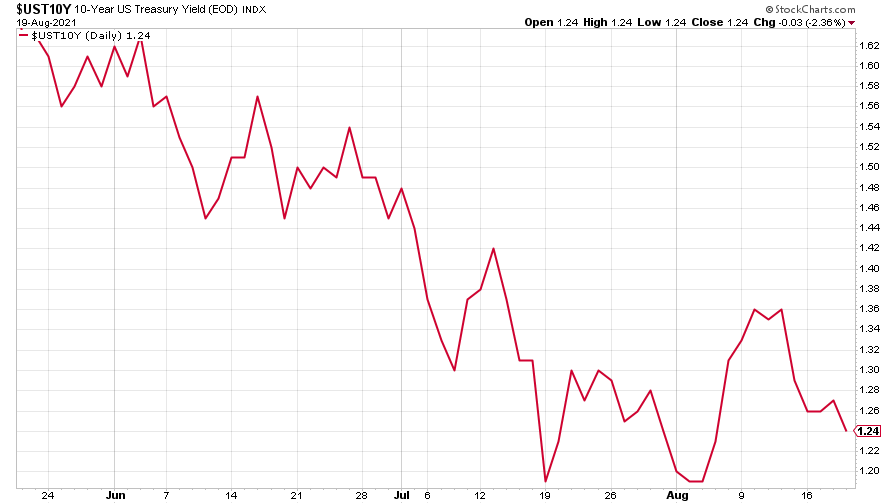
(Ten-year US Treasury yield: three months)
The yield on the Japanese ten-year bond continues trading in its usual (much tighter than it might look – look at the scale) range.
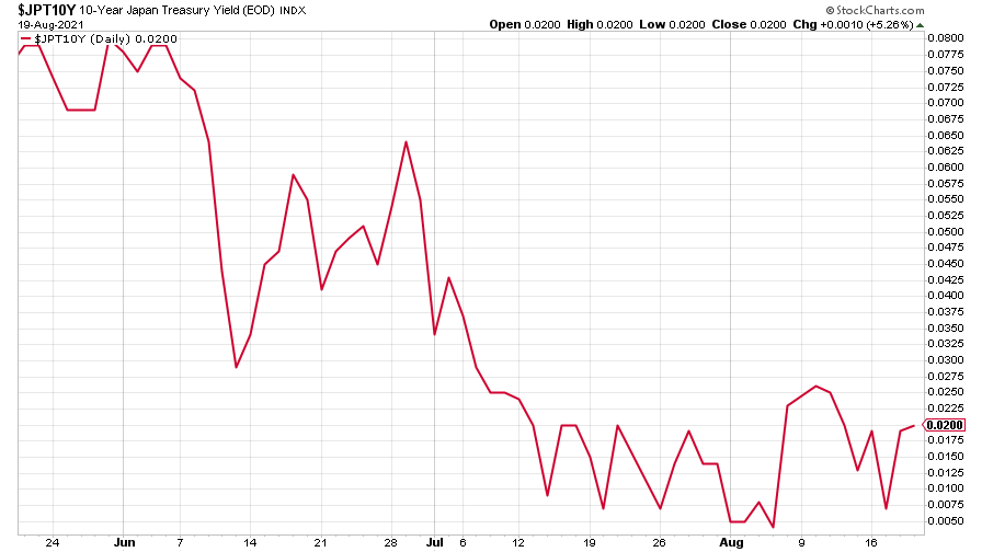
(Ten-year Japanese government bond yield: three months)
And the yield on the ten-year German Bund slipped further back.
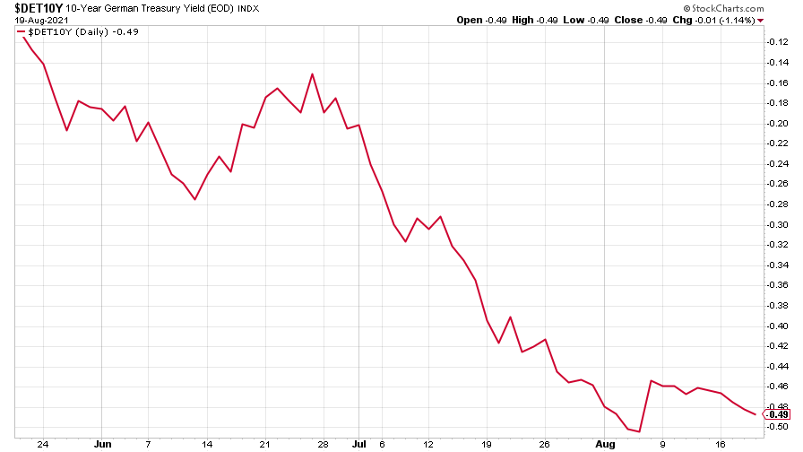
(Ten-year Bund yield: three months)
Copper took a turn for the worse.
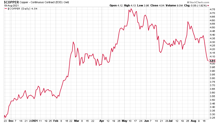
(Copper: nine months)
The closely-related Aussie dollar fell hard, too, not helped by much of the country going into a new lockdown.
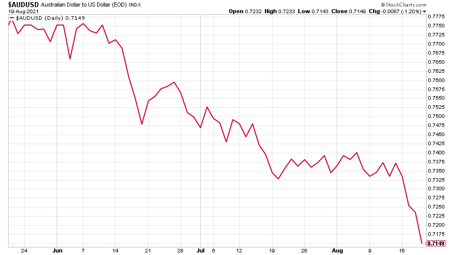
(Aussie dollar vs US dollar exchange rate: three months)
Bitcoin continued its wobbly recovery, heading towards $50,000.
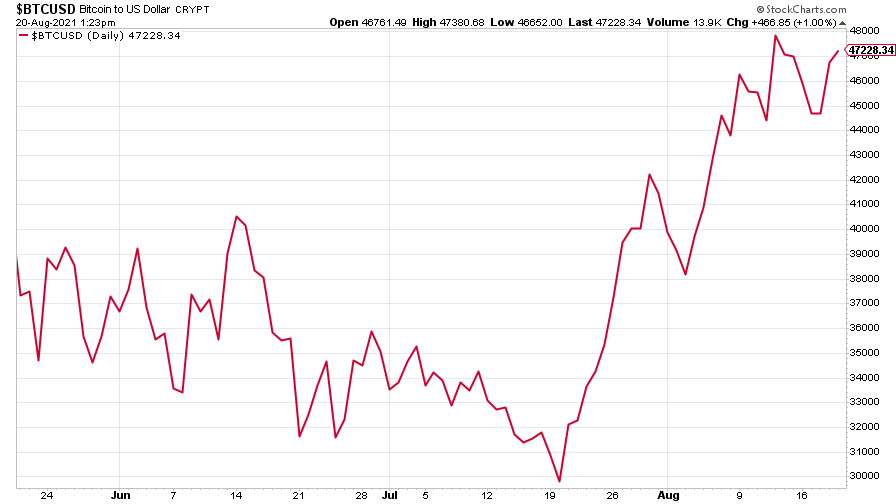
(Bitcoin: three months)
US weekly initial jobless claims fell by 29,000 to 348,000. The four-week moving average fell by 19,000 to 377,750.
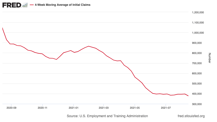
(US initial jobless claims, four-week moving average: since Jan 2020)
The oil price saw a big drop, falling back to levels last seen in late May.
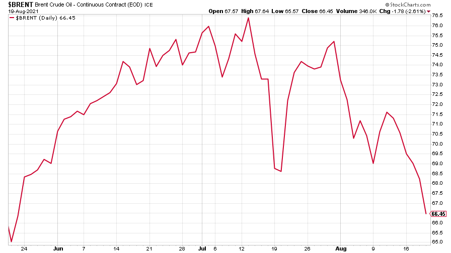
(Brent crude oil: three months)
Amazon continued to fall.
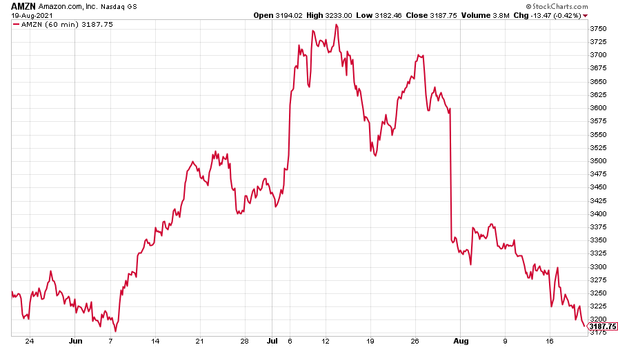
(Amazon: three months)
And Tesla remained volatile, but down on the week.
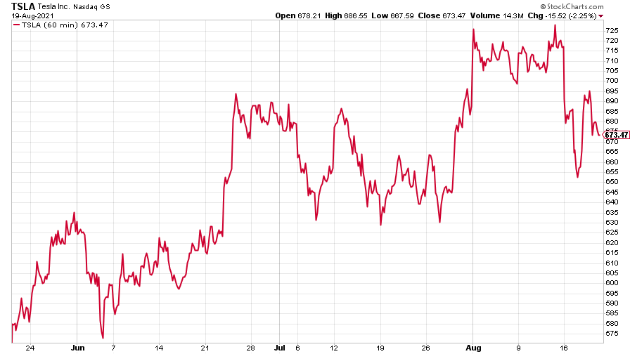
(Tesla: three months)
Have a great weekend.
Get the latest financial news, insights and expert analysis from our award-winning MoneyWeek team, to help you understand what really matters when it comes to your finances.

