Get the latest financial news, insights and expert analysis from our award-winning MoneyWeek team, to help you understand what really matters when it comes to your finances.
You are now subscribed
Your newsletter sign-up was successful
Want to add more newsletters?
Welcome back.
In this week’s magazine, we examine the shaky foundations of the internet, starkly demonstrated the other week when huge chunks of it went offline after an obscure but vital company’s customer changed their preferences. We also look at how to invest in stem cell technology – the “building blocks of the body” that will revolutionise medicine – and pick the best bets in the sector.
No star guest for this week’s podcast, but Merryn is joined by John to talk about all things inflation. What’s causing it? Is it a temporary blip? What can you do to combat it? And there’s a very interesting story about how we came to decide that 2% was the target to aim for. It might surprise you – find out all about it here.
Try 6 free issues of MoneyWeek today
Get unparalleled financial insight, analysis and expert opinion you can profit from.

Sign up to Money Morning
Don't miss the latest investment and personal finances news, market analysis, plus money-saving tips with our free twice-daily newsletter
Don't miss the latest investment and personal finances news, market analysis, plus money-saving tips with our free twice-daily newsletter
This week’s “Too Embarrassed To Ask” looks at sovereign bonds – what they are and how they work. You can watch that here.
Here are the links for this week’s editions of Money Morning and other web articles you may have missed:
- Monday Money Morning: Will the Federal Reserve give markets a shock this week?
- Web article: Bitcoin bounces after Elon Musk weighs in on the clean energy debate
- Tuesday Money Morning: Two of the biggest risks to the “Roaring 2020s” scenario
- Merryn’s blog: You probably are saving enough for your retirement, but you might want to change how you do it
Web article: Why hedge funds are stocking up on cryptocurrencies - Wednesday Money Morning: Is the commodity bull market already losing steam?
- Merryn’s blog: Climate activists are missing the point on big oil companies
Web article: UK inflation jumps to the highest level in two years – a short-term blip or the start of something bigger? - Thursday Money Morning: The Fed springs a surprise on investors – are there more to come?
- Friday Money Morning: Markets believe that bankruptcy has been abolished – that’s not a good thing
- Crypto roundup: Elon Musk, El Salvador and hedge funds – a busy week for bitcoin
Now for the charts of the week.
The charts that matter
Gold saw a sudden drop after the US Federal Reserve came out as more aggressive on inflation than many expected.
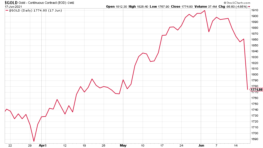
(Gold: three months)
The US dollar index (DXY – a measure of the strength of the dollar against a basket of the currencies of its major trading partners) responded to the prospect of higher interest rates by climbing sharply.
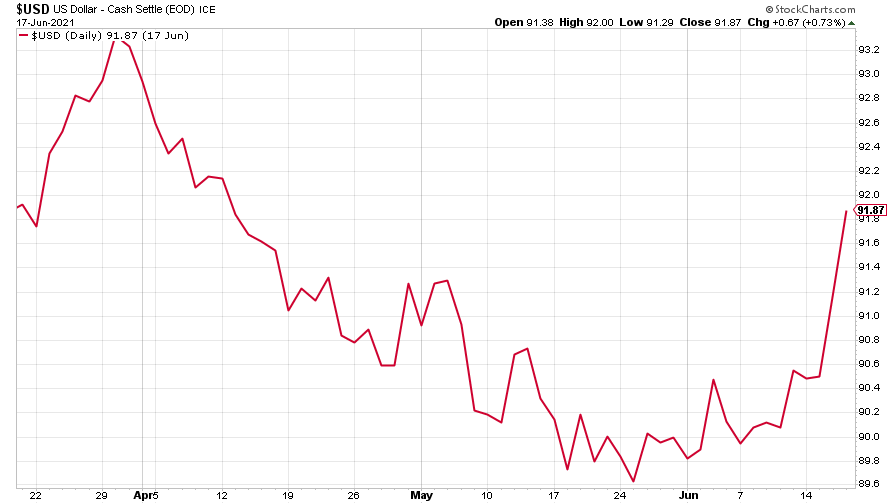
(DXY: three months)
But it doesn’t seem to have affected the Chinese yuan (or renminbi) much (when the red line is rising, the dollar is strengthening while the yuan is weakening).
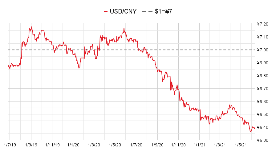
(Chinese yuan to the US dollar: since 25 Jun 2019)
The yield on the ten-year US government bond recovered from last week’s big drop.
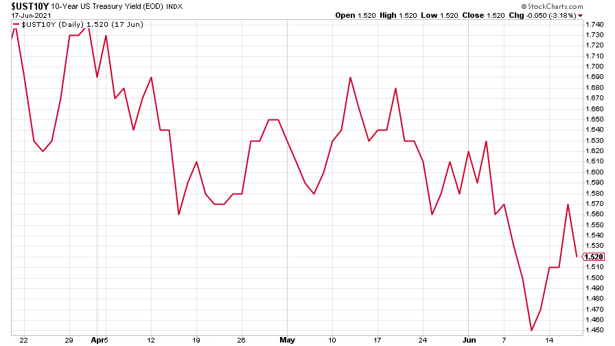
(Ten-year US Treasury yield: three months)
The yield on the Japanese ten-year bond turned back up, too.
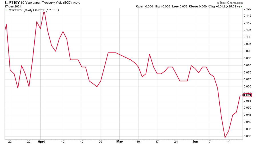
(Ten-year Japanese government bond yield: three months)
And the yield on the ten-year German Bund headed back up toward positive territory, though remained negative.
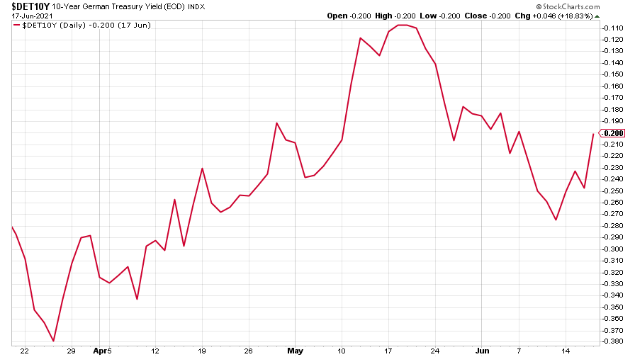
(Ten-year Bund yield: three months)
Copper fell sharply. Could this be the end of the commodities bull run already? Probably not, says Dominic – though metals certainly aren’t looking too hot.
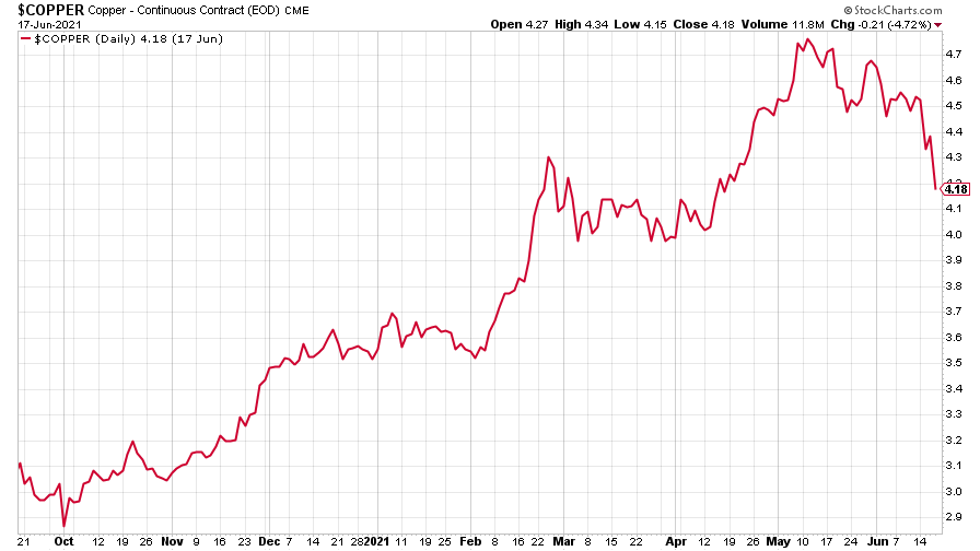
(Copper: nine months)
The closely-related Aussie dollar followed the copper price down.
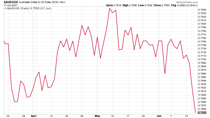
(Aussie dollar vs US dollar exchange rate: three months)
Bitcoin is trading in a range – waiting to do something spectacular, no doubt. Saloni had a look at an eventful week for the cryptocurrency in our new crypto-roundup. Read that here.
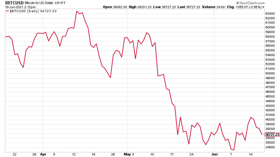
(Bitcoin: three months)
US weekly initial jobless claims rose for the first time in a long while, climbing 37,000 to 412,000, compared to 375,000 last week. The four-week moving average fell by 8,000 to 395,000 from 403,000 the week before.
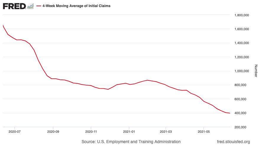
(US initial jobless claims, four-week moving average: since Jan 2020)
The oil price kept on climbing. One commodity that’s still definitely in a bull market.
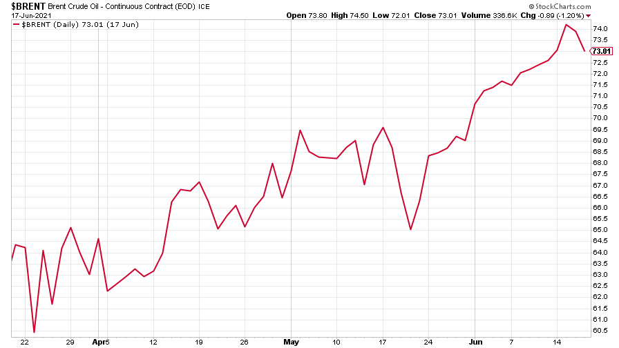
(Brent crude oil: three months)
Amazon continued its big climb.
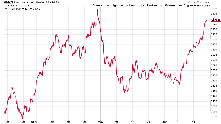
(Amazon: three months)
Tesla, however, just drifted sideways.
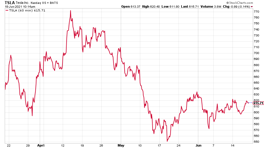
(Tesla: three months)
Have a great weekend.
Get the latest financial news, insights and expert analysis from our award-winning MoneyWeek team, to help you understand what really matters when it comes to your finances.

