The charts that matter: collapsing oil and soaring gold
After a week in which the oil price went negative and the gold price soared, John Stepek looks at how the charts that matter most to the global eocnomy fared.

Welcome back.
Quick reminder – if you’ve not already subscribed to MoneyWeek, now is the ideal time to do so. You get your first six issues free, and we’ve also thrown in my new ebook, The Little Book of Big Crashes, where I discuss some of the biggest market crashes in world history, what caused them and what we might be able to learn from them – including lessons for today’s coronavirus crisis. So sign up for your subscription today.
(PS existing subscribers – you should already have been sent a download link for the book, but email us at editor@moneyweek.com with your subscriber number or address details if you haven’t received it).
Try 6 free issues of MoneyWeek today
Get unparalleled financial insight, analysis and expert opinion you can profit from.

Sign up to Money Morning
Don't miss the latest investment and personal finances news, market analysis, plus money-saving tips with our free twice-daily newsletter
Don't miss the latest investment and personal finances news, market analysis, plus money-saving tips with our free twice-daily newsletter
Podcasts galore
Merryn has gone seriously podcast-happy in the last few weeks, and they’re all gems, so I’m just going to give you a quick rundown of all the most recent ones – give them all a listen, they’re excellent.
This week, she spoke to Ruffer’s Alexander Chartres about how the remarkably benign financial and geopolitical era we’ve been living through is drawing to an end, with that process being accelerated by the coronavirus pandemic. There is light at the end of the tunnel though – sort of.
Then before that we had Professor Steve Keen on debt jubilees; the FT’s Gillian Tett on New York lockdown; Intertemporal Economics founder Brian Pellegrini on why things might not be quite as bad as they appear; and financial historian Russell Napier on financial repression. Ideal listening material for your daily walk!
Oh and for something lighter, I joined The Week Unwrapped team this week to talk about press freedom, the price of gold, and... calorie counting.
And here are the links for this week’s editions of Money Morning plus other stories you might have missed on the website this week.
- Monday: There’s one very obvious reason for the massive stockmarket rally
- Tuesday:The negative oil price meant traders couldn’t give the stuff away – here’s what that means
- Wednesday: The UK housing market has shut down. But what happens after Covid-19?
- Thursday: Will gold really hit $3,000 an ounce in the next 18 months?
- Friday: Europe still can’t resolve its main problem – who pays for everything?
Oh and if you’re looking around for opportunities, now is probably the ideal time to improve your investing knowledge with The Sceptical Investor – my guide to contrarian investing...
The charts that matter
Gold (measured in dollar terms) has had another good week. On the one hand, the reality and prospect of lots of money printing tends to be good for gold. On the other hand, the ongoing fear that this rally can’t last has kept “safe haven” assets propped up too.
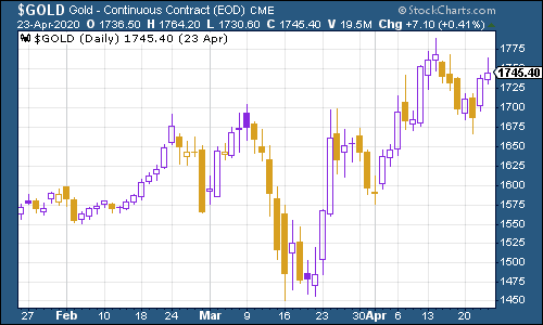
(Gold: three months)
The US dollar index – a measure of the strength of the dollar against a basket of the currencies of its major trading partners – clawed a little higher this week, again probably due to the “safe haven” bid.
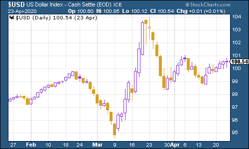
(DXY: three months)
The Chinese yuan (or renminbi) remains above the $1/¥7 mark, but has been relatively stable.
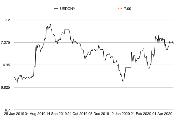
(Chinese yuan to the US dollar: since 25 Jun 2019)
The yield on the ten-year US government bond remains extremely low as investors are reluctant to sell their “risk-free” assets.
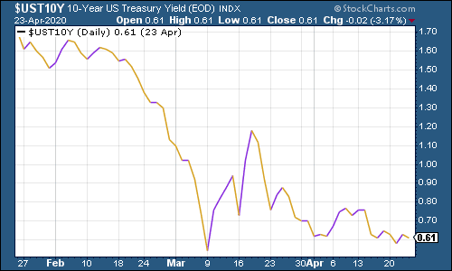
(Ten-year US Treasury yield: three months)
The yield on the Japanese ten-year was little changed, even with talk that the Bank of Japan might do unlimited quantitative easing (although that’s pretty much what it’s already doing, or at least allowed to do).
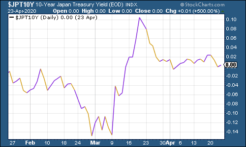
(Ten-year Japanese government bond yield: three months)
The yield on the ten-year German bund meanwhile, was little changed on last week, as the European Union continued to struggle to come up with an agreement for a coronavirus aid package that all member states are happy with.
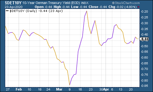
(Ten-year Bund yield: three months)
Copper has continued to rally which is one bright spot – it suggests that the economy hasn’t entirely disappeared.
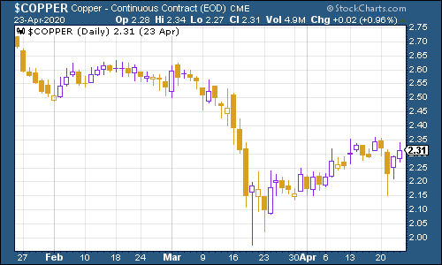
(Copper: three months)
The Aussie dollar has continued to hold up against the US dollar, partly because Australia seems to be having a good crisis.
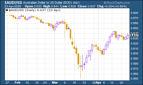
(Aussie dollar vs US dollar exchange rate: three months)
Cryptocurrency bitcoin surged somewhat higher this week.
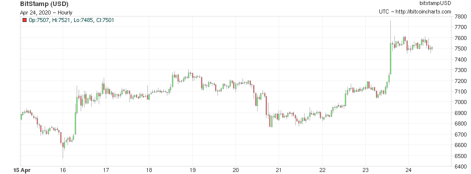
(Bitcoin: ten days)
US weekly jobless claims were once horrendous, although that’s now expected. This week, jobless claims came in at 4.43 million, lower than the 5.24 million seen last week. That means more than 26 million people have now been pushed onto America’s dole queues in the last five weeks. The four-week moving average now sits at 5.8 million, a fresh all-time record.
The only positive thing you can say is that the number of new claims is coming down. But the main issue now will be how quickly people can get back to work.
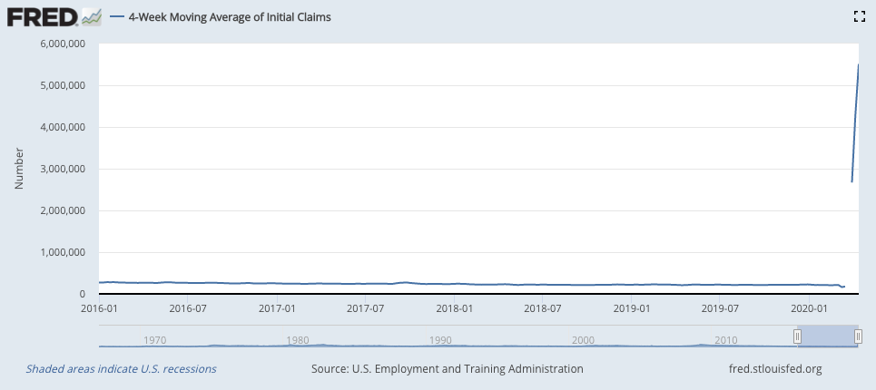
(US jobless claims, four-week moving average: since January 2016)
Oil in general had a remarkable week, although you wouldn’t really know it to look at the oil price chart below, which shows Brent crude, the international/European benchmark. Oil as measured by the US benchmark, WTI, turned negative at one point - you can learn more about that here, but it had a significant knock-on effect, with Brent sliding hard from its recent rebound.
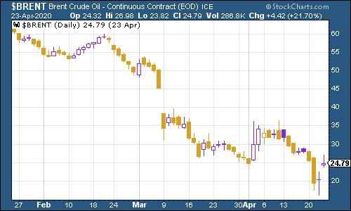
(Brent crude oil: three months)
Amazon shares have continued to make new highs despite the travails of the wider market. Perhaps ironically, the tech stocks are the ones that led the bull market and now they’re the ones that have thrived and survived the bear market best too.
(Amazon: three months)
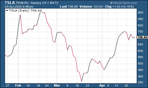
Electric car group Tesla meanwhile was a bit lower, partly due to wider concerns that low oil prices might end up putting a dent in the case for electric cars.
(Tesla: three months)
Have a good weekend.
Get the latest financial news, insights and expert analysis from our award-winning MoneyWeek team, to help you understand what really matters when it comes to your finances.

