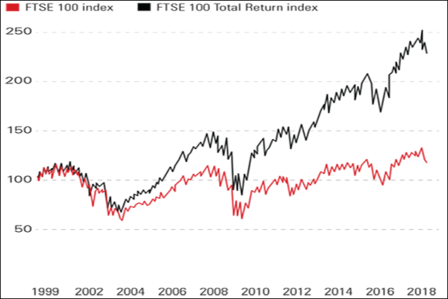
Chart of the week: The power of dividends
If you’d held it since 1999 and reinvested all your dividends, your money would have increased by a factor of 2.5, as the progress of the FTSE Total Return index shows.
During the latest market wobble, the FTSE 100 briefly returned to levels it had first reached in 1999. The index's long struggle has been ascribed to its heavyweight financial and resource stocks. Both sectors have done poorly thanks to the banking crisis and the end of the commodities supercycle. In truth, says Lex in the Financial Times, it was the tech bubble that did the damage. In 1999, Vodafone was worth £215bn; it is only a quarter of that sum now.
In any case, the index only measures prices. If you'd held it since 1999 and reinvested all your dividends, your money would have increased by a factor of 2.5, as the progress of the FTSE Total Return index shows.
Subscribe to MoneyWeek
Subscribe to MoneyWeek today and get your first six magazine issues absolutely FREE
Sign up to Money Morning
Don't miss the latest investment and personal finances news, market analysis, plus money-saving tips with our free twice-daily newsletter
Sign up to Money Morning
Our team, led by award winning editors, is dedicated to delivering you the top news, analysis, and guides to help you manage your money, grow your investments and build wealth.
-
How to invest in nuclear power
We need nuclear power to go green, says Dominic Frisby. But there is a better option than huge power stations
By Dominic Frisby Published
-
Chase slashes its easy-access savings rate – is it time to switch?
The Chase easy-access savings account has proved popular with savers thanks to its competitive rate and bonus deals. But, as the rate has dropped, has it lost its charm?
By Katie Williams Published
-
The charts that matter: bond yields and US dollar continue to climb
Charts The US dollar and government bond yields around the world continued to climb. Here’s what happened to the charts that matter most to the global economy.
By Ben Judge Last updated
-
The charts that matter: markets start the year with a crash
Charts As markets start 2022 with a big selloff, here’s what happened to the charts that matter most to the global economy.
By Ben Judge Published
-
The charts that matter: Fed becomes more hawkish
Charts Gold rose meanwhile the US dollar fell after a key Fed meeting. Here’s what else happened to the charts that matter most to the global economy.
By Saloni Sardana Published
-
The charts that matter: a tough week for bitcoin
Charts Cryptocurrency bitcoin slid by some 20% this week. Here’s what else happened to the charts that matter most to the global economy.
By Ben Judge Published
-
The charts that matter: omicron rattles markets
Charts Markets were rattled by the emergence of a new strain of Covid-19. Here’s how it has affected the charts that matter most to the global economy.
By Ben Judge Published
-
The charts that matter: the US dollar keeps on strengthening
Charts The US dollar saw further rises this week as gold and cryptocurrencies sold off. Here’s how that has affected the charts that matter most to the global economy.
By Ben Judge Published
-
The charts that matter: gold hangs on to gains while the dollar continues higher
Charts The gold price continued to hang on to last week’s gains, even as the US dollar powered higher this week. Here’s how that has affected the charts that matter most to the global economy.
By Ben Judge Published
-
The charts that matter: inflation fears give gold a much needed boost
Charts US inflation hit its highest in 30 years this week, driving gold and bitcoin to new highs. Here’s how that has affected the charts that matter most to the global economy.
By Ben Judge Published