Chart of the week: Even the past is murky to economists
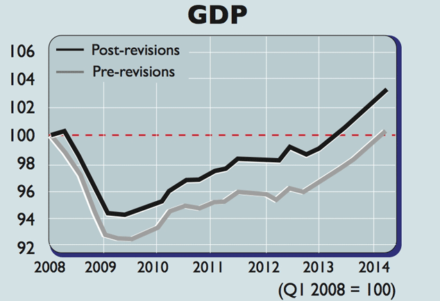
The Office for National Statistics has revised its GDP data going back to 1998, giving a different picture of the 2000-07 boom.
Not only can economists not predict the future, but they can't even describe the past, says Roger Bootle of Capital Economics. Measuring GDP, a country's economic output, is an inexact and ongoing science.
The Office for National Statistics has revised data going back to 1998. The upshot is that the 2000-2007 boom was not quite as strong as believed at the time, while the recovery from the slump was stronger.
GDP in 2009 was 0.9% stronger than initially estimated, for instance, and the double-dip recession of 2012 has been revised away.The economy expanded by 0.1% at the start of 2012, compared to a first estimate that pointed to a 0.2% decline.
Subscribe to MoneyWeek
Subscribe to MoneyWeek today and get your first six magazine issues absolutely FREE
Sign up to Money Morning
Don't miss the latest investment and personal finances news, market analysis, plus money-saving tips with our free twice-daily newsletter
The overall slide from the pre-crisis peak in early 2008 to the trough the following year has been upgraded from 7.1% to 6%.
The numbers may well be tweaked further in future, but for now this means output reached its pre-crisis level in the middle of 2013 a year earlier than we thought.
Sign up to Money Morning
Our team, led by award winning editors, is dedicated to delivering you the top news, analysis, and guides to help you manage your money, grow your investments and build wealth.
-
Nvidia earnings: what to expect
Nvidia announces earnings after market close on 20 November. What should investors expect from the semiconductor giant?
By Dan McEvoy Published
-
M&S and Tesco among those warning of a £7bn Budget hit
Seventy-nine UK retailers have written to Chancellor Rachel Reeves about possible price rises and job cuts - here is what it means
By Chris Newlands Published
-
The charts that matter: bond yields and US dollar continue to climb
Charts The US dollar and government bond yields around the world continued to climb. Here’s what happened to the charts that matter most to the global economy.
By Ben Judge Last updated
-
The charts that matter: markets start the year with a crash
Charts As markets start 2022 with a big selloff, here’s what happened to the charts that matter most to the global economy.
By Ben Judge Published
-
The charts that matter: Fed becomes more hawkish
Charts Gold rose meanwhile the US dollar fell after a key Fed meeting. Here’s what else happened to the charts that matter most to the global economy.
By Saloni Sardana Published
-
The charts that matter: a tough week for bitcoin
Charts Cryptocurrency bitcoin slid by some 20% this week. Here’s what else happened to the charts that matter most to the global economy.
By Ben Judge Published
-
The charts that matter: omicron rattles markets
Charts Markets were rattled by the emergence of a new strain of Covid-19. Here’s how it has affected the charts that matter most to the global economy.
By Ben Judge Published
-
The charts that matter: the US dollar keeps on strengthening
Charts The US dollar saw further rises this week as gold and cryptocurrencies sold off. Here’s how that has affected the charts that matter most to the global economy.
By Ben Judge Published
-
The charts that matter: gold hangs on to gains while the dollar continues higher
Charts The gold price continued to hang on to last week’s gains, even as the US dollar powered higher this week. Here’s how that has affected the charts that matter most to the global economy.
By Ben Judge Published
-
The charts that matter: inflation fears give gold a much needed boost
Charts US inflation hit its highest in 30 years this week, driving gold and bitcoin to new highs. Here’s how that has affected the charts that matter most to the global economy.
By Ben Judge Published