The charts that matter: what happened to reflation?
Government bond yields turned down this week, while the US stock market hit new highs, as “reflation” trades wilted under the pressure of concerns over the Delta variant. Here’s how it affected the charts that matter most to the global economy.
Welcome back.
On the cover of this week’s magazine, we’ve got England’s “Freedom Day”. It was supposed to be the great release from months of lockdowns. But, says Emily Hohler, it “turned out to be much the same as every other day, except worse”.
Meanwhile, our big investment feature this week is India. It’s had a catastrophic pandemic, but the stockmarket is hitting record highs. Investors might be getting a little ahead of themselves, says Cris Sholto Heaton, but they’re “right to remain optimistic about the long term”. Cris looks at the economic background and picks five of the best ways to buy in. If you’re not already a subscriber, sign up for MoneyWeek magazine now.
Try 6 free issues of MoneyWeek today
Get unparalleled financial insight, analysis and expert opinion you can profit from.

Sign up to Money Morning
Don't miss the latest investment and personal finances news, market analysis, plus money-saving tips with our free twice-daily newsletter
Don't miss the latest investment and personal finances news, market analysis, plus money-saving tips with our free twice-daily newsletter
This week’s “Too Embarrassed To Ask” video looks at the “lifetime allowance”. If you have been saving into your pension for some time now you may well have heard the term. Here's what it means and why it matters.
And joining Merryn on the podcast this week is Brian Pellegrini, founder of Intertemporal Economics. They talk about the post-pandemic recovery and why many Americans are just not returning to work, plus Big Tech, inflation and productivity. Find out what Brian has to say here.
Here are the links for this week’s editions of Money Morning and other web articles you may have missed:
- Monday Money Morning: Lockdown Day saw the market hit rock bottom – could Freedom Day mark a top?
- Web article: Oil cartel Opec agrees deal to boost oil production – what does it mean for you?
- Tuesday Money Morning: Here’s what it’ll take for markets to stop worrying about Covid-19
- Merryn’s blog: The space race: exciting, but not necessarily profitable
- Wednesday Money Morning: Why markets keep going up in the face of “real world” economic turmoil
Web article: Bitcoin bounces – but only after dipping below key level of $30,000. What’s next? - Thursday Money Morning: Playing pass the parcel with toxic assets won’t save the environment
- Web article: What are central banks planning to do – stay loose or raise interest rates?
- Friday Money Morning: Why the European Central Bank’s new regime matters more than you think
- Cryptocurrency roundup: US and EU impose tougher regulations
Now for the charts of the week.
The charts that matter
Gold’s recovery stalled after a couple of weeks of gains.
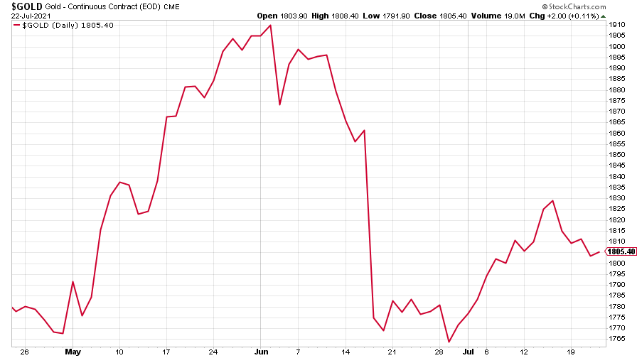
(Gold: three months)
The US dollar index (DXY – a measure of the strength of the dollar against a basket of the currencies of its major trading partners) carried on getting stronger (which partly explains gold wilting).
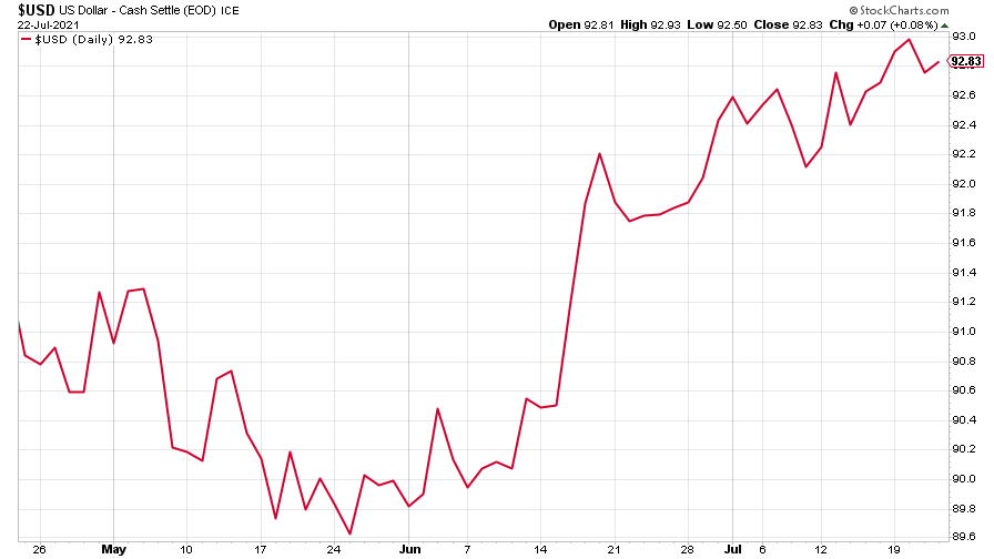
(DXY: three months)
The Chinese yuan (or renminbi) continued to reflect the dollar’s strength (when the red line is rising, the dollar is strengthening while the yuan is weakening).
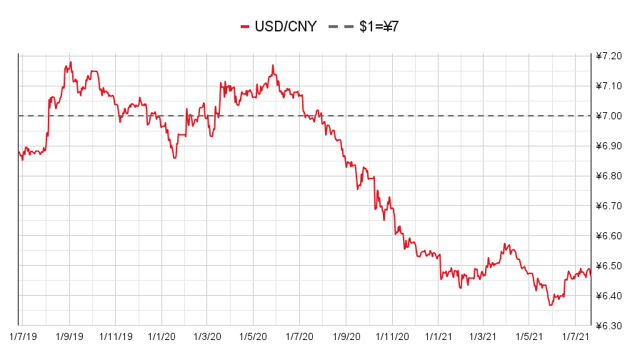
(Chinese yuan to the US dollar: since 25 Jun 2019)
The yield on the ten-year US government bond fell further as investors continued to demand bonds despite concerns about inflation.
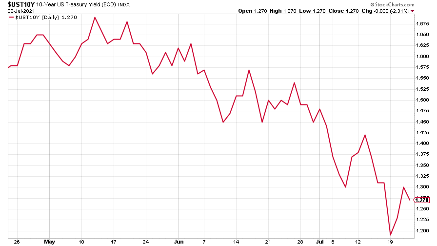
(Ten-year US Treasury yield: three months)
The yield on the Japanese ten-year bond had an erratic week, ending much where it started.
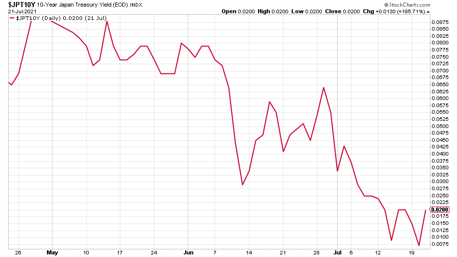
(Ten-year Japanese government bond yield: three months)
And the yield on the ten-year German Bund took a big tumble, too.
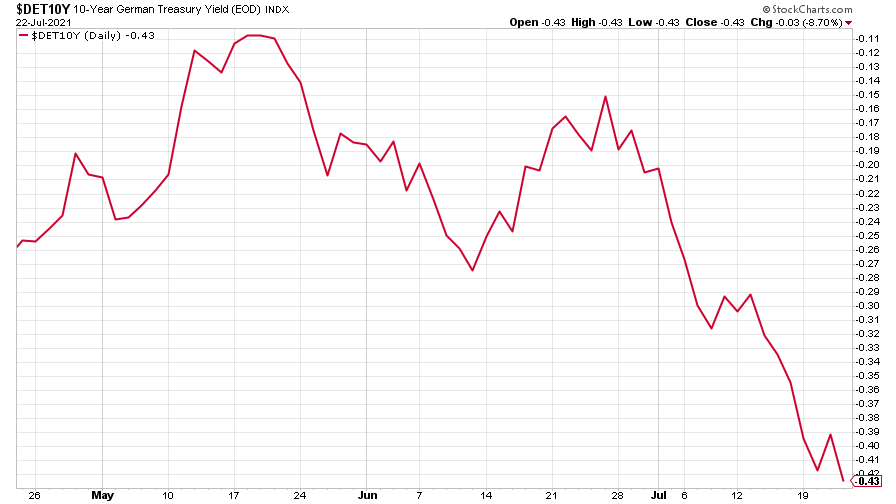
(Ten-year Bund yield: three months)
Copper is just biding its time, perhaps as investors feared the rampaging Delta variant would derail the recovery.
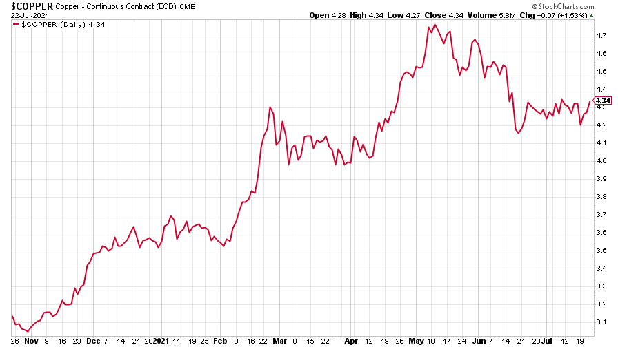
(Copper: nine months)
The closely-related Aussie dollar fell further, though it turned up a little towards the end of the week.
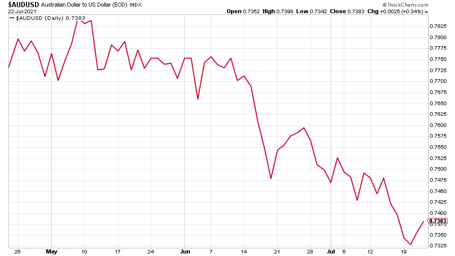
(Aussie dollar vs US dollar exchange rate: three months)
Bitcoin continued its drift lower. Even Elon Musk’s latest pronouncement, that Tesla might start accepting it as payment again, failed to stir much movement.
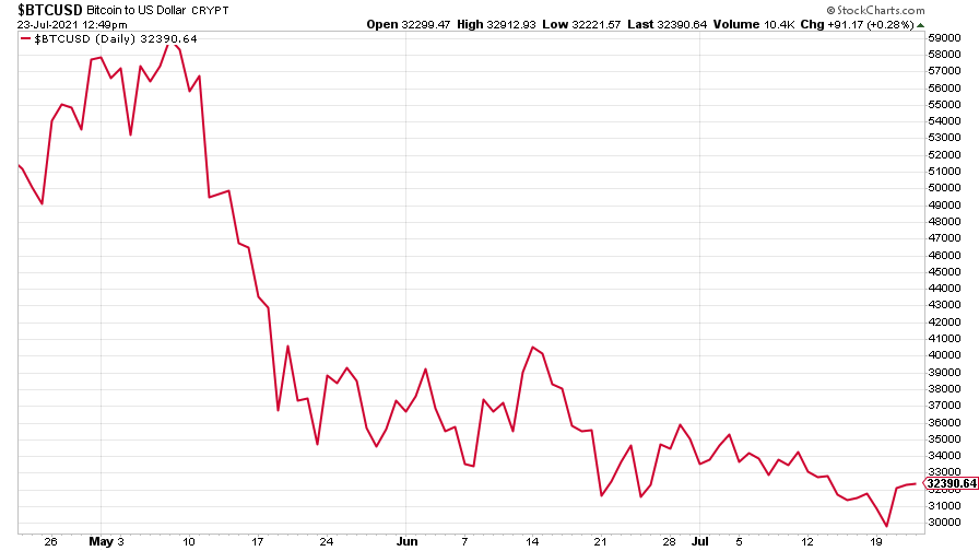
(Bitcoin: three months)
US weekly initial jobless claims jumped by 51,000 to 419,000. The four-week moving average rose by 250 to 384,500.
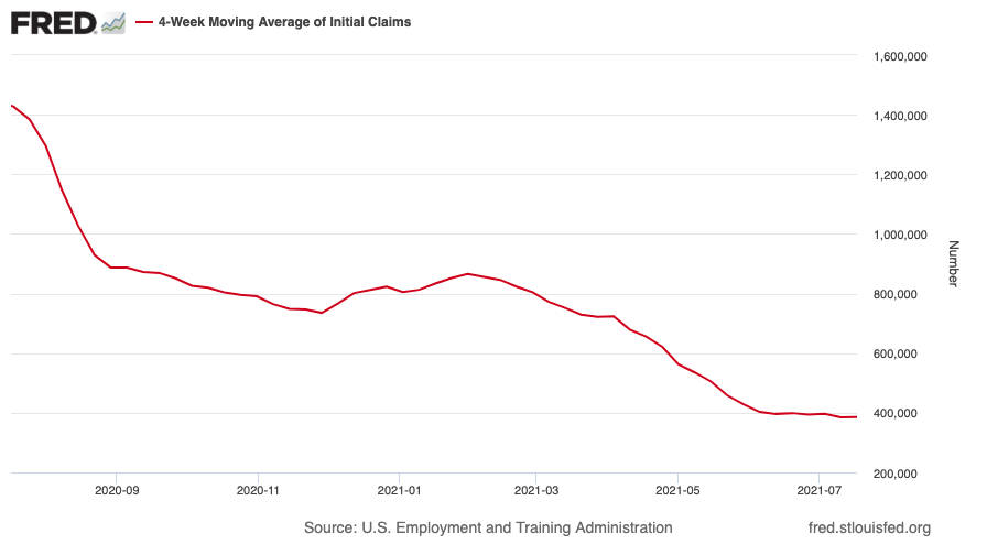
(US initial jobless claims, four-week moving average: since Jan 2020)
The oil price saw a big drop as the Opec cartel said it would ramp up production, then shot back up towards the end of the week.
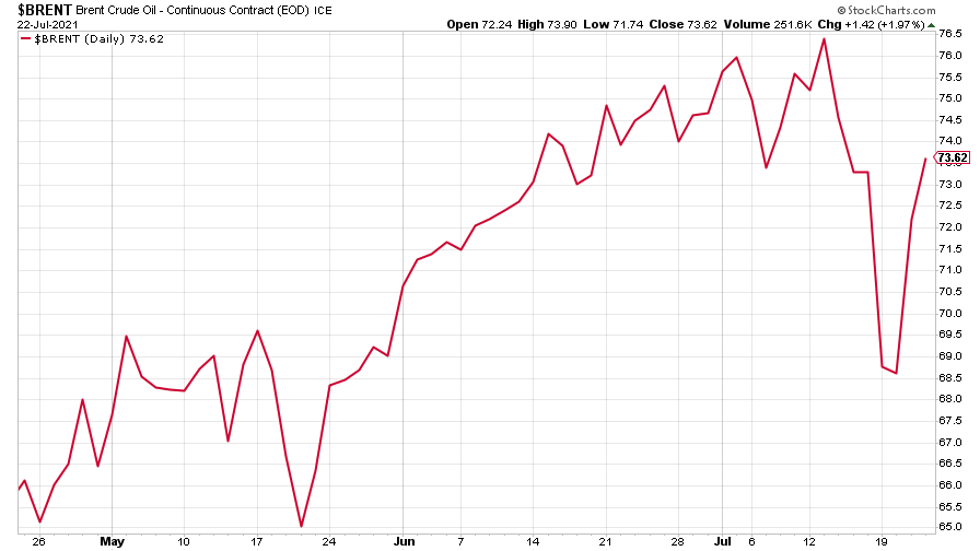
(Brent crude oil: three months)
Amazon turned higher, helped by demand for growth stocks.
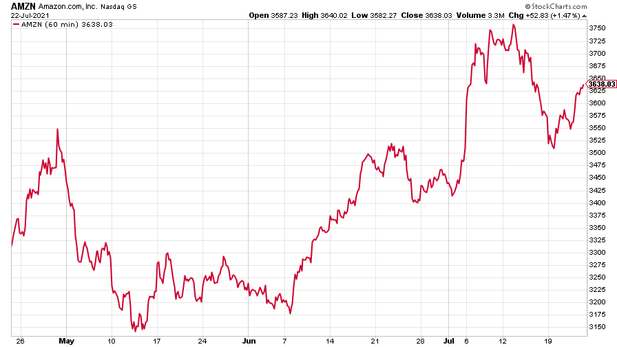
(Amazon: three months)
And Tesla trod water.
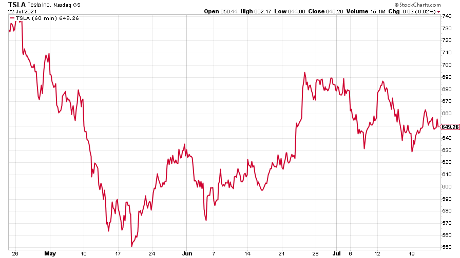
(Tesla: three months)
Have a great weekend.
Get the latest financial news, insights and expert analysis from our award-winning MoneyWeek team, to help you understand what really matters when it comes to your finances.

