The charts that matter: GameStop, silver, vaccines, and swapping gold for bitcoin
After a week with plenty to talk about, John Stepek looks at how the events of the last seven days have affected the charts that matter most to the global economy.

Welcome back.
Quick reminder – if you haven’t yet watched Merryn’s recent interview with Charles Plowden of Baillie Gifford, make sure you catch up. It’s still available on demand – tune in here.
Also, don’t miss the MoneyWeek podcast this week. Merryn talks to Raoul Pal of GMI and Real Vision fame about bitcoin, gold, what the GameStop and Robinhood shenanigans have taught us about the fragile state of the market, and much much more. Listen to it here. (And please do leave a review if you can – I realise that will depend on how you listen to the podcast, but if you have the option, it’s always great to get your feedback).
Try 6 free issues of MoneyWeek today
Get unparalleled financial insight, analysis and expert opinion you can profit from.

Sign up to Money Morning
Don't miss the latest investment and personal finances news, market analysis, plus money-saving tips with our free twice-daily newsletter
Don't miss the latest investment and personal finances news, market analysis, plus money-saving tips with our free twice-daily newsletter
This week’s issue of the magazine looks at the reality behind the GameStop saga (it’s more complicated than David vs Goliath) and whether it’ll drive silver higher (and whether that matters or not). We also delve into the details of the UK’s vaccine rollout and what it suggests for both the UK economy and the global outlook. Subscribe now to get your first six mags free.
Our latest “Too Embarrassed To Ask” video looks at the “Cape ratio”. To find out why it’s one of our favourite valuation measures, just watch the video here.
Here are the links for this week’s editions of Money Morning and other web stories you may have missed.
- Monday: Is silver the next GameStop? What you need to know before you buy
- Merryn’s blog: How the Reddit mob could be good for shareholder capitalism
- Tuesday: Inflation is the only thing that can burst this bubble
- Wednesday: Oil had a terrible 2020. This year will be better
- Thursday: History suggests we can expect a rapid recovery once Covid is beaten
- Friday: Negative interest rates are highly unlikely in the UK – that’s good news for this investment
Now for the charts of the week.
The charts that matter
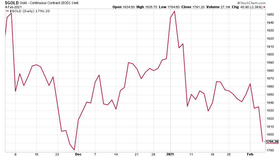
Gold tanked this week as everything went against it. The dollar strengthened (often though not always bad for gold, which is priced in dollars). Investors returned to a “risk-on” mood (gold tends to be viewed as a “risk-off”, “safe haven” asset). And US Treasury bond yields went up.
This last is probably the most significant. Gold does best when “real” yields (ie, interest rates after inflation) are falling – thus far, inflation has not kept up with rising rates, so real rates have risen. I fully expect them to fall in time as inflation rises and rates are suppressed by central banks. But in the meantime, gold doesn’t like it.
(Gold: three months)
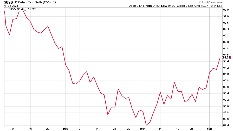
The US dollar index (DXY – a measure of the strength of the dollar against a basket of the currencies of its major trading partners) headed higher again this week. In my view, this is more a case of the dollar being “due a bounce” because everyone was short it, rather than something more fundamental.
But let’s not jump the gun – better to keep an eye on it. After all, while the US is going to print a lot of money (dollar negative, all else being equal), it’s also doing better than the eurozone on getting its population vaccinated and thus out of lockdown and thus growing the economy again faster. Given that the euro is the world’s other big currency, the dollar’s overall direction depends a lot on its performance against the single currency.
(DXY: three months)
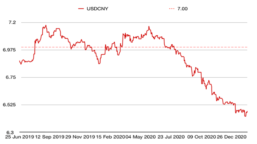
Even the Chinese yuan (or renminbi) slipped against the US dollar (when the red line is falling, the yuan is strengthening) this week, which hasn’t happened in a while.
(Chinese yuan to the US dollar: since 25 Jun 2019)
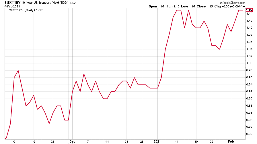
The yield on the ten-year US government bond was a good bit higher this week and it’s looking as though we might start to see it head for levels we haven’t seen since Covid went global (bear in mind that the US ten-year was yielding nearly 2% at the end of 2019 – so it can go a lot higher from here just to get back to “semi-normal”).
(Ten-year US Treasury yield: three months)
Interestingly, the yield on the Japanese ten-year stretched higher than normal –I mean obviously it stayed near 0% as usual, but I’m wondering when the market will start to test the Bank of Japan on this again.
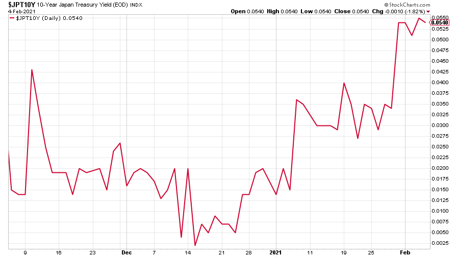
(Ten-year Japanese government bond yield: three months)
Even the yield on the ten-year German Bund was higher (still very negative, but higher than it has been since September 2020).
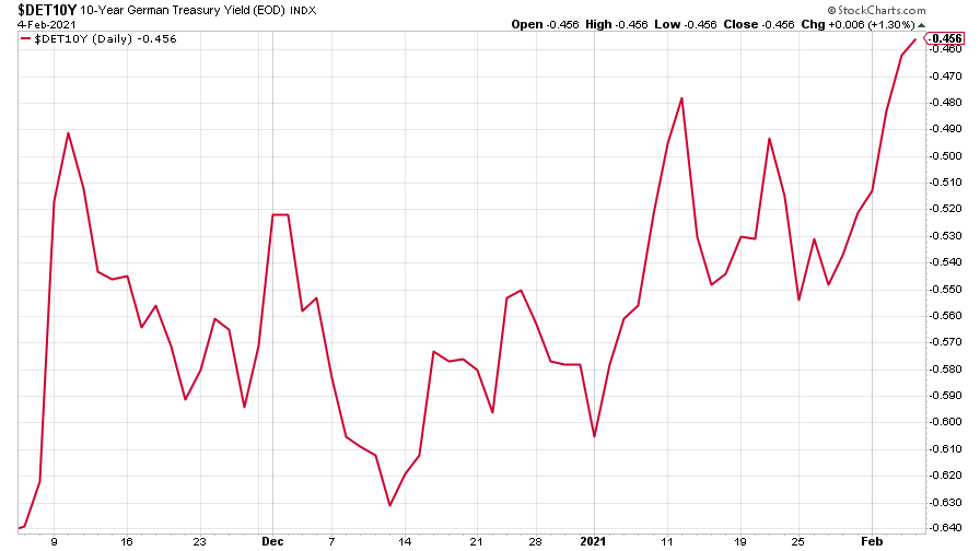
(Ten-year Bund yield: three months)
Copper dipped a little again this week, probably mostly down to concerns over Chinese growth and also the stronger US dollar.
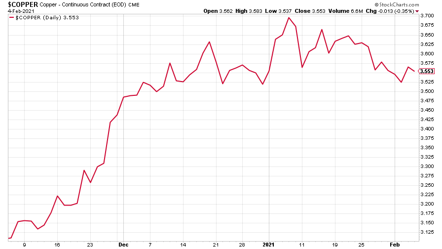
(Copper: nine months)
Meanwhile the commodities-and-China-dependent Aussie dollar slipped even further this week against the stronger US dollar.
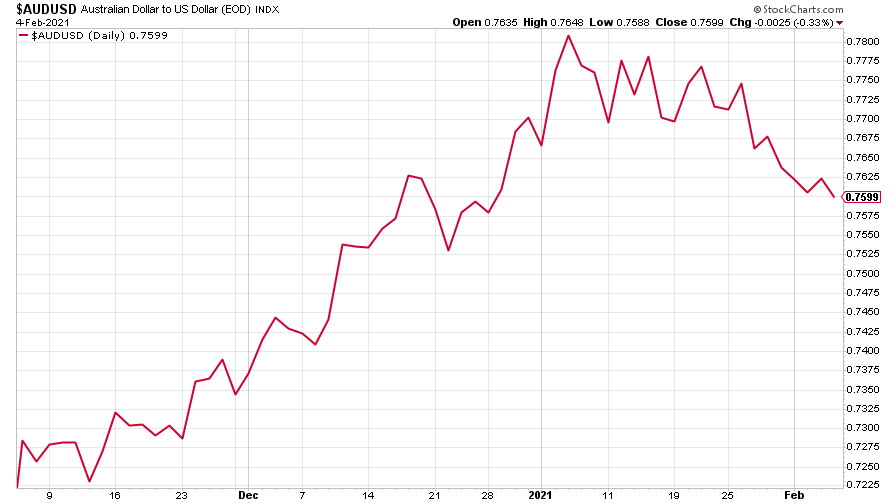
(Aussie dollar vs US dollar exchange rate: three months)
Cryptocurrency bitcoin has held up after its steep fall. And it doesn’t seem to be connected to the GameStop business – the rest of the assets linked to that have fallen hard this week. I’ll admit I had wondered if bitcoin would bounce back from its plunge below $30,000 at the end of last month, but so far it seems that it’s resisting another bear market for the time being.
(Quick heads up – Dominic is putting together a more detailed guide to buying bitcoin as we speak – I’ll be telling you more about that next week.)
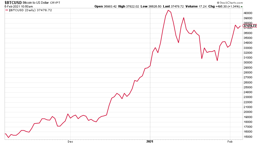
(Bitcoin: three months)
US weekly jobless claims fell to 779,000, compared to 812,000 last week (revised lower from 847,000), and better than economists had expected. The four-week moving average fell to 848,250 from 849,500 (which was revised lower from 868,000) the week before.
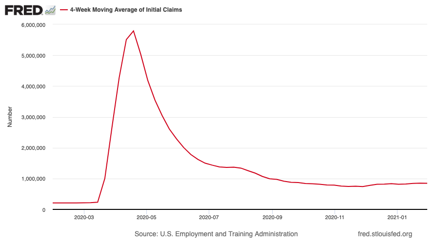
(US jobless claims, four-week moving average: since Jan 2020)
Meanwhile, markets are starting to take more of an interest in US non-farm payrolls. In pre-Covid times this was arguably the most important economic release every month as it helps to influence monetary policy, but amid the Covid slump it lost a lot of its informational content (it’s been hard to rely on the data given the sheer level of disruption). But now that there’s light on the horizon, markets are starting to look for it in the data.
This month, they didn’t quite get what they were looking for. The US added 49,000 jobs in January, which was a bit weaker than the 85,000 or so expected. That helped to put a dent in the US dollar which in turn saw gold bump a bit higher.
The oil price (as measured by Brent crude) had a strong rally this week, even as everyone keeps talking about divestment and electric cars and how it’s the fuel of the past. Hmm. That’s hubris.
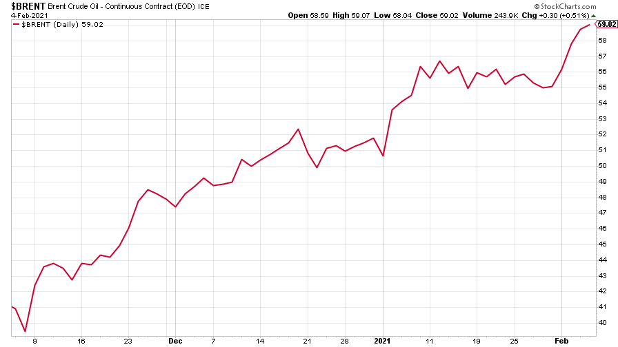
(Brent crude oil: three months)
Amazon moved gently higher this week as it reported results. The figures were strong – with profits much better than expected – but in the detail, analysts were a bit concerned by the fact that its cloud division (Amazon Web Services, AWS) missed estimates. Cloud is a really important part of Amazon’s business so any faltering in the division will raise concerns.
Also of course, Jeff Bezos stepped down as chief executive, giving way to AWS head, Andy Jassy. Bezos has been an extraordinary CEO and it’ll be interesting to see how Jassy follows him. Though if Bezos has handled the succession as well as he built the company in the first place – an admittedly rare skill – it should all be quite smooth.
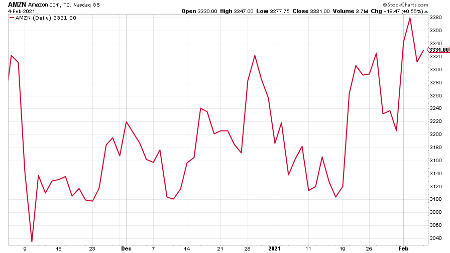
(Amazon: three months)
Tesla was a bit higher this week. And Elon Musk couldn’t resist tweeting about other investments, clearly for his own amusement. The latest asset he’s been having a giggle with is Dogecoin.
This cryptocurrency, which was explicitly set up as a parody of bitcoin and is based on a moderately funny meme about a cute breed of Japanese dog, rose by 50% after Musk called it “the people’s crypto”. To be fair Dogecoin has already risen several times over this year – likely off the back of the bitcoin rush – so it’s not all Musk’s fault.
For the curious, Dogecoin is “mined” the same way as bitcoin. But there’s no upper limit on the number of them. There are already something like 100 billion in existence. I can see the argument for bitcoin –just. But I’m struggling to see the argument for this one.
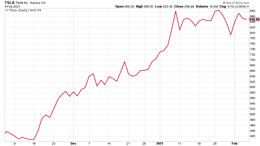
(Tesla: three months)
Have a great weekend. Remember to watch Merryn’s interview!
Get the latest financial news, insights and expert analysis from our award-winning MoneyWeek team, to help you understand what really matters when it comes to your finances.
