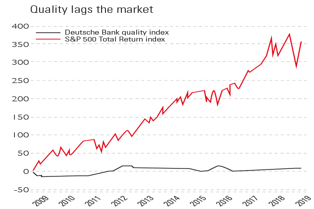
Chart of the week: QE rewards lazy investors
This chart is a stark illustration of the effect of a decade of rock-bottom interest rates and quantitative easing (QE - or money printing).
"A rising tide lifts all boats," says Tim Price in a Price Value Partners note. This chart is a stark illustration of the effect of a decade of rock-bottom interest rates and quantitative easing (money printing).
The liquidity flood has ensured a 360% increase in the S&P Total Return index, which includes reinvested dividends. But an index constructed by Deutsche Bank, which tracks 1,000 top-quality global blue chips chosen for their high scores in key metrics such as profitability has climbed by just 8% in a decade.
You would normally expect quality to be rewarded by the market, but in this era of central-bank activism, making the effort to find good stocks is "useless". You might as well "[plop] your money willy-nilly into crappy stuff".
Subscribe to MoneyWeek
Subscribe to MoneyWeek today and get your first six magazine issues absolutely FREE
Sign up to Money Morning
Don't miss the latest investment and personal finances news, market analysis, plus money-saving tips with our free twice-daily newsletter
Viewpoint
The Times
Sign up to Money Morning
Our team, led by award winning editors, is dedicated to delivering you the top news, analysis, and guides to help you manage your money, grow your investments and build wealth.
-
8 of the best properties for sale with equestrian facilities
The best properties for sale with equestrian facilities – from a Georgian manor in Ceredigion, Wales, to a period farmhouse with an equine swimming pool in Banbury, Oxfordshire
By Natasha Langan Published
-
Energy bills to rise by 1.2% in January 2025
Energy bills are set to rise 1.2% in the New Year when the latest energy price cap comes into play, Ofgem has confirmed
By Dan McEvoy Published
-
The charts that matter: bond yields and US dollar continue to climb
Charts The US dollar and government bond yields around the world continued to climb. Here’s what happened to the charts that matter most to the global economy.
By Ben Judge Last updated
-
The charts that matter: markets start the year with a crash
Charts As markets start 2022 with a big selloff, here’s what happened to the charts that matter most to the global economy.
By Ben Judge Published
-
The charts that matter: Fed becomes more hawkish
Charts Gold rose meanwhile the US dollar fell after a key Fed meeting. Here’s what else happened to the charts that matter most to the global economy.
By Saloni Sardana Published
-
The charts that matter: a tough week for bitcoin
Charts Cryptocurrency bitcoin slid by some 20% this week. Here’s what else happened to the charts that matter most to the global economy.
By Ben Judge Published
-
The charts that matter: omicron rattles markets
Charts Markets were rattled by the emergence of a new strain of Covid-19. Here’s how it has affected the charts that matter most to the global economy.
By Ben Judge Published
-
The charts that matter: the US dollar keeps on strengthening
Charts The US dollar saw further rises this week as gold and cryptocurrencies sold off. Here’s how that has affected the charts that matter most to the global economy.
By Ben Judge Published
-
The charts that matter: gold hangs on to gains while the dollar continues higher
Charts The gold price continued to hang on to last week’s gains, even as the US dollar powered higher this week. Here’s how that has affected the charts that matter most to the global economy.
By Ben Judge Published
-
The charts that matter: inflation fears give gold a much needed boost
Charts US inflation hit its highest in 30 years this week, driving gold and bitcoin to new highs. Here’s how that has affected the charts that matter most to the global economy.
By Ben Judge Published