Chart of the week: Inflation in OECD countries
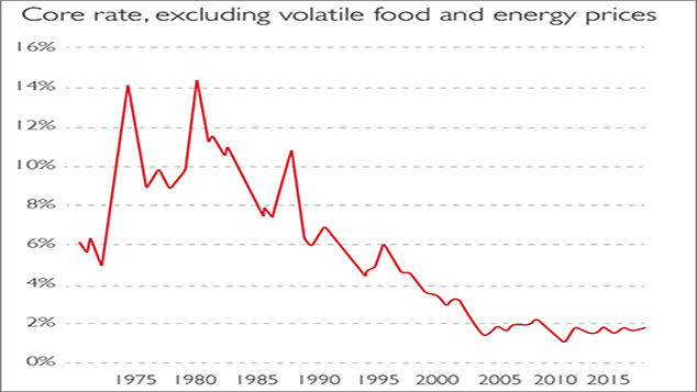
It’s been ages since we had to worry about big price rises, as this chart of underlying inflation in the OECD, a group of developed countries, reminds us.
It's been ages since we had to worry about big price rises, as this chart of underlying inflation in the OECD, a group of developed countries, reminds us. The key reason for disinflation in the past two decades was globalisation, which shifted power from labour to capital, says Andreas Niehaus in Finanz und Wirtschaft.
The global workforce almost doubled between 1990 and 2001, while automation and digitalisation also lowered production costs. This halted wage-price spirals even when growth was strong. But inflation may be making a comeback and central banks don't seem ready to respond.
Subscribe to MoneyWeek
Subscribe to MoneyWeek today and get your first six magazine issues absolutely FREE

Sign up to Money Morning
Don't miss the latest investment and personal finances news, market analysis, plus money-saving tips with our free twice-daily newsletter
-
Who is the richest person in the world?
The top five richest people in the world have a combined net worth of $825 billion. Who takes the crown for the richest person in the world?
By Vaishali Varu Published
-
Top 10 stocks with highest growth over past decade - from Nvidia, Microsoft to Netflix, which companies made you the most money?
We reveal the 10 global companies with the biggest returns since 2013. One firm has posted an astonishing 9,870% return, meaning a £1,000 investment would now be worth almost £82,000.
By Ruth Emery Published
-
The charts that matter: bond yields and US dollar continue to climb
Charts The US dollar and government bond yields around the world continued to climb. Here’s what happened to the charts that matter most to the global economy.
By Ben Judge Last updated
-
The charts that matter: markets start the year with a crash
Charts As markets start 2022 with a big selloff, here’s what happened to the charts that matter most to the global economy.
By Ben Judge Published
-
The charts that matter: Fed becomes more hawkish
Charts Gold rose meanwhile the US dollar fell after a key Fed meeting. Here’s what else happened to the charts that matter most to the global economy.
By Saloni Sardana Published
-
The charts that matter: a tough week for bitcoin
Charts Cryptocurrency bitcoin slid by some 20% this week. Here’s what else happened to the charts that matter most to the global economy.
By Ben Judge Published
-
The charts that matter: omicron rattles markets
Charts Markets were rattled by the emergence of a new strain of Covid-19. Here’s how it has affected the charts that matter most to the global economy.
By Ben Judge Published
-
The charts that matter: the US dollar keeps on strengthening
Charts The US dollar saw further rises this week as gold and cryptocurrencies sold off. Here’s how that has affected the charts that matter most to the global economy.
By Ben Judge Published
-
The charts that matter: gold hangs on to gains while the dollar continues higher
Charts The gold price continued to hang on to last week’s gains, even as the US dollar powered higher this week. Here’s how that has affected the charts that matter most to the global economy.
By Ben Judge Published
-
The charts that matter: inflation fears give gold a much needed boost
Charts US inflation hit its highest in 30 years this week, driving gold and bitcoin to new highs. Here’s how that has affected the charts that matter most to the global economy.
By Ben Judge Published