Chart of the week: The feel-good factor returns
The UK 'misery index' has fallen to close to its lowest level in almost half a century.
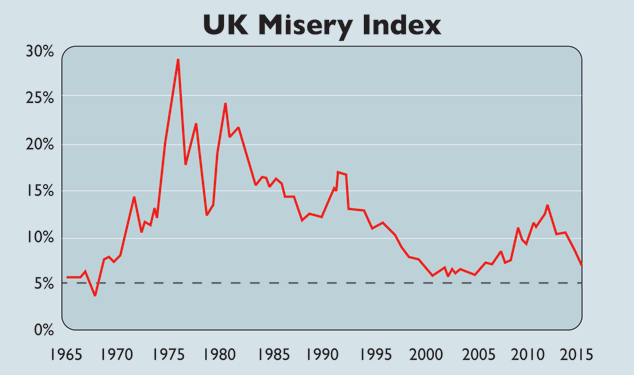
The "Misery Index" was widely used in the 1970s and 1980s to gauge the outlook for consumption, which accounts for the largest share of the UK economy.
The index, which is calculated as the sum of the unemployment and inflation rates, peaked at 30% in the mid-1970s. But it is now close to its lowest level in almost half a century, says Capital Economics. Unemployment of 5.7% and inflation of 0.3% makes a Misery reading of 6%.
Subscribe to MoneyWeek
Subscribe to MoneyWeek today and get your first six magazine issues absolutely FREE

Sign up to Money Morning
Don't miss the latest investment and personal finances news, market analysis, plus money-saving tips with our free twice-daily newsletter
Sign up for MoneyWeek's newsletters
Get the latest financial news, insights and expert analysis from our award-winning MoneyWeek team, to help you understand what really matters when it comes to your finances.
-
NS&I launches new British Savings Bonds issues with higher interest rates
NS&I has launched new issues of British Savings Bonds with improved interest rates, making them much more attractive for customers who want absolute security on their cash savings
By Daniel Hilton
-
Santander launches new freebie for certain savings customers - are you eligible?
Santander is offering a free four-year railcard to some customers from today. We explain who will qualify for the incentive
By Jessica Sheldon
-
The charts that matter: bond yields and US dollar continue to climb
Charts The US dollar and government bond yields around the world continued to climb. Here’s what happened to the charts that matter most to the global economy.
By Ben Judge
-
The charts that matter: markets start the year with a crash
Charts As markets start 2022 with a big selloff, here’s what happened to the charts that matter most to the global economy.
By Ben Judge
-
The charts that matter: Fed becomes more hawkish
Charts Gold rose meanwhile the US dollar fell after a key Fed meeting. Here’s what else happened to the charts that matter most to the global economy.
By Saloni Sardana
-
The charts that matter: a tough week for bitcoin
Charts Cryptocurrency bitcoin slid by some 20% this week. Here’s what else happened to the charts that matter most to the global economy.
By Ben Judge
-
The charts that matter: omicron rattles markets
Charts Markets were rattled by the emergence of a new strain of Covid-19. Here’s how it has affected the charts that matter most to the global economy.
By Ben Judge
-
The charts that matter: the US dollar keeps on strengthening
Charts The US dollar saw further rises this week as gold and cryptocurrencies sold off. Here’s how that has affected the charts that matter most to the global economy.
By Ben Judge
-
The charts that matter: gold hangs on to gains while the dollar continues higher
Charts The gold price continued to hang on to last week’s gains, even as the US dollar powered higher this week. Here’s how that has affected the charts that matter most to the global economy.
By Ben Judge
-
The charts that matter: inflation fears give gold a much needed boost
Charts US inflation hit its highest in 30 years this week, driving gold and bitcoin to new highs. Here’s how that has affected the charts that matter most to the global economy.
By Ben Judge