
It’s Monday morning, which means it’s time for the next series covering some of the basics of technical analysis.
Today we look at what I consider one of the most useful indicators of the lot – the golden cross – and its opposite, the death cross.
Why so useful? Because they help you identify trends – when they start and when they end – and then they keep you on board.
Try 6 free issues of MoneyWeek today
Get unparalleled financial insight, analysis and expert opinion you can profit from.

Sign up to Money Morning
Don't miss the latest investment and personal finances news, market analysis, plus money-saving tips with our free twice-daily newsletter
Don't miss the latest investment and personal finances news, market analysis, plus money-saving tips with our free twice-daily newsletter
Moving averages can sometimes let you down
The principle is simple. You need to plot two moving averages (MAs) on a chart – one a short-term moving average; the other longer term.
The most commonly used pair (the default on most chart packages) – and in my view the least effective – is the 50-period moving average and the 200-period. When the 50 crosses up through the 200, and the price is above, there is your buy signal – the golden cross. When the reverse happens, and the 50 crosses down through the 200, there is your sell signal. The death cross.
Here, for example, is a daily chart of the S&P 500 over the last two years. The red line is the 50-day moving average and the blue line is the 200-day moving average. I’ve flagged up the last three crosses – the last three buy and sell signals.

The golden cross (buy signal) came in March 2019 at around 2,900. The death cross (sell signal) came a year later in March 2020 at around 2,500. And then the next buy signal came in July with the S&P 500 now at around 3,150.
Utterly useless! How could you have bought the S&P 500 in 2019 and still manage to lose money? Yet if you followed this system, that is what would have happened. The first trade lost you 400 points, and if you went short on the sell signal you would have lost another 650. Between the two trades, you’re not far off losing half the value of the S&P. It’s hard to find a worse system.
I hope you can see why I don’t like the 50/200 as a combination. And yet this is the one the media always reports on. Fools. You would be better off simply owning the S&P 500 as long as it is above the 50-day moving average (red line), and not owning it when it is below.
The trick is to choose your time periods carefully
The secret of using moving average crosses as a trading tool lies in which moving averages you choose.
If you are a day-trader, you might use hourly combinations, or even shorter timeframes. If you like to place one or two trades a fortnight, you might use daily combinations. If you prefer only to trade once or twice a year, then weekly combinations are for you.
You will also find that different combinations work better in different markets. For the S&P 500, the most powerful combinations I’ve found are 21 and nine-period, or the 21 and six-period combinations. Also I use exponential moving averages (EMAs) which give extra weighting to more recent weeks.
Here is the S&P 500 since 2016 with the buy and sell signals marked.

Using weekly opening prices, we got a buy signal in March 2016 with the S&P at 2,046. We stayed long for two and half years – no trades in that time. No commissions! We sold in October 2018 for 2,750. A nice 700-point profit.
The next buy came in February 2019 at 2,711 (below where we sold). The sell came a year later in February of this year at 2,900. The next buy signal came at the end of May at 3,030, and we remain on a buy signal, currently showing a 300 point profit.
It’s much more effective than the 50/200. This is a lagging indicator so you will never catch highs and lows, but it makes sure you catch trends.
There are all sorts of ways you can tweak it to protect profits when you have them. You can sell if it gets a certain percentage above its short-term average, use stops just below moving averages. The danger with the system is during market crashes, such as in March of this year, you give back profits very quickly. Hence why it is a good idea to use stops or something similar with this system.
So there we are. Golden crosses and death crosses. Have a play with you charting software, Back test the system – and you’ll find your own combinations. Used well this is a powerful tool. Used badly, it stinks!

-
 Worried about an AI bubble? These investment trusts could help
Capital spend on artificial intelligence infrastructure is coming under more scrutiny, but the sector still dominates passive indices.
-
 Biotech's future looks bright – the best investments to buy
Biotechnology companies are coming out of a dark period for the industry. Why has the tide turned, and is now a good time to buy in?


-
 What's behind the big shift in Japanese government bonds?
Rising long-term Japanese government bond yields point to growing nervousness about the future – and not just inflation
-
 Why you should keep an eye on the US dollar, the most important price in the world
Advice The US dollar is the most important asset in the world, dictating the prices of vital commodities. Where it goes next will determine the outlook for the global economy says Dominic Frisby.
-
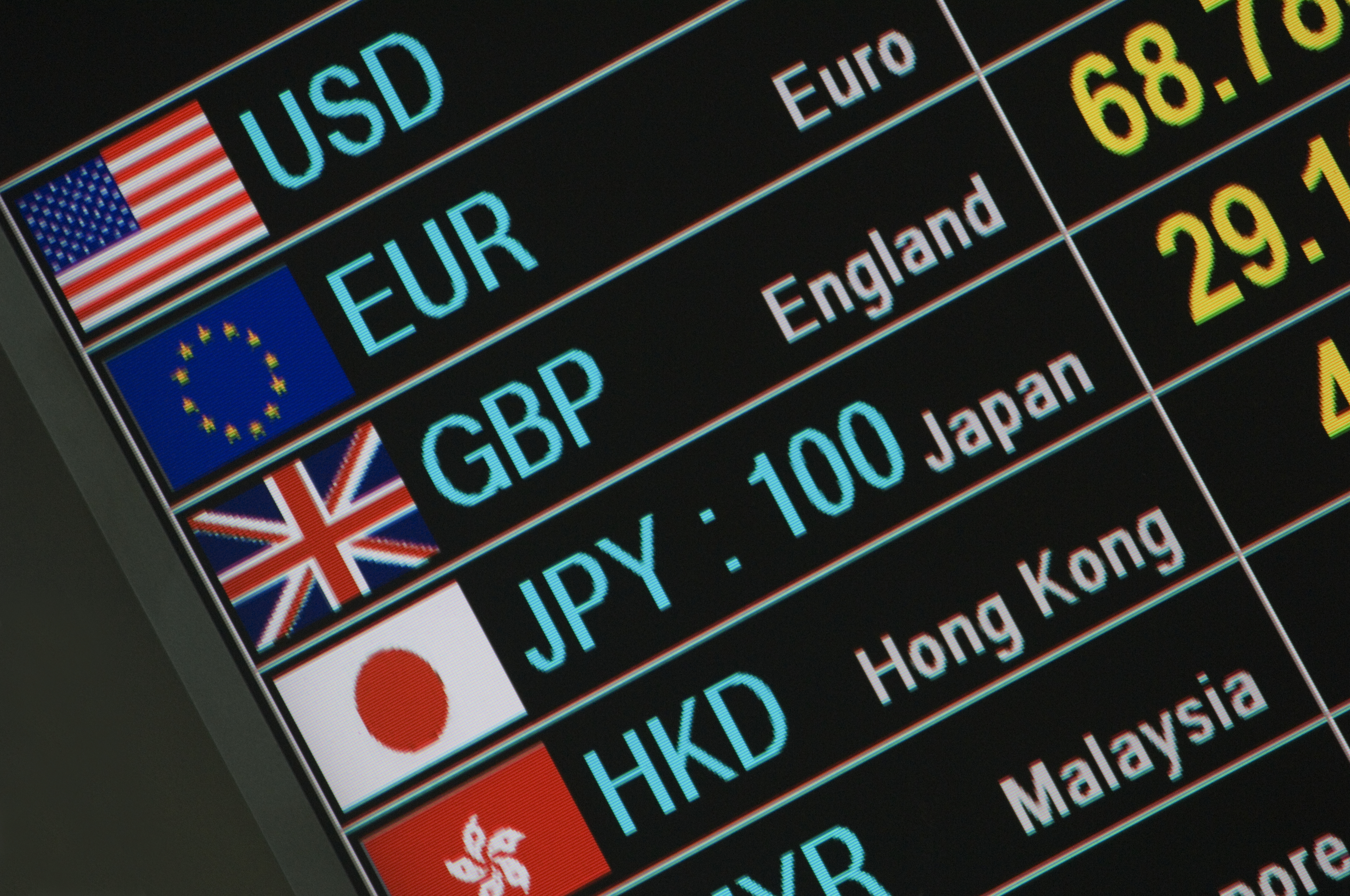 What is FX trading?
What is FX trading and can you make money from it? We explain how foreign exchange trading works and the risks
-
 The Burberry share price looks like a good bet
Tips The Burberry share price could be on the verge of a major upswing as the firm’s profits return to growth.
-
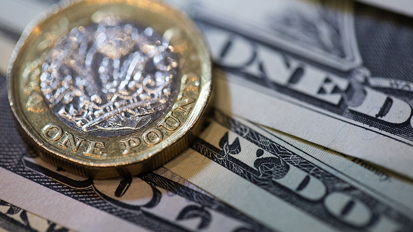 Sterling accelerates its recovery after chancellor’s U-turn on taxes
News The pound has recovered after Kwasi Kwarteng U-turned on abolishing the top rate of income tax. Saloni Sardana explains what's going on..
-
 Why you should short this satellite broadband company
Tips With an ill-considered business plan, satellite broadband company AST SpaceMobile is doomed to failure, says Matthew Partridge. Here's how to short the stock.
-
 It’s time to sell this stock
Tips Digital Realty’s data-storage business model is moribund, consumed by the rise of cloud computing. Here's how you could short the shares, says Matthew Partridge.
-
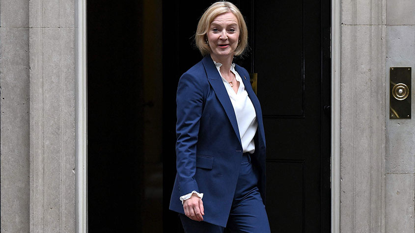 Will Liz Truss as PM mark a turning point for the pound?
Analysis The pound is at its lowest since 1985. But a new government often markets a turning point, says Dominic Frisby. Here, he looks at where sterling might go from here.


