Welcome back.
In this week’s magazine, we’re looking at economic and investment cycles. As John said in yesterday’s Money Morning, you can’t use them to time your entrances and exits into a market, but they can be a valuable tool for investors. Akhil Patel revisits the theme he wrote about in MoneyWeek in 2014 – that economies and markets are driven by an 18-year cycle based on land and property values. It’s a compelling read – subscribe to MoneyWeek here (and get your first six issues free) if you haven’t already done so.
This week’s “Too Embarrassed To Ask” video explains what “options” are. You can watch that here.
Try 6 free issues of MoneyWeek today
Get unparalleled financial insight, analysis and expert opinion you can profit from.

Sign up to Money Morning
Don't miss the latest investment and personal finances news, market analysis, plus money-saving tips with our free twice-daily newsletter
Don't miss the latest investment and personal finances news, market analysis, plus money-saving tips with our free twice-daily newsletter
Merryn’s pulled another big hitter out of the bag as a guest on this week’s podcast – historian and author Professor Niall Ferguson. He talks to Merryn about the unpredictability of disaster and how we’ll never be prepared for it. Plus, he gives his views on bitcoin (he’s a fan), Covid restrictions and our possible descent into a total surveillance society. Find out what he has to say here.
Here are the links for this week’s editions of Money Morning and other web articles you may have missed:
- Monday Money Morning: Here’s why investors were happy with Friday’s US employment data
- Tuesday Money Morning: What China’s war on tech firms means for investors
- Merryn’s blog: If a company is cheap enough for private equity, why isn’t it cheap enough for everyone else?
- Wednesday Money Morning: Commodity supercycle or not, here’s a metal that’ll still be in demand – tin
Web article: What’s driving the oil price volatility, and where could it go next? - Thursday Money Morning: It’s a tug of war between reflation and deflation – who will win?
- Web article: Ether price looks set to climb as network “hard fork” approaches
- Friday Money Morning: The real value to investors of cycle theories
- Web article: British fintech Wise has hit the market. Should you invest?
- Crypto roundup: $100bn wiped off crypto market value in one day
Now for the charts of the week.
The charts that matter
Gold started to climb back up after its big fall.
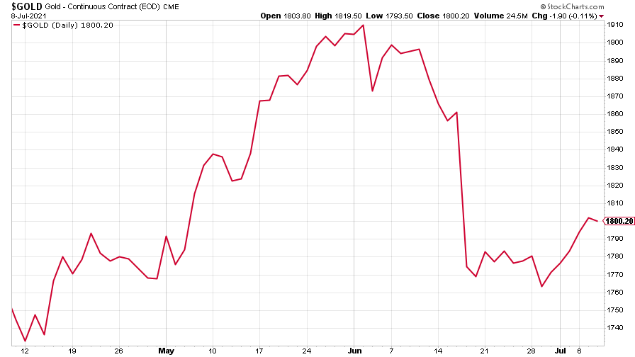
(Gold: three months)
The US dollar index (DXY – a measure of the strength of the dollar against a basket of the currencies of its major trading partners) climbed higher.
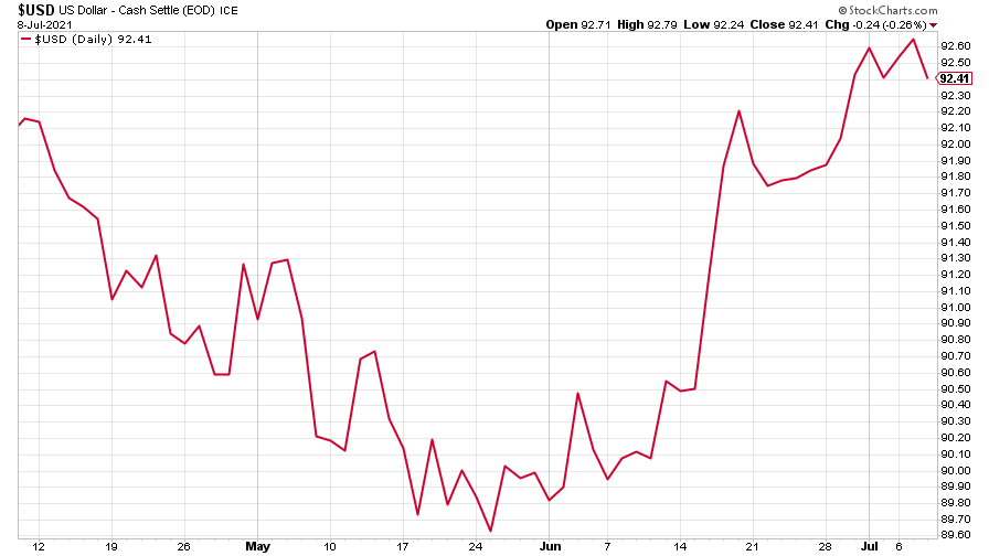
(DXY: three months)
The Chinese yuan (or renminbi) reflected the dollar’s strength, weakening a little (when the red line is rising, the dollar is strengthening while the yuan is weakening).
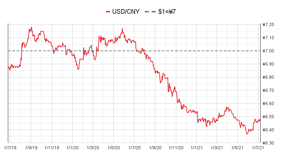
(Chinese yuan to the US dollar: since 25 Jun 2019)
After seeming to settle last week, the yield on the ten-year US government bond dived lower again.
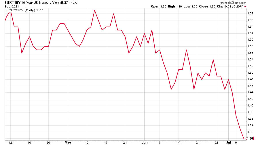
(Ten-year US Treasury yield: three months)
The yield on the Japanese ten-year bond reversed last week’s gains.
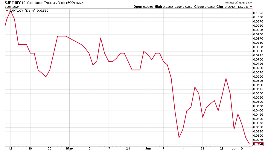
(Ten-year Japanese government bond yield: three months)
And the yield on the ten-year German Bund fell back to its level of three months ago.
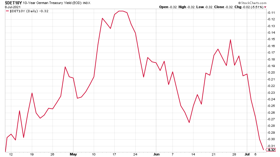
(Ten-year Bund yield: three months)
Copper drifted lower – just a breather or have investors given up on the Great Reflation?
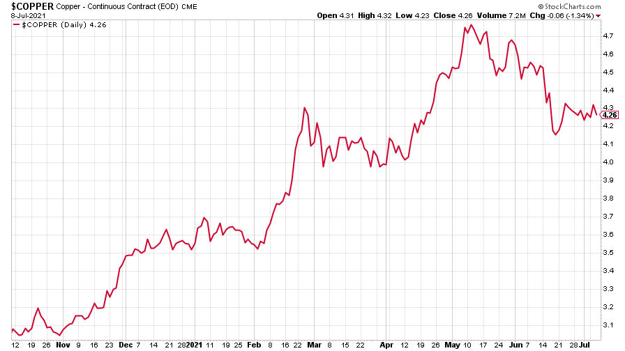
(Copper: nine months)
The closely-related Aussie dollar resumed its slide.
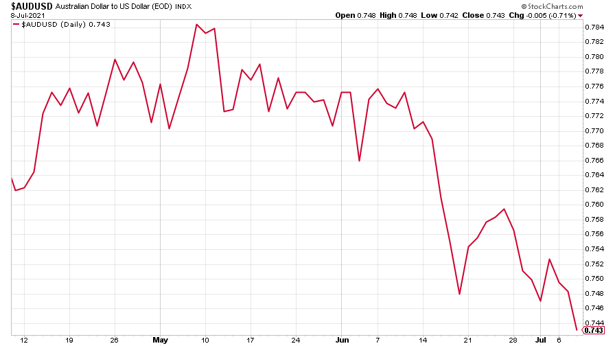
(Aussie dollar vs US dollar exchange rate: three months)
Bitcoin drifted lower.
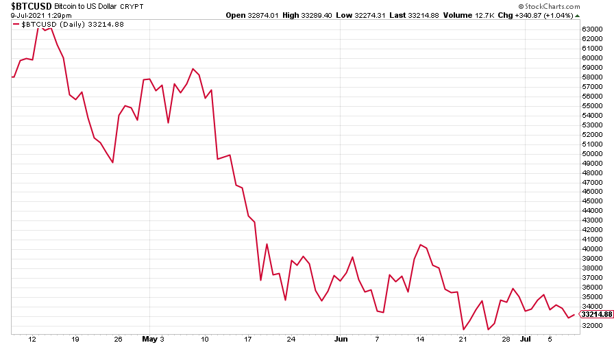
(Bitcoin: three months)
US weekly initial jobless claims rose slightly, up by 2,000 to 373,000, revised up from 364,000. The four-week moving average fell, however, down 250 to 394,500.
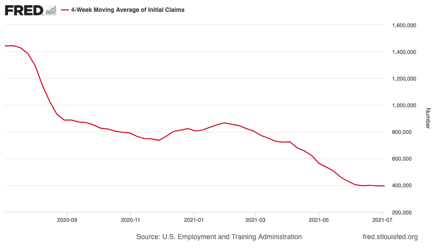
(US initial jobless claims, four-week moving average: since Jan 2020)
The oil price paused for breath – but that might not be the end of its bull run.
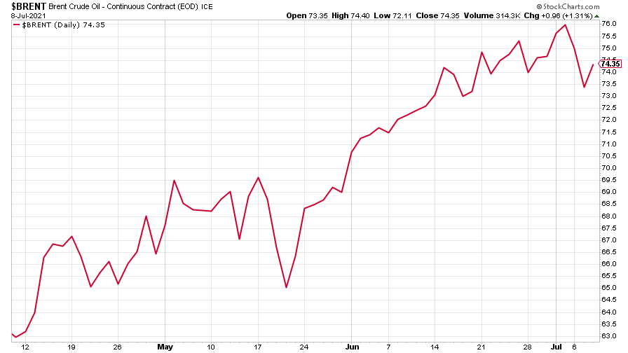
(Brent crude oil: three months)
Amazon took another big jump.
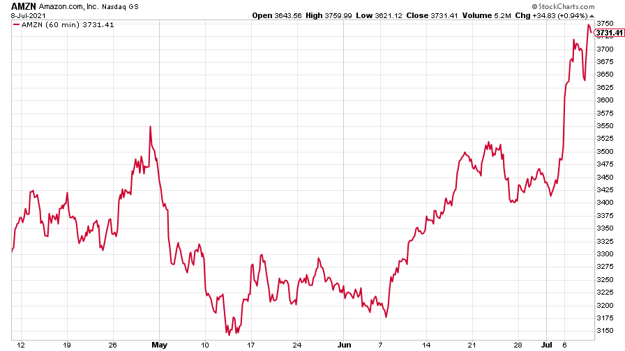
(Amazon: three months)
While Tesla fell back, with a little rally towards the end of the week.
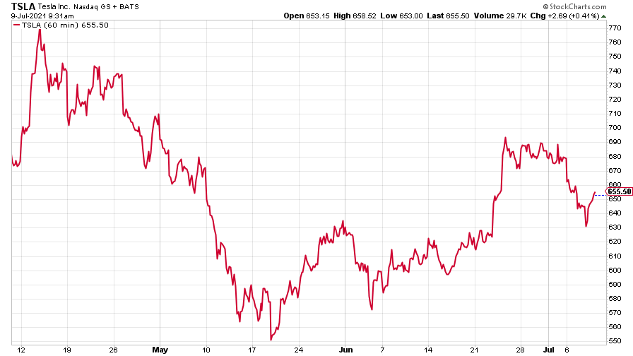
(Tesla: three months)
Have a great weekend.
Get the latest financial news, insights and expert analysis from our award-winning MoneyWeek team, to help you understand what really matters when it comes to your finances.

