Welcome back.
In this week’s magazine, we look at the country’s – indeed much of the developed world’s – labour shortage and what it means. As Philip Pilkington argues, chronic labour shortages caused by people’s fears of returning to work and hesitancy in getting vaccinated means rising wages - and that in turn could mean spiralling inflation. We’ve seen this sort of thing before, he says – in the 1970s. “The dynamics this time are different”, he says, but “investors should beware”. He explains the best ways to protect your portfolio – if you’re not already a subscriber, sign up here and get your first six issues free.
This week’s “Too Embarrassed To Ask” video explains what a marginal tax rate is. A surprising number of people are flummoxed by this apparently simple concept. Find out exactly what it means here.
Try 6 free issues of MoneyWeek today
Get unparalleled financial insight, analysis and expert opinion you can profit from.

Sign up to Money Morning
Don't miss the latest investment and personal finances news, market analysis, plus money-saving tips with our free twice-daily newsletter
Don't miss the latest investment and personal finances news, market analysis, plus money-saving tips with our free twice-daily newsletter
And in this week’s podcast, Merryn’s joined by Kieran Heinman, author of Playing The Market: Retail Investment And Speculation In 20th Century Britain. Listen to the episode here.
Here are the links for this week’s editions of Money Morning and other web articles you may have missed:
- Monday Money Morning: Fund managers are good at buying shares – but terrible at selling them
- Tuesday Money Morning: The UK jobs market is booming – what does that mean for investors?
- Merryn’s blog: The times may be changing, but don’t change how you invest
- Thursday Money Morning: What really causes inflation? Here’s what prices since 1970 tell us
- Web article: Why are energy prices going up so much, and what does it mean for consumers and investors?
- Friday Money Morning: Why it pays to face up to your investment mistakes
- Cryptocurrency roundup: Litecoin blunder, cardano update and bitcoin mining in Laos
Now for the charts of the week.
The charts that matter
Gold saw a big fall as US economic data came in stronger than expected (if markets think that rates will go up sooner as a result of stronger economic data, then all else being equal, that’s not good for gold).
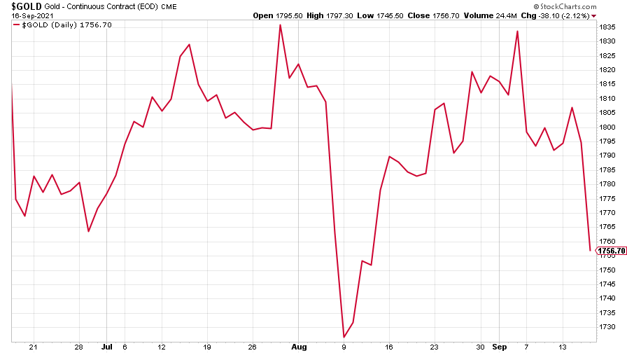
(Gold: three months)
The US dollar index (DXY – a measure of the strength of the dollar against a basket of the currencies of its major trading partners) edged higher.
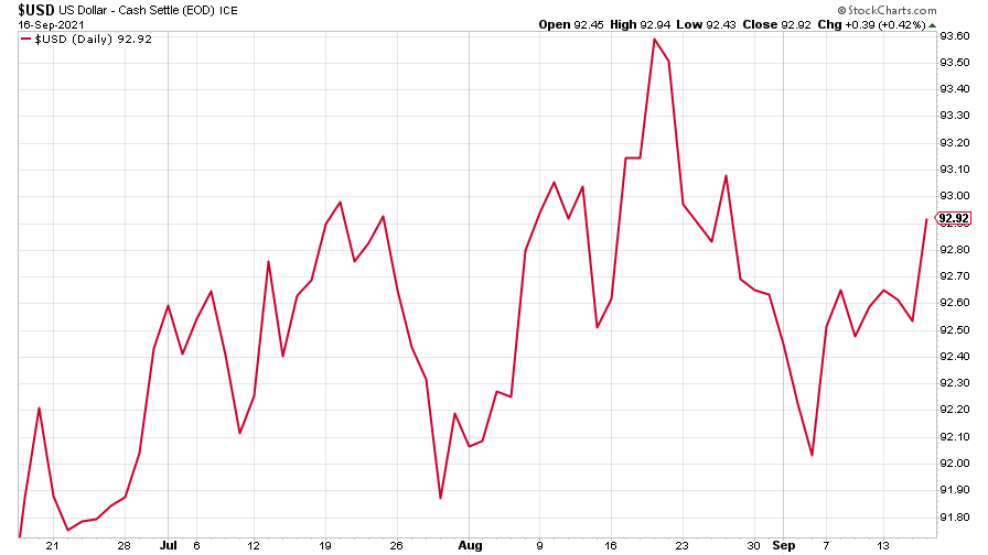
(DXY: three months)
The Chinese yuan (or renminbi) looked to be gaining strength (when the red line is rising, the dollar is strengthening while the yuan is weakening).
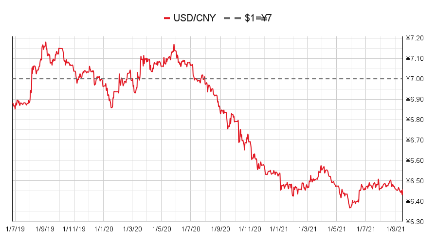
(Chinese yuan to the US dollar: since 25 Jun 2019)
The yield on the ten-year US government bond changed little this week.
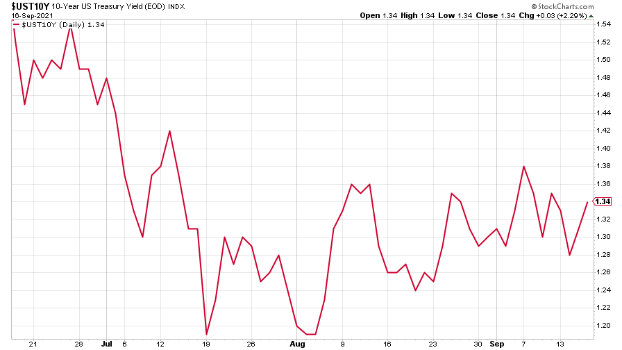
(Ten-year US Treasury yield: three months)
The yield on the Japanese ten-year bond recovered after an earlier slip.
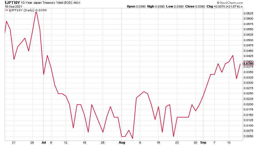
(Ten-year Japanese government bond yield: three months)
And the yield on the ten-year German Bund continued its gradual rise.
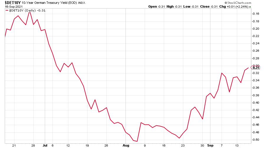
(Ten-year Bund yield: three months)
Copper saw very little action – climbing a little only to fall back.
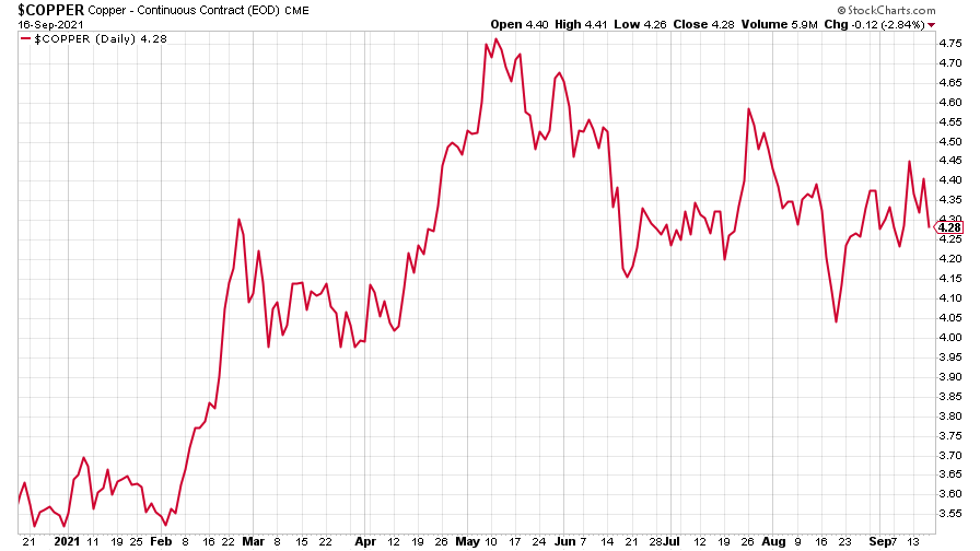
(Copper: nine months)
The closely-related Aussie dollar fell back.
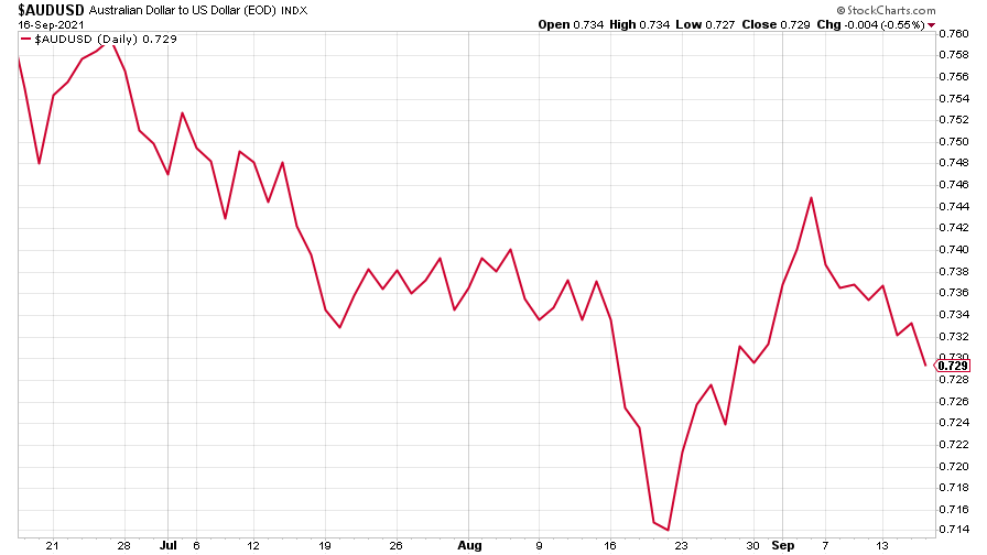
(Aussie dollar vs US dollar exchange rate: three months)
Bitcoin recovered somewhat from last week’s big fall.
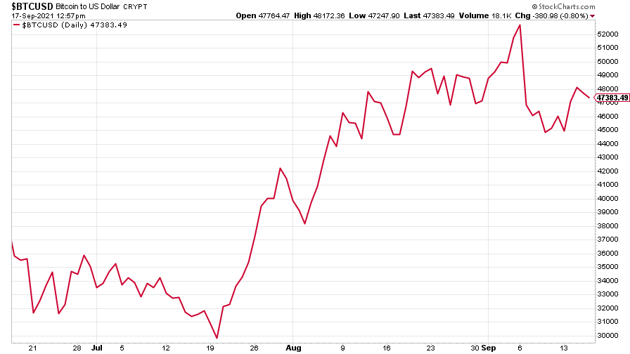
(Bitcoin: three months)
US weekly initial jobless claims rose by 20,000 to 332,000. The four-week moving average fell by 4,250 to 335,750.
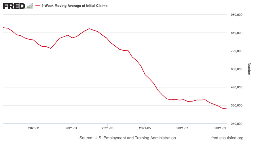
(US initial jobless claims, four-week moving average: since Jan 2020)
The oil price headed back over $75 a barrel.
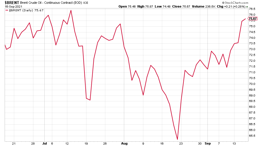
(Brent crude oil: three months)
Amazon fell a little further, despite a rally towards the end of the week.
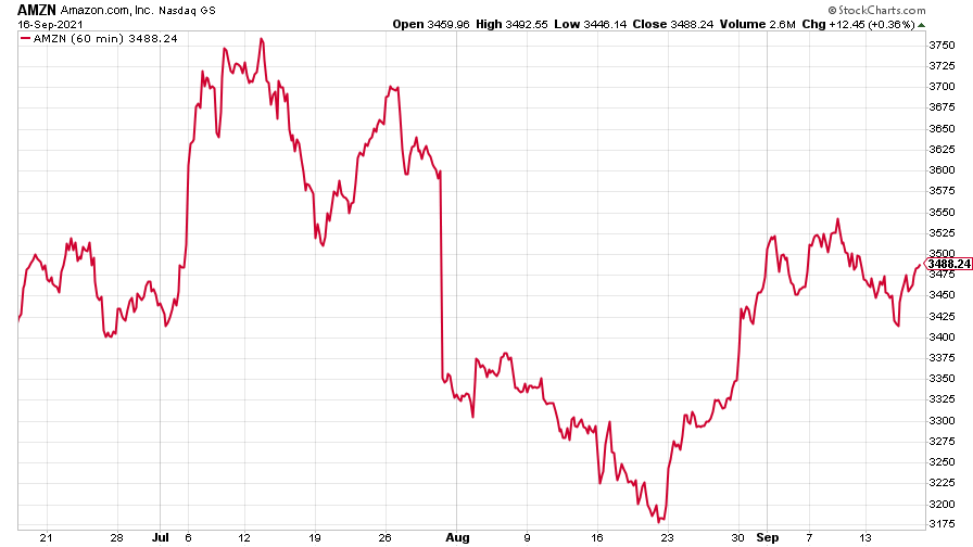
(Amazon: three months)
Tesla looked to be heading for a fall, then regained most of its losses.
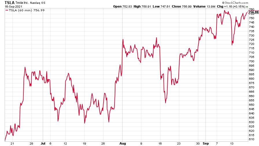
(Tesla: three months)
Have a great weekend.
Get the latest financial news, insights and expert analysis from our award-winning MoneyWeek team, to help you understand what really matters when it comes to your finances.

