Chart of the week: Norway taps its piggy bank
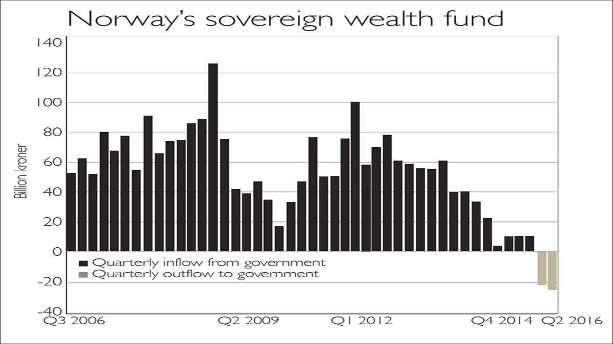
For the first time since Norway set up its sovereign wealth fund in 1996, the state has tapped it to cover some public spending.
Saudi Arabia isn't the only nation struggling following the oil-price slide, says ZeroHedge.com. For the first time since Norway set up its sovereign wealth fund in 1996, the state has tapped it to cover some public spending.
It took out $5.4bn in the first half of the year, and is set to withdraw another $20bn in the second, a sum worth around 18% of overall government spending, which in turn accounts for 60% of the $375bn economy.
This is still under the 4% annual withdrawal limit ($36bn), which may be cut, given the difficulty of earning a decent yield these days.
Subscribe to MoneyWeek
Subscribe to MoneyWeek today and get your first six magazine issues absolutely FREE
Sign up to Money Morning
Don't miss the latest investment and personal finances news, market analysis, plus money-saving tips with our free twice-daily newsletter
Viewpoint
Deutsche Bank
Sign up to Money Morning
Our team, led by award winning editors, is dedicated to delivering you the top news, analysis, and guides to help you manage your money, grow your investments and build wealth.
-
Energy bills to rise by 1.2% in January 2025
Energy bills are set to rise 1.2% in the New Year when the latest energy price cap comes into play, Ofgem has confirmed
By Dan McEvoy Published
-
Should you invest in Trainline?
Ticket seller Trainline offers a useful service – and good prospects for investors
By Dr Matthew Partridge Published
-
The charts that matter: bond yields and US dollar continue to climb
Charts The US dollar and government bond yields around the world continued to climb. Here’s what happened to the charts that matter most to the global economy.
By Ben Judge Last updated
-
The charts that matter: markets start the year with a crash
Charts As markets start 2022 with a big selloff, here’s what happened to the charts that matter most to the global economy.
By Ben Judge Published
-
The charts that matter: Fed becomes more hawkish
Charts Gold rose meanwhile the US dollar fell after a key Fed meeting. Here’s what else happened to the charts that matter most to the global economy.
By Saloni Sardana Published
-
The charts that matter: a tough week for bitcoin
Charts Cryptocurrency bitcoin slid by some 20% this week. Here’s what else happened to the charts that matter most to the global economy.
By Ben Judge Published
-
The charts that matter: omicron rattles markets
Charts Markets were rattled by the emergence of a new strain of Covid-19. Here’s how it has affected the charts that matter most to the global economy.
By Ben Judge Published
-
The charts that matter: the US dollar keeps on strengthening
Charts The US dollar saw further rises this week as gold and cryptocurrencies sold off. Here’s how that has affected the charts that matter most to the global economy.
By Ben Judge Published
-
The charts that matter: gold hangs on to gains while the dollar continues higher
Charts The gold price continued to hang on to last week’s gains, even as the US dollar powered higher this week. Here’s how that has affected the charts that matter most to the global economy.
By Ben Judge Published
-
The charts that matter: inflation fears give gold a much needed boost
Charts US inflation hit its highest in 30 years this week, driving gold and bitcoin to new highs. Here’s how that has affected the charts that matter most to the global economy.
By Ben Judge Published