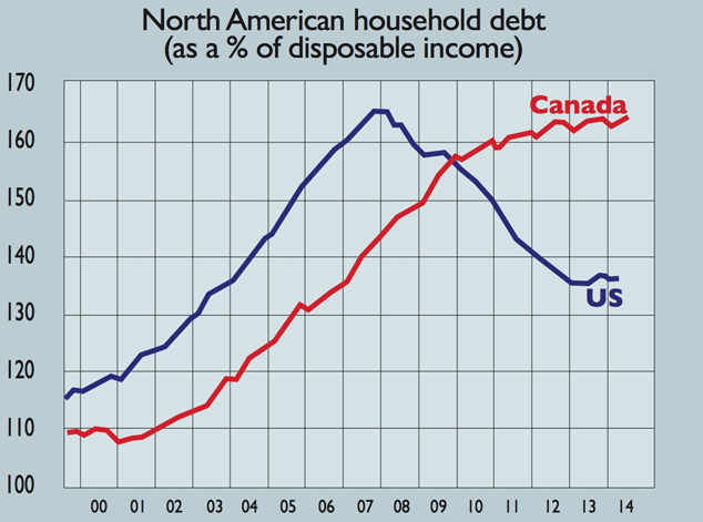
Chart of the day: Canada’s stretched households
While US consumers have worked off a chunk of their debt since the financial crisis, Canadian households have kept on borrowing.
US consumers have worked off a good chunk of their debt since the credit bubble blew up. On average, they owe less than 140% of disposable income now, down from 165% in 2008.
But Canadian households just kept going through the crunch, as Canada's economy largely shrugged it off. But record household debt means there is little scope for consumers to bolster overall growth if money from exporting commodities such as oil falls away.
Subscribe to MoneyWeek
Subscribe to MoneyWeek today and get your first six magazine issues absolutely FREE
Sign up to Money Morning
Don't miss the latest investment and personal finances news, market analysis, plus money-saving tips with our free twice-daily newsletter
Sign up to Money Morning
Our team, led by award winning editors, is dedicated to delivering you the top news, analysis, and guides to help you manage your money, grow your investments and build wealth.
-
The top stocks in the FTSE 100
After a year of strong returns for the UK’s flagship index, which FTSE 100 stocks have posted the best performance in 2024?
By Dan McEvoy Published
-
A junior ISA could turn your child’s pocket money into thousands of pounds
Persuading your child to put their pocket money in a junior ISA might be difficult, but the pennies could quickly grow into pounds – and teach them a valuable lesson about money
By Katie Williams Published
-
The charts that matter: bond yields and US dollar continue to climb
Charts The US dollar and government bond yields around the world continued to climb. Here’s what happened to the charts that matter most to the global economy.
By Ben Judge Last updated
-
The charts that matter: markets start the year with a crash
Charts As markets start 2022 with a big selloff, here’s what happened to the charts that matter most to the global economy.
By Ben Judge Published
-
The charts that matter: Fed becomes more hawkish
Charts Gold rose meanwhile the US dollar fell after a key Fed meeting. Here’s what else happened to the charts that matter most to the global economy.
By Saloni Sardana Published
-
The charts that matter: a tough week for bitcoin
Charts Cryptocurrency bitcoin slid by some 20% this week. Here’s what else happened to the charts that matter most to the global economy.
By Ben Judge Published
-
The charts that matter: omicron rattles markets
Charts Markets were rattled by the emergence of a new strain of Covid-19. Here’s how it has affected the charts that matter most to the global economy.
By Ben Judge Published
-
The charts that matter: the US dollar keeps on strengthening
Charts The US dollar saw further rises this week as gold and cryptocurrencies sold off. Here’s how that has affected the charts that matter most to the global economy.
By Ben Judge Published
-
The charts that matter: gold hangs on to gains while the dollar continues higher
Charts The gold price continued to hang on to last week’s gains, even as the US dollar powered higher this week. Here’s how that has affected the charts that matter most to the global economy.
By Ben Judge Published
-
The charts that matter: inflation fears give gold a much needed boost
Charts US inflation hit its highest in 30 years this week, driving gold and bitcoin to new highs. Here’s how that has affected the charts that matter most to the global economy.
By Ben Judge Published