Welcome back.
In this week’s magazine, we’re taking a look at the private equity sector’s feeding frenzy in UK stockmarkets. Supermarket chain Morrisons is the latest target, but it won’t be the last. UK stocks are cheap compared to world markets, and even if a lot of other people haven’t recognised it, private equity investors have, and are sniffing around for bargains. That’s a good thing, says Matthew Lynn in his City View column. And John explains how you can buy in.
And this week’s “Too Embarrassed To Ask” video gives you a quick run down on just what private equity is, for those of you who are unsure. You can watch that here.
Try 6 free issues of MoneyWeek today
Get unparalleled financial insight, analysis and expert opinion you can profit from.

Sign up to Money Morning
Don't miss the latest investment and personal finances news, market analysis, plus money-saving tips with our free twice-daily newsletter
Don't miss the latest investment and personal finances news, market analysis, plus money-saving tips with our free twice-daily newsletter
We may not have had a star guest in last week’s podcast, but we certainly do for this week’s. Merryn managed to get the Bank of England’s outgoing chief economist (he finished up on Thursday) Andy Haldane. They talked about a lot of things – the post-pandemic economic recovery, the prospect of inflation, financial repression, bitcoin, and central bank digital currencies. All that took a little longer than most podcasts – it runs to around 40 minutes rather than the usual 30 – but it really is worth your time. Find out everything he has to say here.
Here are the links for this week’s editions of Money Morning and other web articles you may have missed:
- Monday Money Morning: Morrisons is just the start – get ready for a private equity feeding frenzy
- Tuesday Money Morning: Why oil stocks still look like a good bet
- Merryn’s blog: Inflation: should you worry a lot or a little?
Web article: What is the EU’s “safe asset” bond and what might it mean for you? - Wednesday Money Morning: Has bitcoin bottomed out, or is a drop to $12,000 on the cards?
Web article: Dogecoin the big loser in the latest cryptocurrency rout - Thursday Money Morning: Why “black swan” events are even rarer than you might think
- Friday Money Morning: Inflation is coming, says the Bank of England – but don't expect us to react
- Crypto roundup: A bad week for most – but bitcoin bounced
Now for the charts of the week.
The charts that matter
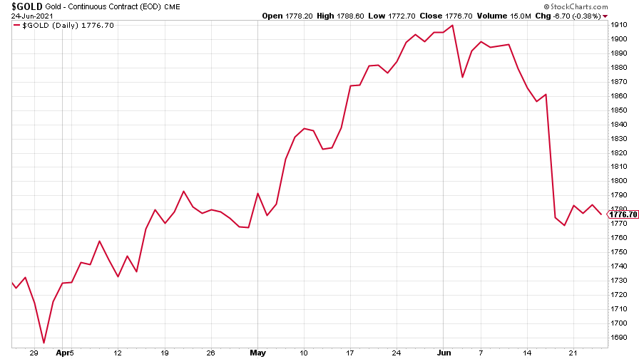
Gold stabilised after the previous week’s big plunge.
(Gold: three months)
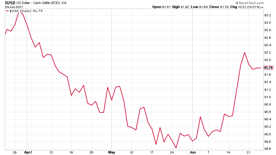
The US dollar index (DXY – a measure of the strength of the dollar against a basket of the currencies of its major trading partners) dropped a little and steadied after shooting up on the prospect of higher interest rates.
(DXY: three months)
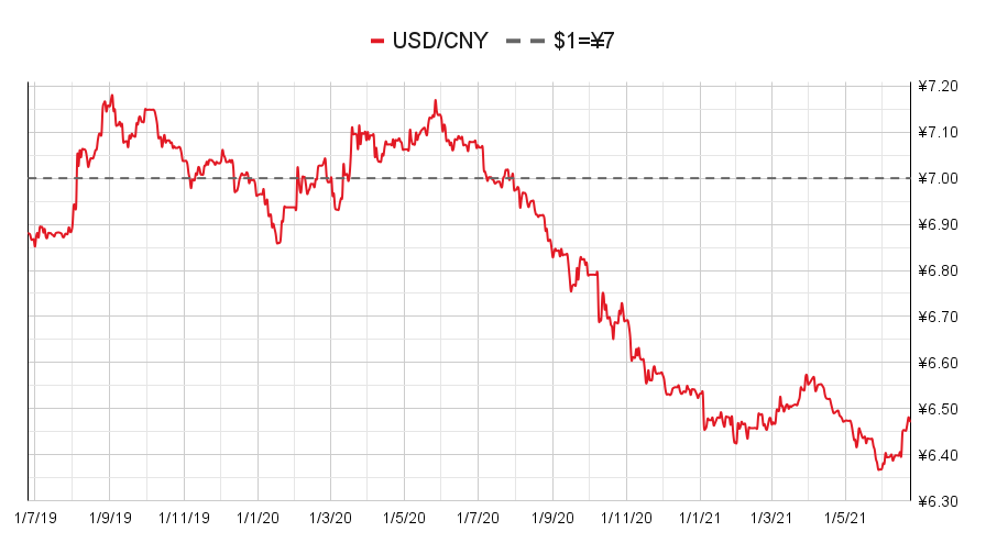
The Chinese yuan (or renminbi) weakened (when the red line is rising, the dollar is strengthening while the yuan is weakening).
(Chinese yuan to the US dollar: since 25 Jun 2019)
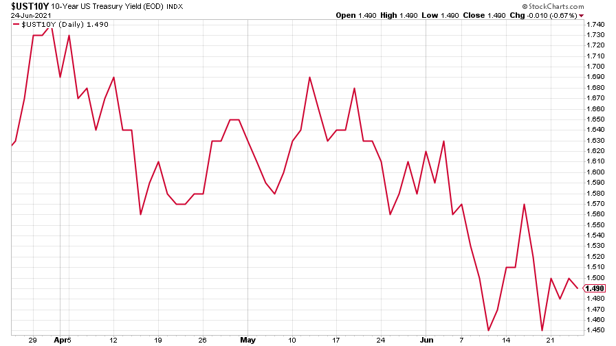
The yield on the ten-year US government bond settled down.
(Ten-year US Treasury yield: three months)
The yield on the Japanese ten-year bond wobbled, then turned back up.
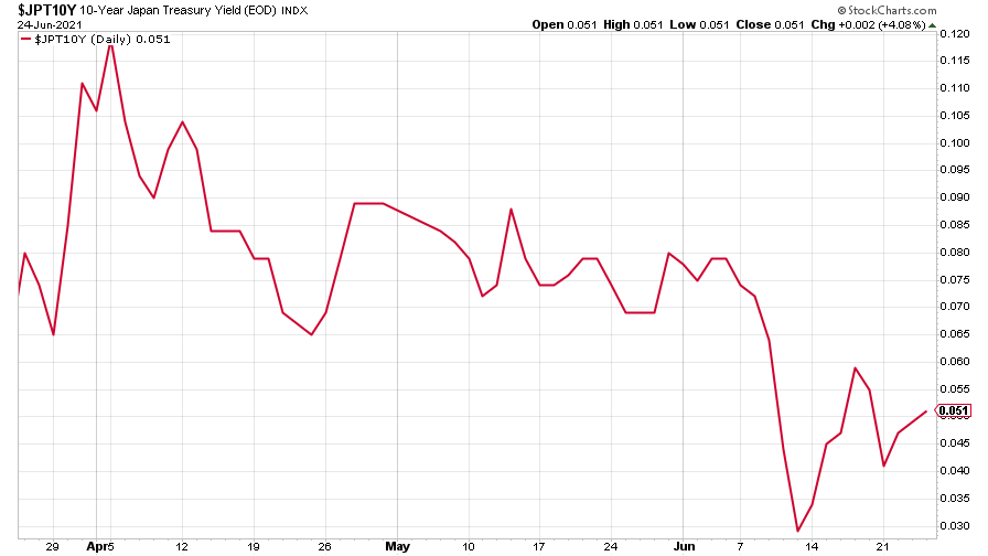
(Ten-year Japanese government bond yield: three months)
And the yield on the ten-year German Bund clawed back a little more of its losses, before rethinking towards the end of the week.
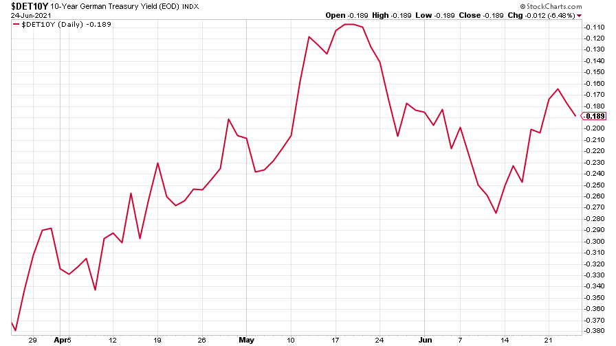
(Ten-year Bund yield: three months)
Copper turned back up, but the commodities supercycle does seem to be pausing for breath.
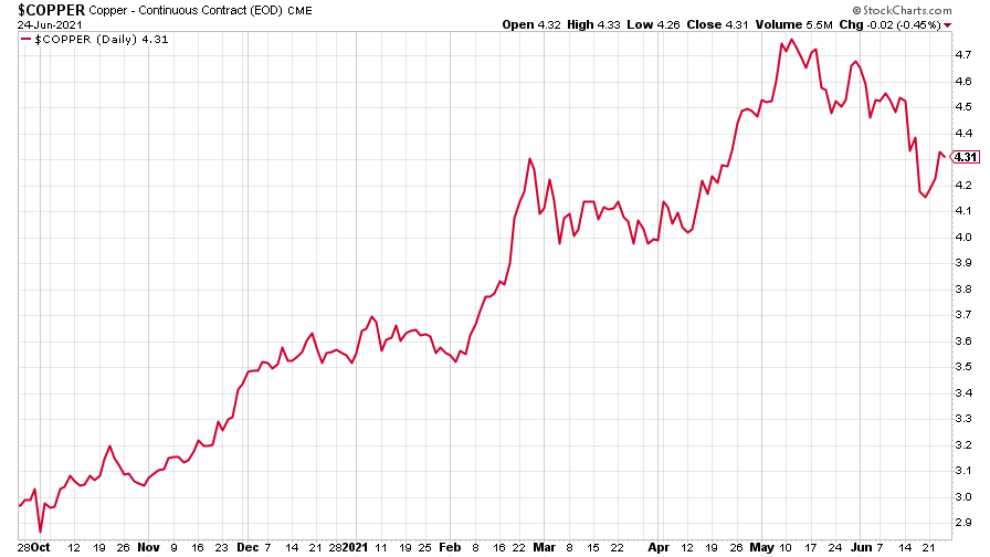
(Copper: nine months)
The closely-related Aussie dollar followed the copper price back up.
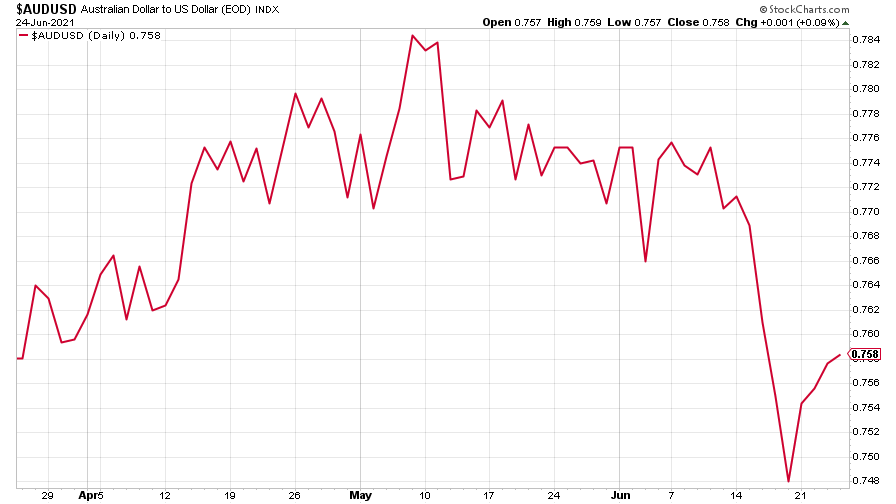
(Aussie dollar vs US dollar exchange rate: three months)
Bitcoin fell further at the start of the week, but managed to stabilise, regaining some of its losses. Read more on that in Saloni’s weekly cryptocurrency roundup.
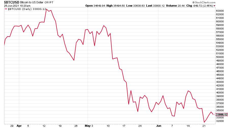
(Bitcoin: three months)
US weekly initial jobless claims slipped further, down 7,000 to 411,000, compared to 418,000 last week. The four-week moving average rose slightly, however, up 1,500 to 397,750 from 396,250 the week before.
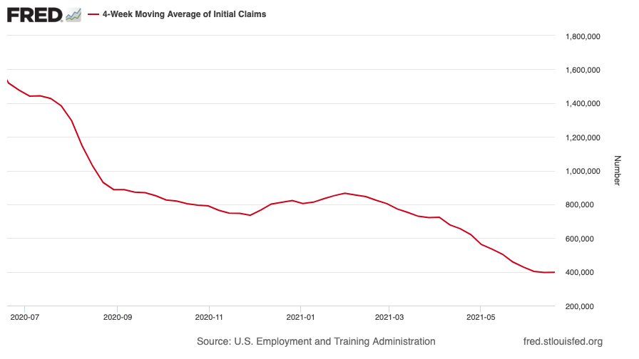
(US initial jobless claims, four-week moving average: since Jan 2020)
The oil price continued its bull market.
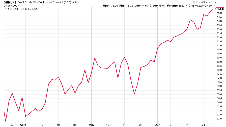
(Brent crude oil: three months)
Amazon slipped a little from the previous week’s climb.
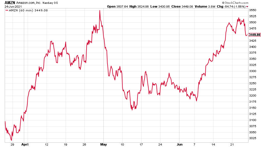
(Amazon: three months)
And finally, Tesla saw a big jump in its share price as the Nasdaq hit a new high this week.
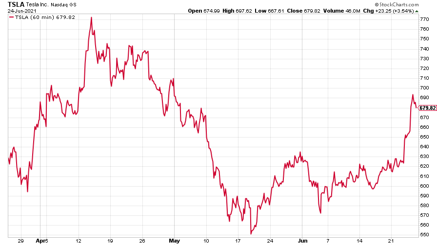
(Tesla: three months)
Have a great weekend.
Get the latest financial news, insights and expert analysis from our award-winning MoneyWeek team, to help you understand what really matters when it comes to your finances.

