The FTSE 100, along with most other major stock indexes, has risen to new heights since the 2009 'end of the world' lows.
This index contains some of the largest natural resource companies in the world, and is therefore dependent on global demand for commodities.
Generally, as go commodities, so goes the FTSE.
Try 6 free issues of MoneyWeek today
Get unparalleled financial insight, analysis and expert opinion you can profit from.

Sign up to Money Morning
Don't miss the latest investment and personal finances news, market analysis, plus money-saving tips with our free twice-daily newsletter
Don't miss the latest investment and personal finances news, market analysis, plus money-saving tips with our free twice-daily newsletter
Currently, with pressure on commodity prices, there is a divergence at play with the FTSE, which is making new highs.

At some point, this divergence will be corrected. The question is: will the FTSE decline to meet the commodity price trend, or vice versa?
Trading's mythical creature
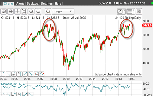
With the market currently trading in the 6,700 area, it has risen to the same level as the previous rally high in 2007.
This means that it has entered the long-established area of resistance.
And on the chart, it appears that if this area restrains further advances, we could be looking at a double top pattern.
A double top pattern is a famous one in early charting lore.
When I started trading, it was one of the most sought-after (and talked-about) patterns. I guess that was because it was one of the easiest to spot.
Many early budding technical analysts strained their eyes, looking for these mythical creatures, most of which disappeared as trading developed of course.
How to spot a double top
But examine closely the form of the two topping areas highlighted.
Back in 2007, there are two highs made at the same level. This is a genuine double top.
Now take a look at the current pattern:
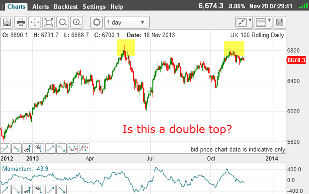
The market has been turned back at the 6,800 area, first in May, and then a few days ago.
This has the makings of a double top unless the market can zoom past the 6,800 area, of course.
One of the requirements of a genuine double top is that the tops must be separated by at least six weeks. This one fits the bill.
Also, another rule states that the tops can differ by up to 2% (136 pips) and still qualify. So we have lots of room. But any move above 6,940 would eliminate the double top theory.
Sadly, as in all analysis, you can only be proved correct in hindsight. All traders must use the currently available information to try to gain insight into the next market moves.
And technical traders use the price information contained in the charts to base their views.
As good as it gets
But I find this potential double top to be worth noting.
Is there anything in the shorter-term chart that can offer any clues?
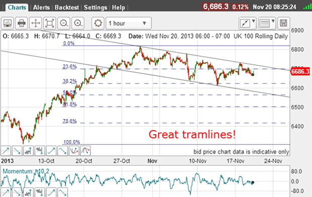
This is the hourly chart showing the big rally off the early October low, and the high in the 6,800 area.
This 6,800 level is the double topping' area, of course.
Since then, the market has backed off and is trundling along my excellent tramline pair in the trading channel.
The upper line has four accurate touch points, while the lower line has a prior pivot point (PPP) and three accurate touch points.
This is about as good as it gets.
Any move outside this trading channel should be very significant. But for now, the market is making a series of overlapping waves in the channel.
This suggests that so far, the move off the high is corrective, and that the odds slightly favour a move above the upper tramline at some point.
But a sharp move down soon would cancel out this potential.
Also note the most recent low was made on the Fibonacci 38% retrace of the move up. And with the lower tramline crossing at this point, that was a textbook long entry.
When a good tramline meets a Fibonacci level, the support/resistance is especially strong, and these are usually excellent low-risk entry points.
Battle lines are drawn
On the bearish side, I have a potential double top forming where previous highs were made in the 6,800 area, and bullish sentiment is sky-high (a top is coming).
On the bullish side, on the short-term chart, I have what appears to be a corrective move down off the 6,800 level, and the main trend still up.
To me, that is a stand-off and I shall be watching and waiting for now.
But if markets have memories, the similarity of the current chart with that in 2007 should be very significant.