The charts that matter: introducing the terrors of the yield curve
The inverted yield curve is the latest spectre to terrify financial markets. John Stepek explains what t is, and looks at the rest of the charts that matter most to the global economy.

Welcome back.
If you missed any of this week's Money Mornings, here are the links you need.
Monday: America's trade truce with China is good news for markets
Try 6 free issues of MoneyWeek today
Get unparalleled financial insight, analysis and expert opinion you can profit from.

Sign up to Money Morning
Don't miss the latest investment and personal finances news, market analysis, plus money-saving tips with our free twice-daily newsletter
Don't miss the latest investment and personal finances news, market analysis, plus money-saving tips with our free twice-daily newsletter
Tuesday: This signal is the closest you'll get to a sure thing in economics
Wednesday: The market reaction to the French riots goes a long way to explaining them
Thursday: How to keep your head in markets when all around are losing theirs
Friday: The FTSE 100 has gone nowhere in nearly 20 years. That's tempting
Don't miss this week's issue of MoneyWeek magazine in which Dominic looks at the gold mining sector and its travails and picks some of the best plays. If you're not already a subscriber, sign up here now.
And now over to the charts.
First things first, a new addition the yield curve. This unwieldy-sounding bit of jargon is the latest spectre to terrify financial markets. I wrote about it earlier this week, but I think we'd better explain the chart below, because there's nothing very curvy about it.
The chart shows the difference (the "spread") between the yield on the ten-year US Treasury, and the yield on the two-year US Treasury. In other words, it shows you how much more it costs the US government to borrow money over ten years rather than two. (The number is reached by subtracting the two-year yield from the ten-year).
Once this number turns negative (in other words, the US is paying more to borrow over two years than over ten), we can say that the yield curve has inverted. And an inverted yield curve almost always signals a recession (at least, that's been the case since at least World War II).
It's still pretty rubbishy as a market-timing tool the recession can appear anything from about six months to more than two years after the inversion. And stock markets typically go up for quite some time, even after the curve has inverted. But it's worth watching, especially given its current power to spook markets.
The key thing to remember here is this until it goes below zero, there's no signal. So even at 0.12%, we're doing OK.
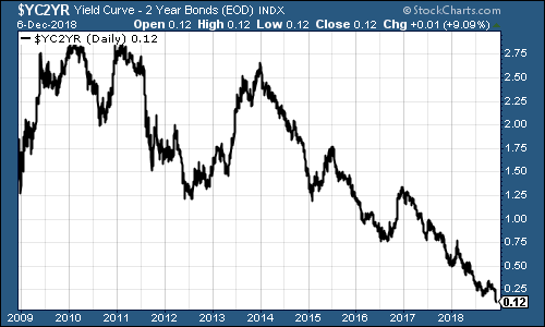
(The gap between the yield on the ten-year US Treasury and that on the two-year: going back ten years)
So how about gold (measured in dollar terms)? The yellow metal is now trading at around $1,240 an ounce. It's been creeping higher, partly because of market nerves and partly because of hopes that the US Federal Reserve will waver on raising interest rates.
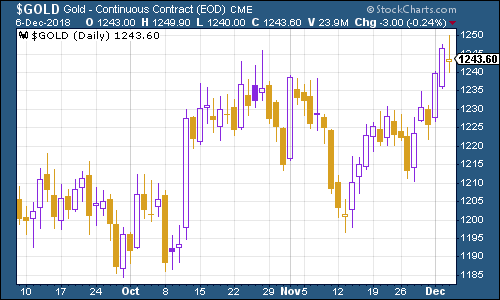
(Gold: three months)
The US dollar index a measure of the strength of the dollar against a basket of the currencies of its major trading partners is trading in a pretty narrow range. It has to be said that a drop in the US dollar would be good news for most assets. I imagine most in the market have their fingers crossed for a drop.
And a US dollar bear market is certainly a possibility from here. Of all the charts in this list, I reckon this is the most important one to keep an eye on over the coming weeks in terms of whether this equity slide turns into a full-on crash, or we get a proper 2016-style rebound.
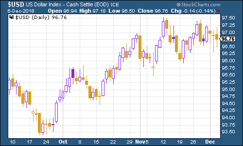
(DXY: three months)
Bond yields fell hard this week as fear of a slowdown gripped markets the yield on the ten-year US Treasury bond fell down below 3% for the first time in a long time.
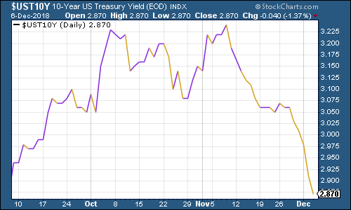
(Ten-year US Treasury yield: three months)
The Japanese government bond (JGB) yield headed even lower too.
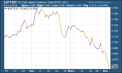
(Ten-year Japanese government bond yield: three months)
And ten-year German bund yields (the borrowing cost of Germany's government, Europe's "risk-free" rate) continued to plumb the depths, while German stocks slipped into a bear market. However, the gap between Italian bonds and German bund yields continued to ease off as market fears about Italy fade for now by comparison to fears of a growth slowdown.
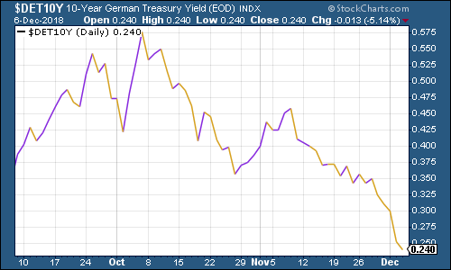
(Ten-year bund yield: three months)
Again, for all the fears of a growth slowdown, copper is continuing to hold its ground. It did jump in the wake of the relatively positive outcome from the G20 meeting then slipped back but if everyone is really nervous about an economic slowdown, particularly in China, then I would have thought copper would be showing more signs of vulnerability by now.
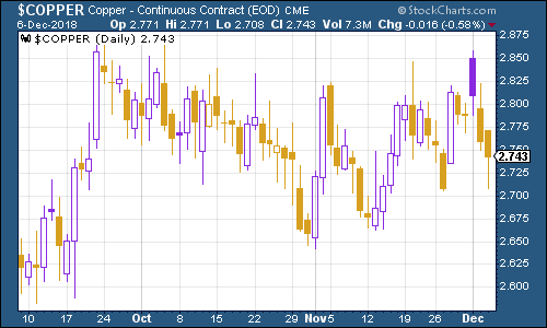
(Copper: three months)
Cryptocurrency bitcoin continued to plunge this week. It's a far cry from where it was this time last year, as the chart below shows.
Although it's also interesting to note just how swiftly the crash came from the top in December. For example, if you'd bought bitcoin in February at around $6,000 a coin, you'd have spent most of the year feeling that you'd done OK. Now of course, you'd be nursing a near-50% loss.
2019 promises to be an interesting year for crypto. I think we'd need to see a genuinely useful, widespread application coming through to get people believing that the sector really is another internet, rather than just some techno-anarchist fantasy born of 0% interest rates.
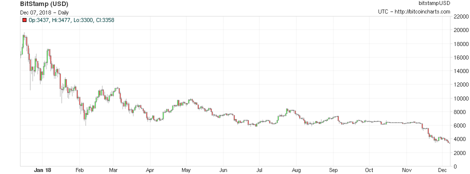
(Bitcoin: one year)
Turning to another early warning recession indicator the four-week moving average of weekly US jobless claims headed higher again, to 228,000, as weekly claims came in at 231,000. That was the highest level since April and it's the fourth gain in a row.
As I said last week, there are good reasons not to take this data at face value. Thanksgiving and Christmas are both disruptive, making the data harder to collect. But as I also said last week, it is also starting to look like we might have reached a trough for this business cycle.
Again, that's not a cast-iron view (and if you look back at January 2018, I think you could easily have started to believe the bottom was in then too). But let's watch this.
Why? Well, as David Rosenberg of Gluskin Sheff has noted in the past (and I'll warn as always, that this is taken from a small sample size, because recessions aren't that common and we only have a small number of instances to go on), the stockmarket usually does not peak until after we've seen jobless claims (as measured by the 4-week moving average) hit rock bottom for a cycle. On average, the peak follows about 14 weeks from the trough for jobless claims. A recession follows about a year later.
So if mid-to-late September was the bottom, that would imply a market peak around late December, or the start of next year. Of course, given market action since October, maybe we've already seen the peak but I'm still not entirely convinced.
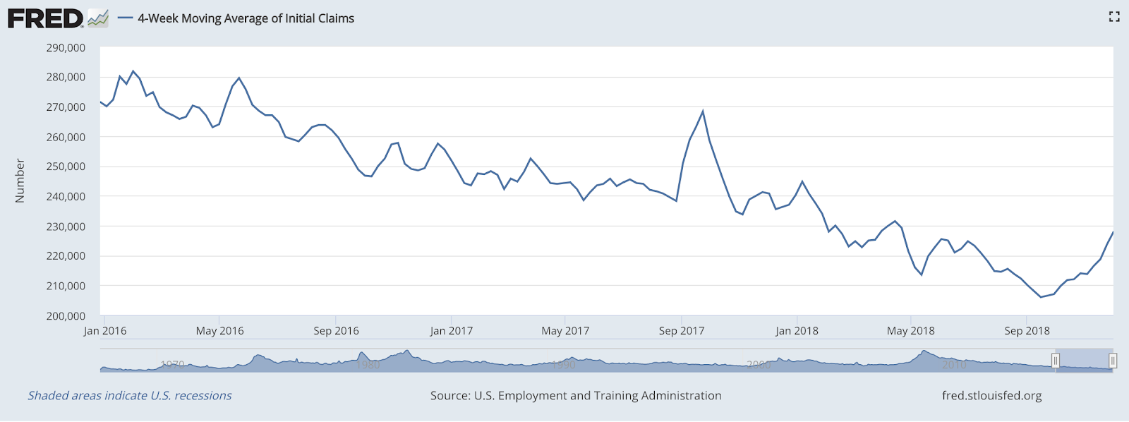
(US jobless claims, four-week moving average: since January 2016)
The oil price (as measured by Brent crude, the international/European benchmark) continues to struggle. There's an assumption that oil cartel Opec will step in and cut production but they have to agree to a deal this weekend first. Again however, a rebound in the oil price is something to watch out for in terms of where markets go next (and bear in mind that expectations management is at least one part of Opec's strategy).
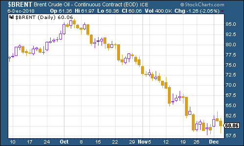
(Brent crude oil: three months)
Internet giant Amazon is continuing to rebound. If it can clamber back above the $1,800 mark, I wouldn't write off the potential for a proper Santa Claus rally just yet.
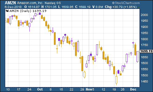
(Amazon: three months)
Look, I have to admit it I'm starting to develop a sneaking fondness for electric car group Tesla. In a week in which most stocks have been racked with panic and volatility, Tesla the very definition of a flaky, high-risk, over-indebted company a mere couple of months ago is not far off its all-time high. And this time it didn't even have to talk up the idea of going private to get there.
It helps that Tesla made a profit last quarter and it helps that the share price is now at a level where it may be able to pay off a $920m bond due in March, with stock rather than cash. The bond in question is "convertible", which means it can be repaid in equity as long as the price is above a certain level in this case, $359.88 per share.
It likely also helps that the stock was so heavily shorted. It'd take a stubborn short seller to sustain the kind of losses they must be seeing now.
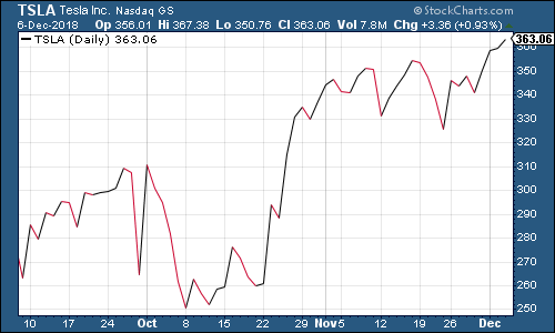
(Tesla: three months)
Get the latest financial news, insights and expert analysis from our award-winning MoneyWeek team, to help you understand what really matters when it comes to your finances.
