Beware – the yield curve is inverting
One of Wall Street’s most reliable signals of danger in the markets is flashing. Is it time to worry, asks Marina Gerner.
Get the latest financial news, insights and expert analysis from our award-winning MoneyWeek team, to help you understand what really matters when it comes to your finances.
You are now subscribed
Your newsletter sign-up was successful
Want to add more newsletters?

"One of Wall Street's most reliable fortune tellers is flashing ominous signals," says CNN. All eyes have turned to the yield curve. Investors are fretting about whether it's going to "invert," which is seen as a harbinger of trouble. Since World War II, every recession has been preceded by an inverted yield curve.
The yield curve plots the difference, or spread, between the yield on the ten-year US Treasury (government bond), and the yield on the two-year Treasury. It therefore shows how much it costs the US government to borrow money over ten years, compared to two years. In normal times, the interest rate on loans rises with the lending period, so the yield curve slopes upwards.
The yield curve inverts when long-term interest rates fall below the level of short-term ones. This means investors are pencilling in a downturn that will prompt the central bank to cut interest rates. Inversion hasn't occurred yet, but it's getting uncomfortably close.
Try 6 free issues of MoneyWeek today
Get unparalleled financial insight, analysis and expert opinion you can profit from.

Sign up to Money Morning
Don't miss the latest investment and personal finances news, market analysis, plus money-saving tips with our free twice-daily newsletter
Don't miss the latest investment and personal finances news, market analysis, plus money-saving tips with our free twice-daily newsletter
The canary in the coalmine
The yield curve has flattened sharply recently. The more closely monitored spread between two and ten-year yields is still positive, but the two- and three-year yields are now above five-year ones for the first time since 2007. At its post-2008 financial crisis peak that two-ten year gap was 2.9% as the economy pulled out of recession, say Joe Rennison and Robin Wigglesworth in the Financial Times. Now, it has slipped below 0.1% for the first time since 2007. "It seems... only a matter of time before the benchmark measure also inverts, says Tom Stevenson in The Daily Telegraph. "The canary may still be clinging to its perch, but it's getting breathless."
But does that mean a recession is imminent? No. "Even if the yield curve inverts further, the economy is likely to continue performing well in the short-term," says Michael Pearce on Capital Economics. As Rennison and Wigglesworth point out, US economic growth in the third quarter was strong, unemployment and wage growth data are positive, and US investors and policy makers are still upbeat. The oil price drop has boosted households' purchasing power, which will keep consumption strong in the short run. S&P 500 companies are still set to boost profits next year, says Michael Mackenzie in the FT.
Too soon to panic
There has been one occasion in the 1960s when the yield curve inverted but a slowdown ensued, not a recession. And while a recession occurred on all the other occasions, it did so "with a sizeable lag," as Stevenson notes, on average two years after the inversion. So this near-inversion may simply be one further sign that the bull market is on its last legs. "Just as the bond market foretold in 2000 and 2006, there is a growing wariness of late-cycle weakness, marked by plenty of corporate debt," says Mackenzie. In any case, the yield curve is worth watching given its power to unnerve the markets.
... but the death cross' is nothing to fear
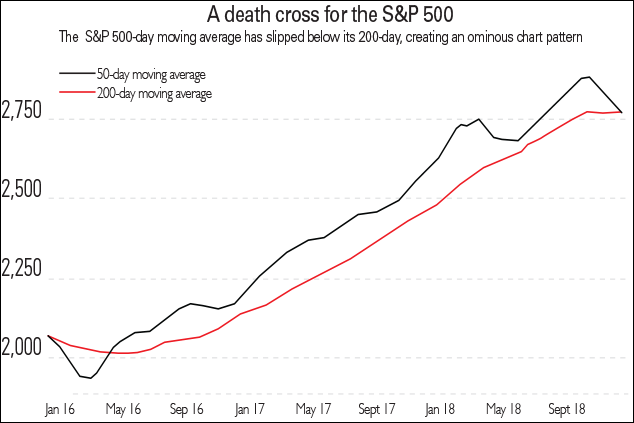
"In all the squiggly charts that traders see every day, recognisable patterns occasionally emerge," says Jason Karaian on Quartz. One of the patterns that spooks investors is the "death cross," when an index's short-term moving average drops below its long-term moving average when both are declining. Commonly it refers to the 50-day average falling below the 200-day average. The death cross is supposed to reflect dwindling momentum and herald further falls. The opposite is called a "golden cross," supposedly a classic "buy" signal.

On 7 December, both the S&P 500, America's blue-chip index, and the Russell 2000, the main gauge of small companies' share prices, formed a death cross. The S&P slipped by 2.3% after two previous days of falls. That pushed its 50-day moving average four points below its declining 200-day moving average, leading to the first death cross since January 2016.
But the death cross has not been a good bear market indicator. "Like all technical indicators, it has its limits," says April Joyner on Reuters. Far from all large market sell-offs have been signalled by a death cross. Crucially, there was no death cross before the financial crisis. However, there have been four S&P death crosses since then. The death cross only correctly presaged further equity falls ten times out of 22 incidents since 1970, according to Tan Kai Xian and Will Denyer of Gavekal Research.
Meanwhile, US asset management group Fisher Investments UK notes death crosses in equity markets worldwide occurred in 2004, 2006, 2011, 2015, 2016, 2017 and 2018 all global bull market years. As Xian and Denyer put it: "We... would advise investors not to get unduly focused on tea leaf gazing".
Get the latest financial news, insights and expert analysis from our award-winning MoneyWeek team, to help you understand what really matters when it comes to your finances.
Marina Gerner is an award-winning journalist and columnist who has written for the Financial Times, the Times Literary Supplement, the Economist, The Guardian and Standpoint magazine in the UK; the New York Observer in the US; and die Bild and Frankfurter Rundschau in Germany.
Marina is also an adjunct professor at the NYU Stern School of Business at their London campus, and has a PhD from the London School of Economics.
Her first book, The Vagina Business, deals with the potential of “femtech” to transform women’s lives, and will be published by Icon Books in September 2024.
Marina is trilingual and lives in London.