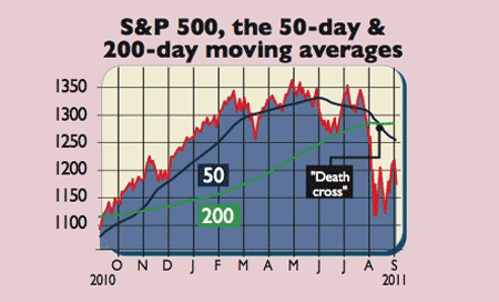
Given America is still the world's most influential economy, investors should watch its key stock index, the S&P 500, closely. The bad news is that the death cross' has just been spotted in the market. For technical analysts (chartists), this is a sure sign to sell. But what exactly is the death cross? And does it really mean what chartists think it does?
The death cross is found using two relatively simple technical indicators. You take the 50-day moving average (MA, this averages the index price over the past 50 days and so gives a short-term view of the market trend) and the 200MA (the same thing, over a longer period of time). By themselves, each is of limited use. But combined, they can reveal a lot.
The 50MA gives a good idea of where the 200MA is headed. If it turns sharply upwards, chances are the 200MA will too, and vice versa. Stock bulls want to see the 50MA cut up through a rising 200MA. This is known as the golden cross'. That suggests that not only is the underlying long-term trend upward, but that the markets are confident in the shorter term too. In other words, the short and long-term trends support each other.
Try 6 free issues of MoneyWeek today
Get unparalleled financial insight, analysis and expert opinion you can profit from.

Sign up to Money Morning
Don't miss the latest investment and personal finances news, market analysis, plus money-saving tips with our free twice-daily newsletter
Don't miss the latest investment and personal finances news, market analysis, plus money-saving tips with our free twice-daily newsletter
On 10 August this year, the opposite happened. The S&P 500 50MA cut down through an already falling 200MA. That's a death cross' and it signals doom, according to chartists. It has appeared before each of the last two major bear market phases (in 2001 and in 2008). So should you sell now? Maybe, according to data from Mark Hulbert of Marketwatch.com. In the S&P's sister index, the Dow Jones, there have been 85 death crosses from the late 1880s till 2010. On average, in the year after such a cross, the market gains 2.4% compared to a 114-year annual average of 6.4%. That suggests the death cross works as a sell signal.

But there's a problem. "There has been no statistically significant difference since 1990 between the average performance [of stocks] following death crosses and all other market sessions." It has had a few big triumphs, but also some flops, such as in October 2005, "in the middle of the 2002-2007 bull market".
Even if the last 21 years are a blip, there's another practical problem with using death crosses and golden crosses as sell and buy signals it may not be worth it. Tom McClellan notes on Businessinsider.com that, between 1928 and 2011, if you'd bought the S&P 500 when the 50MA was above the 200MA and sold in the opposite scenario, then you'd have beaten a buy and hold investor, but not by much and certainly not enough to warrant the extra cost.
Part of the problem, says Professor LeBaron at Brandeis University, is that, once these indicators get a name for themselves, everyone starts using them and they stop working. So while there are many good reasons to be wary of the market just now, we wouldn't base any decisions solely on one magic number'.
Why you shouldn't rely on analysts
BP is far from the only example. In a 2010 report, consultants McKinsey concluded that over-optimism is endemic among analysts. Over a 25-year period, "with few exceptions, aggregate earnings forecasts exceed realised earnings per share" in other words, companies generally don't meet expectations. Real growth figures beat forecasts only twice in 25 years, both "during the recovery following a recession".
There are several reasons why this is the case analysts are punished for getting forecasts wrong, so they tend to herd together. Indeed, even after the BP disaster, "the forecast share price never fell below the price of BP's actual stock", notes Psyfitec.com. Their proximity to firms is also a problem. As James Montier of US fund manager GMO notes, the time analysts spend meeting companies is almost certainly counterproductive. Human beings "aren't good at looking for information that will prove us to be wrong", so such "meetings are likely to be mutual love-ins" with analysts lapping up evidence that backs their existing rosy forecasts and ignoring warning signs that don't.
The message for investors is clear: take "the research of others" with a pinch of salt, and make sure you "don't overpay [for stocks] and don't under-diversify". Analyst views in particular are often no more useful than "stories emanating from company managements".