Every now and again, an almighty storm gathers over the stock market. It's known by charting fans as a death cross'. Occasionally this blows up into a hurricane: the ultimate death cross'. But what are these doom-laden signals and do you need to batten down the hatches as the latest looms?
What is charting?
To get to grips with death crosses and their more terrifying cousins, you need to understand charting techniques. Chartists (also known as technical analysts') base their investment decisions on spotting familiar patterns of stockmarket behaviour early.
The underlying theory boils down to this: markets reflect the group decisions of human beings. Human behaviour is flawed and also doesn't change much. So chartists look out for certain repeating patterns in the market, then use their knowledge of history to take a guess at what comes next.
Try 6 free issues of MoneyWeek today
Get unparalleled financial insight, analysis and expert opinion you can profit from.

Sign up to Money Morning
Don't miss the latest investment and personal finances news, market analysis, plus money-saving tips with our free twice-daily newsletter
Don't miss the latest investment and personal finances news, market analysis, plus money-saving tips with our free twice-daily newsletter
In very simple terms, a chartist will say things like: "I've seen this pattern before. Usually there's a big sell-off pretty soon, so I'll beat the market by selling now." Or a contrarian might wait for the sell-off to happen, then buy in, waiting for the rebound.
A word about moving averages
One of the simplest signals the cross is built on moving averages. A moving average can be applied to any market, from stocks to currencies to commodities. All it does is smooth out short-term fluctuations in price, with the aim of revealing the true' underlying trend.
Say over five days the FTSE 100 closes at these levels: 5,200, 5,250, 5,350, 5,100, 5,200. The average of those is (5,200 + 5,250 + 5,350 + 5,100 + 5,200)/5, which equals 5,220. Now let's add in the day six closing price, which is 5,000. To create a simple five-day moving average (DMA), knock off the first reading, include the last one and recalculate. Now the five DMA is (5,250 + 5,350 + 5,100 + 5,200 + 5,000)/5, which equals 5,180. In other words, the overall trend is down, based on five days of data.
Moving averages can be constructed for short and longer periods of time for any stockmarket index. Probably the single most important stockmarket index in the world is the US S&P 500. This captures the progress of America's top 500 firms (based on stockmarket value).
Big moves here tend to ripple straight across the Atlantic to get reflected in the FTSE 100, and the States also tends to lead most other major markets. Two of the most closely watched moving averages are the 50-DMA and the 200-DMA. It's the interaction of these two that fascinates cross watchers.
The death cross
When using moving averages, chartists watch for two key events. When the 50-DMA moves up through the 200-DMA, it suggests the market in question may be about to move sharply upwards. That's called a golden cross', as it's a classic buy' signal to a chartist.
The opposite is called a death cross'. This is when the 50-DMA slices down through the 200-DMA, suggesting traders have suddenly got bearish and the trend is down. The ultimate death cross' takes things a step further. It compares the 50-month moving average (50-MMA) to the 200-MMA. When the 50-MMA cuts down through the 200-MMA you have the ultimate death cross'.
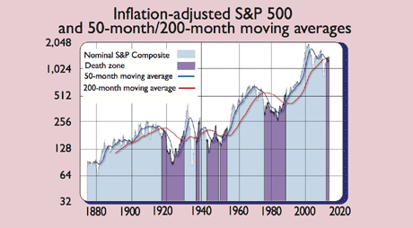
But why use 50 and 200 months? According to Trendythird.blogspot.fr, this is because 50 months translates as four years and two months, "roughly the length of an election cycle or market cycle". Two hundred months is "roughly the length of a secular (bull or bear) stockmarket cycle".
As Investors Chronicle's Dominic Picarda notes, "since 1800 there have been eight instances [of ultimate death crosses] in the US stockmarket". So they're pretty rare. Indeed, the 50-MMA average has stayed above the 200-MMA for most of the last 66 years. But now the 50-MMA is hovering just above the 200-MMA and may soon plunge through it. So what should you do with this information?
Turning Japanese
Picarda argues that none of the previous ultimate death crosses "were harbingers of total collapse". The average stockmarket loss afterwards was 22%, the biggest being 39% during the 1840s depression. I'd argue that a drop of 22%-39% is bad enough for my liking, as you'd need a pretty massive bounce to follow to get you back to break-even.
That aside, using such a long-term signal for short-term trading purposes isn't the point, says Albert Edwards of Socit Gnrale. For its real significance, he argues, we need to look at Japan. There, an ultimate death cross occurred more recently in 1998. Now, "14 years later, we are still in the firm embrace of the bear", he says. Couple that with the recent collapse in US earnings optimism and, as Jamie Chisholm notes in the FT, this grim signal may point to the fact that a proper American recession has begun.
What to do?
The fact that central banks from Britain to America and even China are still trying to pump liquidity into financial markets via low interest rates and money printing (quantitative easing, QE) tells you how worried they are. Even the European Central Bank's Mario Draghi appeared not to rule out QE in a recent interview, despite Germany's resistance.
So another ultimate death cross adds fuel to the view that we are in for a long, hard slog before economic growth resumes. That's not necessarily disaster for investors it just means you need to be selective.
According to a recent paper by Joachim Klement of Wellershoff & Partners, the US market is among the most expensive developed markets based on the Shiller price-to-earnings ratio, which tries to smooth out short-term earnings fluctuations to give a better picture of how cheap or pricey a market is. On this measure, Klement notes, markets in the eurozone are far cheaper. As our editor John Stepek noted here, that means you might be better off investing there for the long run.