These Aussie charts are too good to ignore
The Australian dollar versus its American counterpart is displaying textbook tramlines in the charts, says John C Burford.
I thought I would veer a little off-piste today and cover the Australian dollar versus the US dollar (AUD/USD) a market that is a currency major, but doesn't seem to get the attention it deserves from spread betters. It should and that is because the charts show excellent patterns that can be analysed using my tramline methods.
First, I want to illustrate a principle regarding which currency crosses to trade. In your spread betting platform, you will see three categories: majors, minors and exotics. Most of the majors are traded against the US dollar, the world's reserve currency. And to back up the exchange rate, there is a large commercial need for this market rate which determines trade flows.
But with the minors and certainly the exotics there is often negligible trade flow to underpin market rates. In fact, many of these are derived from a simple math calculation comparing one side of the cross against the US dollar with the other side against the dollar.
Try 6 free issues of MoneyWeek today
Get unparalleled financial insight, analysis and expert opinion you can profit from.

Sign up to Money Morning
Don't miss the latest investment and personal finances news, market analysis, plus money-saving tips with our free twice-daily newsletter
Don't miss the latest investment and personal finances news, market analysis, plus money-saving tips with our free twice-daily newsletter
For example, the cross CHF (Swiss franc)/AUD is derived by dividing the AUD/USD (big market) against the CHF/USD (quite big market).
I recently received an email from someone trading CHF/AUD , and I asked him why he did it. The January 'mishap' when the Swiss franc soared in value within seconds (the central bank suddenly announced they were ceasing to defend the euro peg) was surely a warning sign.
The major currencies offer more than enough great trades
I've attached the long-term weekly chart below to place today's market in perspective. From the 2008/2009 lows, the market rallied in a clear five up (green bars). The third wave showed the requisite strength with high momentum readings along its length. When you see a market with this degree of strength, you always suspect a third wave if the earlier action can be labelled in waves 1 and 2, as here.
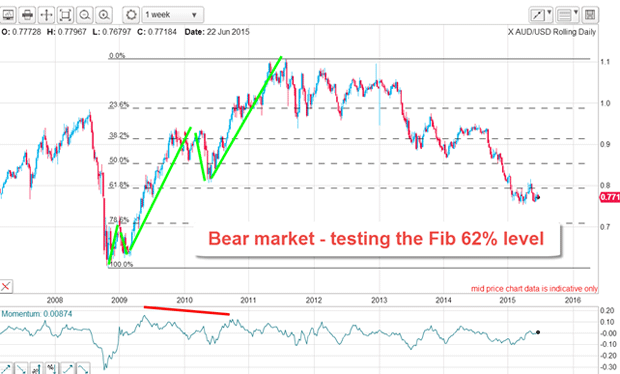
Note that the fifth and final wave is extended this is a very common characteristic in the currencies, particularly on this kind of long time frame. In fact, it is about as long in duration as the third wave. I'm sure this feature gave rise to the well-known observation that currency trends just keep on going way beyond the point where most traders believe they should have ended.
Today, the market is well into the bear trend off the 2011 highs and is currently testing the Fibonacci 62% retrace of the entire five up. In fact, the Aussie has lost around 30% of its value since 2011, and it is not hard to understand why with commodity markets Australia's major industry in the doldrums.
But of course, no trend continues forever. The key questions are these: has the market fallen enough, and is it ripe for a turn-around? To answer those questions, we must look closer at the daily and then hourly chart.
Below is the daily from last summer's high: I have drawn in my best fit tramlines, which are not exactly textbook with an insufficient number of touch points. But I do have a good prior pivot points (PPP) on the lower tramline and I have used that as my anchor for the centre tramline. From there, I drew in T3 when the centre tramline was broken in April.
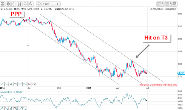
Note that the April/May rally was turned back precisely on T3, a very gratifying validation of my initial tramline placements.
My Elliott waves look just as good as my tramlines
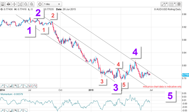
Wave 4 (purple) ended at the 14 May high and the market is working its way through wave 5 to new lows. That is the scenario under this count.
Let's zoom in closer on the hourly. From the wave 4 high, the market has declined in five clear waves with a nice positive-momentum divergence at the low. From there, we have seen a relief rally in a textbook A-B-C. Remember, after a motive five wave move, expect a counter-trend move in three waves.
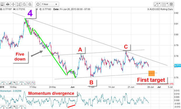
Also, I have drawn in my upper tramline which crosses over the A and C wave highs (with a good PPP). My parallel tramline then crosses the two major lows and a projection gives me my first immediate target.
If the market breaks below that level, we will be well into my purple wave 5 down.
The AUS/USD charts are giving me some highly reliable tramlines and EW counts and an ideal hunting ground for my low-risk trading approach. You really don't need to go far into the outer reaches of the currency universe to discover great trading setups.
Get the latest financial news, insights and expert analysis from our award-winning MoneyWeek team, to help you understand what really matters when it comes to your finances.
John is is a British-born lapsed PhD physicist, who previously worked for Nasa on the Mars exploration team. He is a former commodity trading advisor with the US Commodities Futures Trading Commission, and worked in a boutique futures house in California in the 1980s.
He was a partner in one of the first futures newsletter advisory services, based in Washington DC, specialising in pork bellies and currencies. John is primarily a chart-reading trader, having cut his trading teeth in the days before PCs.
As well as his work in the financial world, he has launched, run and sold several 'real' businesses producing 'real' products.
