Trading turning points using weekly charts
A weekly chart can instantly give us a wide perspective on where the market is currently positioned. But it only rarely gives you insights into good trading positions. For that, we need shorter time-frames to work on.
If you have been around price charts for a while, you will know that the weekly chart can instantly give you a wide perspective on where the market is currently positioned.
However, it only rarely gives you insights into good trading positions (although this example is an exception). For that, we need shorter time-frames to work on. But the weekly can throw up major support and resistance levels (at least price bands can be revealed), as well as any current major trends.
Over the years, I have specialised in identifying major and minor turning points in trending markets. I guess it satisfies my perverse sense of satisfaction in proving the majority wrong.
Try 6 free issues of MoneyWeek today
Get unparalleled financial insight, analysis and expert opinion you can profit from.

Sign up to Money Morning
Don't miss the latest investment and personal finances news, market analysis, plus money-saving tips with our free twice-daily newsletter
Don't miss the latest investment and personal finances news, market analysis, plus money-saving tips with our free twice-daily newsletter
Of course, getting timing spot-on is not at all easy, and I am often too early in taking positions. But using my 3% rule will keep losses manageable until the markets start to co-operate. The key here is to persevere, provided the indicators continue to line up.
Of course, if you are a trend-follower, you have the same set of problems. If you are buying on dips, can you be assured that the dip will not turn into a collapse? Remember, there are no guarantees in trading, just probabilities.
In this example, I combine the concepts of trend-following with trend-changing. How? I'll show you.
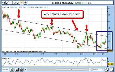
Take a look below at the weekly chart of the US dollar (USD) vs the Swiss franc (CHF). The Swissie is considered the ultimate "safe-haven" currency. The Swiss economy for example, runs budget surpluses, while the US does not. In the first half of 2010, the US dollar swung manically up, as eurozone economies were feared to be in crisis. Then, in the summer, the market started to believe the Federal Reserve would print more dollars, while the eurozone was now felt to be 'safe'.
As a result, in June, the dollar started a big collapse. The Swissie is highly correlated to the euro because of trade, and so the franc swung down in the first half of 2010.
Here is the chart (I have inverted to show USD/CHF):

One feature stands out right away the trend-line joining the three highs in 2003, 2006 and 2008. (I have drawn a parallel tramline joining important lows. This line will become important later on).
Since the downtrend line stretches over six to seven years, I think we can respect it! (Actually, the line passes through an important top in 1999 as well, just to add to its authenticity). Does that mean we can expect any further rallies to be turned back if the market hits this line? The very long-term trend is definitely down will that trend persist? Let us see.
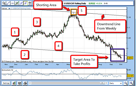
Here is a shorter-timeframe chart:

In November '09, the market traded around the area of the lower tramline and embarked on a clear five-wave Elliott 'up' move (marked 1-2-3-4-5) that took it towards the upper tramline in the 1.15 area by May.
That's when I began to get interested. According to Elliot, a move is completed after five waves. I expected that after such a large gain, any turn-around would be fiercely resisted and the market would become very volatile.
Thus, I decided to set a resting limit sell-order very close to the line at 1.1660. There has to be some leeway in drawing the line you just cannot be too precise in these things. And on 1 June, my order was filled. Having used my 3% rule to set my protective buy-stop at just above the line at 1.1810, I was all set:
1 June sold £1 rolling US/CHF @ 1.1660.
Stop @ 1.1810.
Risk £150 (3%)
That was indeed the top and the seven-year downtrend line I had drawn on the weekly chart had held.
I must say, taking a position based on a straight line I had drawn through previously-established multiple tops over many years, and seeing that line hold in real time, gave me great satisfaction. I'm sure you feel the same way.
When to take profits
During the summer, the market turned very bearish the dollar, and I had to decide where to take profits always a tricky decision. Because of the strength of the downtrend in June and July, I decided to firstly move my protective stop to break-even (using my break-even rule). Then as the market made new lows in August, I moved my stop to 1.070 just above the July/August consolidation zone. That would ensure a good profit in the case of a turn-around.

Because I felt there was a good chance the market would test the lower tramline, I decided to place a resting buy-order at the area of the line at 0.9650 (see the purple box on the chart which I've reprinted from above). Note that in the past, the market has dipped beneath this line and then bounced back up. I wasn't prepared to sit on great profits and see this happen to me! On 5 October, I was taken out for a wonderful profit.
5 October bought £1 rolling US/CHF @ 0.9650.
Profit £2,010 on risk of £150
I took this profit despite the overwhelming chorus of negativity towards the dollar. Why, when everyone is expecting a dollar collapse? Well, for the very same reason I shorted the market in June the chorus at that point was just as negative on the euro (and by association, the Swissie).
This was an exceptional trade. These clear-cut trendlines on the weekly charts do not come along often, but when they do, they can work spectacularly. You can be sure that I'll be on the lookout for a reversal upwards in this market it is trading beneath the lower trendline, after all. History doesn't always repeat itself in the markets but it sure does rhyme.
Get the latest financial news, insights and expert analysis from our award-winning MoneyWeek team, to help you understand what really matters when it comes to your finances.
John is is a British-born lapsed PhD physicist, who previously worked for Nasa on the Mars exploration team. He is a former commodity trading advisor with the US Commodities Futures Trading Commission, and worked in a boutique futures house in California in the 1980s.
He was a partner in one of the first futures newsletter advisory services, based in Washington DC, specialising in pork bellies and currencies. John is primarily a chart-reading trader, having cut his trading teeth in the days before PCs.
As well as his work in the financial world, he has launched, run and sold several 'real' businesses producing 'real' products.
