A panic-inducing chart for stock investors
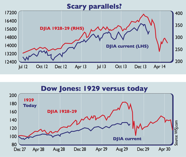
Here's a chart comparing today's Dow Jones with the index in the 1920s right before it fell off a cliff. Should you be worried?


Every so often, a terrifying stock market chart does the rounds. The latest purports to show that since mid-2012 the Dow Jones Industrial Average (DJIA) has been mirroring the pattern seen in the same index in 1928-1929, implying that we are about to plunge off a cliff.
Pay no attention. For starters, it's not hard to construct apparently eerie similarities between different eras. Dan Greenhaus of brokers BTIG notes that the S&P 500's development after the 2011 debt ceiling drama looks a lot like the S&P in the run up to the 1987 crash.
But since that crash was briskly followed by the resumption of the 1980s bull market, that chart isn't as likely to generate as big a buzz online as a supposed pre-Depression cliff-dive. Fundamentals differ between eras; for example, monetary policy is far looser than it was in 1929.
Try 6 free issues of MoneyWeek today
Get unparalleled financial insight, analysis and expert opinion you can profit from.

Sign up to Money Morning
Don't miss the latest investment and personal finances news, market analysis, plus money-saving tips with our free twice-daily newsletter
Don't miss the latest investment and personal finances news, market analysis, plus money-saving tips with our free twice-daily newsletter
But the main reason to ignore this one is that it doesn't compare apples with apples: the scales are different. The Dow's move in the 1920s was far bigger in percentage terms. Look at both in percentage terms (the bottom chart) and the spooky similarity disappears. There are several reasons to be wary but this isn't one of them.
Get the latest financial news, insights and expert analysis from our award-winning MoneyWeek team, to help you understand what really matters when it comes to your finances.
