Before I get to the latest charts, I have something interesting to show you about US Treasury bonds, or T-Bonds
I wrote about T-Bonds in Monday's article and it prompted quite a few comments (as I thought it might!).
Why would long-term bonds and stocks decline together, asked some.
Try 6 free issues of MoneyWeek today
Get unparalleled financial insight, analysis and expert opinion you can profit from.

Sign up to Money Morning
Don't miss the latest investment and personal finances news, market analysis, plus money-saving tips with our free twice-daily newsletter
Don't miss the latest investment and personal finances news, market analysis, plus money-saving tips with our free twice-daily newsletter
Surely when risk is on, bonds are sold and stocks are bought, and vice versa. That's what happens normally
We are not in normal times
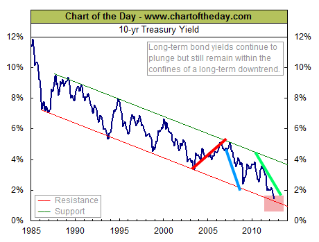
OK, so let's start with a recent comparison.
You can see that from 20032007 (red lines), bond yields and stocks were rising together as usual:
(Click on the chart for a larger version)
But why is that the normal' pattern? Simply because, in an expanding economy, demand for credit rises, putting upward pressure on rates, especially when sovereign borrowing requirements are relatively modest. As ever, the supply/demand equation operates.
Next, note how during the credit crunch 2007- 2009 (blue lines), they fell together as final demand in the economy and demand for credit collapsed together.
But since then (green lines), stocks have been rising while yields have plunged.
In other words, we are not in normal times.
It looks like T-Bonds could be near the top
This 2009-2012 divergence has been ascribed to the 'safe haven' effect. But surely, shares are anything but safe havens! After all, investors are risking their money to own part of a company which may prosper or may stumble. And yet stocks have also been bid up!
So there is a contradiction here. One of them must be wrong!
I contend that in a full-scale panic, everything will be sold to raise cash, even many 'safe' bonds. Which bonds will be left standing is anyone's guess. But with the rocky US debt background, perhaps Treasuries will suffer as well as many others. Of course, we've not reached the panic stage yet.
But as a trader, I know that we can all reason ourselves to the wrong trade at the wrong time! Just look at gold. Here the bulls have long maintained that hyperinflation is inevitable and gold would rocket. And yet gold prices have fallen in a year. That was the logically correct reasoning, but the wrong trade at the wrong time.
What I see in the T-Bond charts is a possible topping here, that is all. I will let the market decide if I have my timing correct. If I am wrong, I have my break-even stops in to ensure no loss.
At the end of the day, I'd rather have a red face than a big trading loss.
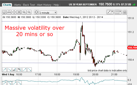
Wednesday's huge volatility contained by tramlines
Turning to Wednesday's action, when the markets were on tenterhooks to hear what succour Bernanke would provide, the 30-year T-Bond future took off, then ran into a brick wall for a superb whiplash.
So see what I mean, take a look at the two-minute chart:
(Click on the chart for a larger version)
The entire range was over 100 pips in the space of less than an hour. Many positions both longs and shorts were taken out by this action. It almost certainly was connected with the huge computer glitch that occurred on the NYSE opening.
Even so, isn't it remarkable that my tramlines guided the high and low of this extremely volatile period?
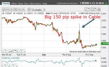
As I write this morning, we have seen the volatile effects of yesterday's Draghi drama and the spikes I forecast in Wednesday's article did indeed occur, especially in the US dollar currency crosses.
Here is the 15-minute chart for GBP/USD (the sterling versus dollar rate or cable' as it's known):
(Click on the chart for a larger version)
Obviously, spiky markets like this make swing trading very tough!
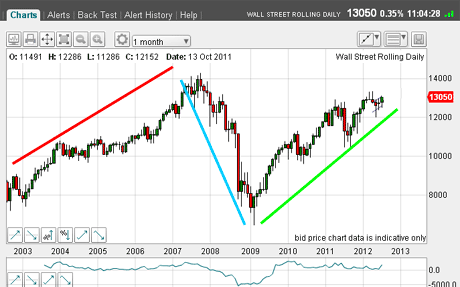
But take a look at the next chart and you can see that the spike up in the Dow was more muted:
(Click on the chart for a larger version)
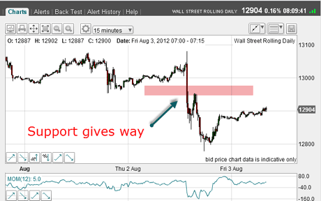
The rally only carried to the area of previous highs in the 13,100 area and then was hit by massive selling, as I forecast on Wednesday.
Some great new tramlines on the Dow
But recall from Wednesday that I was questioning my old Dow tramlines and asking if I should look for another set. Have you found any yourself?
Well, I believe I have found some great new ones, still on the hourly chart! Have a look at these:
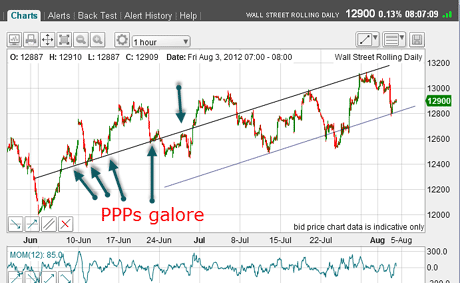
(Click on the chart for a larger version)
Admire the lovely prior pivot points (PPPs) and also the hit last night on my lower line. The rally this week lies right on the upper line, and we are this morning bouncing up off the lower line.
In other words, the market obviously believes this line is significant, and so shall I. Any break below it should be bearish.
Later today, the monthly US jobs report will be released and this usually induces yet more volatility as traders position themselves for it.
As I write, the market has rallied to the Fibonacci 50% retrace of yesterday's plunge:
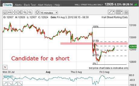
(Click on the chart for a larger version)
This is a great candidate for a short swing trade as the market is close to the support/resistance zone (pink bar) that was broken on the way down yesterday.
Remember, I'm still holding my short trade at the 13,040 area from Wednesday with my stops now at break-even.
Another sign of the great bull/bear stand-off
Finally, what are the AAII mom and pop' retail investors thinking? Here is the survey hot off the press as of 2 August:
| Week ending 8/2 | 30% | 35% | 35% |
| Change in week | 2% | -8% | 6% |
| Long-term average | 39% | 30% | 31% |
Quite an interesting result, don't you think?
What we can see here is that there has been a swing to the bulls of 10% (as the Dow maintained the 13,000 level). But look at the big increase in the "don't knows" of 6%, taking it to well above the long-term average.
What does all this mean? Well I think it reflects the deep chasm between the professionals who are very bullish and the public, who are much more ambivalent.
One measure of the professionals' bullishness is the near-record low ratio of cash held by US mutual funds to their assets (around 3.5%). Bearish professionals would keep a high cash level.
Also, huge withdrawals from US stock mutual funds by the public continue, confirming their negative mood and their need to raise cash. That's a bearish signal.
So tell me what do you make of all this? Share your thoughts below.
To me, there is an unstable stand-off between the bulls and bears. But I think this could be resolved at any time with a new trend in place. In the meantime, we must contend with wide swings both up and down.
It must be absolute hell for trend followers!
If you're a new reader, or need a reminder about some of the methods I refer to in my trades, then do have a look at my introductory videos:
The essentials of tramline trading
An introduction to Elliott wave theory
Advanced trading with Elliott waves
Don't miss my next trading insight. To receive all my spread betting blog posts by email, as soon as I've written them, just sign up here . If you have any queries regarding MoneyWeek Trader, please contact us here.