Investors fall broadly into two camps. The first are those who believe that markets are irrational in other words, that they often 'misprice' stocks. This type of investor favours 'bottom-up' analysis. They use ratios to find what they believe to be good stocks at cheap prices, in the assumption that eventually other investors will catch on and drive the share price closer to 'fair value'.
The second camp believe the 'trend is your friend'. You shouldn't worry about whether a stock is fundamentally cheap or expensive largely because Mr Market is rational at all times. In other words, all known information is already 'in the price', which leaves little scope for bargain hunting. All that matters is spotting whether a price is rising or falling and gauging for how long the trend will last. Catch the prevailing trend early enough, and you'll make a lot of money.
Of course, the best strategy as heavyweight fund managers such as Anthony Bolton have acknowledged probably lies between the two. A cheap, high-quality stock (found using ratios) that also has upward momentum (spotted on the right chart) is likely to be a good bet. We often cover fundamental and ratio analysis here at MoneyWeek, but for those who are curious about the world of charting, here are three terms any would-be chartist should understand.
Try 6 free issues of MoneyWeek today
Get unparalleled financial insight, analysis and expert opinion you can profit from.

Sign up to Money Morning
Don't miss the latest investment and personal finances news, market analysis, plus money-saving tips with our free twice-daily newsletter
Don't miss the latest investment and personal finances news, market analysis, plus money-saving tips with our free twice-daily newsletter
Candlesticks
As the name suggests, charting is based on line charts. But rather than using a simple graph line connecting a particular share's daily mid-market closing price (the one half way between its bid and offer prices) many chartists prefer to use 'candlesticks', which show more information. A vertical line shows the highest price (the top of the candlestick) and the lowest price (the bottom of the candlestick), with the closing price shown as a horizontal dash cutting across it. This helps you to assess whether volatility is rising (the candle sticks are getting taller) or falling (they are getting shorter). It also shows the underlying price direction for the security. Candlesticks are often coloured too, so an additional blue (or hollow, depending on your preference) solid vertical bar in the middle of the candlestick typically indicates that the day's opening price was below the closing price (reflecting buying pressure). A red or filled one suggests the opposite (selling pressure). The longer the 'body' of the candlestick, the greater that pressure it suggests prices moved significantly over the day.

Moving averages
"AMGN is trading above its 50- and 200-day moving averages" is a typical trading bulletin comment. But what does it mean? Moving averages are one of the chartist's most basic, and most useful, tools. Usually these are calculated using closing prices. Say you want to work out a five-day average for a share that has closed at 100p, 120p, 90p, 110p and 130p over the previous week. Simple just add up the five prices and divide by 5. So that's 550p/5, or 110p. Now let's say that on day six, the share price closes at 150p. Take that, and the previous four days' prices, and recalculate. This time the result is 600p/5, or 120p. So the five-day moving average is rising that's a bullish sign. However, it's a fairly short period over which to draw any big conclusions about medium-term price direction.
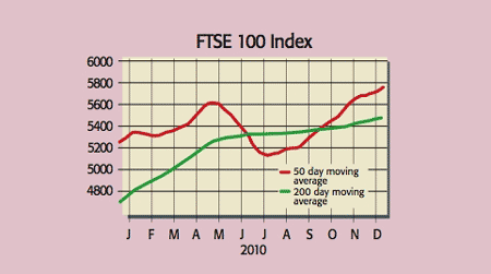
So investors often follow a 50- and 200-day moving average instead. Once plotted, they can be used to assess trends. For example, if a short-term moving average say, a 50-day one crosses up through a longer-term one, such as the 200-day, that's a bullish short-term signal. If the 50-day crashes down through the 200-day, that's bearish. If the latest stock price is well above both the 50 and 200-day line, you have a dilemma. Either the latest price is an aberration, or the chart is offering a strongly bullish signal. Volume information can help here. If a recent move up is supported by heavy, and ideally rising, trading volumes, it probably isn't a flash in the pan.
Channels and resistance points
Shares tend to zigzag over the short-term rather than moving consistently in the same direction. That's a problem for anyone trying to discern an up or down trend. One way to make a trend easier to spot is to superimpose tramlines that join up the peaks and troughs. If the top and bottom lines are both moving up (so the highs are getting higher and the lows are also getting higher) you have a clear bull trend. Equally, a sudden switch to lower highs and lower lows is bearish. And by extending the tramlines, you can get a rough feel for future resistance points.
Many techniques are used to try to determine more precisely where stock resistance (or turning) points will occur. One you may well have heard of is the Fibonacci sequence (see below). And you can learn more about charting techniques at www.moneyweek.com/SB.
What is a Fibonacci retracement?
Nature is full of recurring patterns. Chartists believe stock-price movements recur too. Both, say fans, can often be traced to a mathematical sequence used to describe rabbit population growth by Italian mathematician Leonardo Fibonacci in 1202. It starts with 0 and 1, with each subsequent number the sum of the previous two. So the sequence continues with 1 (0+1), then 2 (1+1), 3, 5, 8, 13 and so on. The Fibonacci retracement pattern is based on taking one number in the sequence and dividing by a number that follows it. So, moving along the sequence, 55/89 is 0.6179, or 61.8%. Divide 55 by the number two places to its right 144 (55+89) and you get 0.3819, or 38.2%. Do it again, but three places to the right, and you get 23.6%, and so on. The point, say fans, is that stocks tend to hit price resistance levels that accord with these percentages. So the sequence is a useful guide to where to buy and sell a stock and also place stop losses.