Charting divides investors. For some it's a vital investing tool. Others think it's little better than reading the tea leaves. But given that Anthony Bolton (Britain's most successful fund manager when he ran the Fidelity Special Situations Fund) has said that if he could only have one investment tool on a desert island, it would be a chart, we shouldn't be too hasty to dismiss it. So what's it all about?
Chartists believe investors act in herds when in doubt we follow the crowd. So investor psychology is predictable. That means that patterns of past behaviour captured by chart lines that reflect share price, currency, and commodity price movements should tend to recur. In other words, the past should be a fairly decent guide to future price action. All an investor has to do, therefore, is to watch for a familiar trend or pattern developing on a chart and then buy or sell just before the herd makes its next move.
Building a chart
At its most basic, a chart can be just a single line that reflects the movement of, say, a share price over a fixed period. The line simply connects a series of single points say the mid-market share price at the close of each day (the mid-market price is just an average of the 'bid' and 'offer' trading prices). However, charts can be constructed to show more than that. For example, the classic 'candlestick' chart can also show the highest prices (the top of the candlestick) and lowest (the bottom) for that particular day, with the closing price shown as a horizontal dash cutting across it. This gives some indication of a share's volatility the taller the candle, the greater that day's price movement. Further, the individual candlesticks can be coloured. For example, a blue candle indicates that the day's opening price was below the closing price; red shows the opposite.
Try 6 free issues of MoneyWeek today
Get unparalleled financial insight, analysis and expert opinion you can profit from.

Sign up to Money Morning
Don't miss the latest investment and personal finances news, market analysis, plus money-saving tips with our free twice-daily newsletter
Don't miss the latest investment and personal finances news, market analysis, plus money-saving tips with our free twice-daily newsletter
Trend spotting the moving average
So far, so pretty. But what's the point? One way to start using charts to reveal trends whether a stock is likely to go up, down or sideways is to look at the moving average. Typically, these are based on closing prices. The principle is simple if you want to work out a three-day average, first add together the closing prices from the past three days, then divide by three. So if the closing prices were 200p, 150p and 100p, the average is 150p. To create a moving average, you wait for the next closing price, say 170p, then drop the first day's price and recalculate. In this case, the new three-day average is 140p i.e. (150p + 100p + 170p)/3. So in this example, the three-day moving average is falling.

Thus even by itself a moving average can reveal a trend of rising or falling prices. You can also compare the latest share price to a moving average to get a feel for if that trend is likely to continue. Another useful trick is to take the moving average for a share over a relatively short period, say 50 days, and compare it to the moving average over a longer period, for instance, 200 days. If the shorter period average 'crosses below' the longer period average, that can be a strong sell signal and vice versa.
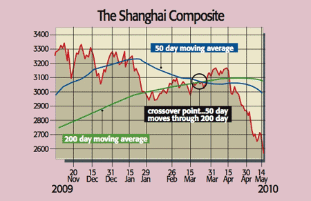
Nervous Chinese investors, for example, will have noted that the 50-day moving average for the Shanghai composite index has just cut down through the 200-day average. That's bad news because once a bull or bear trend takes hold as investors either gain confidence or lose their nerve, it can persist. A case in point is the recent downward march of the euro. Investors have become so concerned about the prospect of a sovereign debt default by one of the 'siesta nations' (which includes the likes of Greece, Spain and Portugal) that even a record e750bn bail-out package hasn't been enough to reassure them.
Trading volumes can seal the deal
Another key piece of data for chartists is trading volume the number of times a stock was traded over a given period (eg, a day). This data can be plotted too, often at the foot of the chart. A bullish signal is given when a rising stock price is supported by rising buying volumes. This suggests an uptick has legs more and more investors are piling into the market. Equally, an uptick in a share price based on anaemic demand may not last.
It all sounds so easy
In practice, charting can get pretty complex. Since every investor wants an edge over the competition, analysts pore over charts in a bid to be the first to spot a new trend, coming up with increasingly complicated patterns as they do so. That's where the bizarre expressions common in the charting world the 'head and shoulders', the 'Fibonacci retracement', the 'Raff regression' and even 'Andrew's Pitchfork' come from. After all, any fool can spot a rising or falling price, the trick is to be early and guess how long a trend will last.
And that's the tough part. As investors in dotcom stocks know, herds can suddenly switch direction bulls become bears and trends end. So what's the best approach? Ideally, you should combine charting with 'fundamental' analysis. In other words, you should have a good reason to buy into an asset because it's cheap on a p/e or dividend yield basis, for instance. Then you can use its price chart to help you decide whether to buy now (i.e. when it looks as though a rising trend is forming), or whether you should wait for a better opportunity.